


Are you drowning in a sea of spreadsheets? It’s a familiar feeling for most founders: spending hours pulling numbers from different files, trying to piece together a clear picture of how the business is actually doing. The reports are time-consuming, prone to error, and usually out of date by the time they’re finished.
For small and medium-sized businesses, this is where a data visualization dashboard changes the game. Think of it as an interactive, visual command center that connects to your scattered data sources and automatically displays your key business metrics in one place. It makes spotting trends, tracking goals, and finding growth opportunities feel intuitive, not exhausting.
Moving From Excel Chaos to Dashboard Clarity
If you're running a growing business, you know the pain of "Excel chaos." It's that nagging sense that you're spending way more time managing data than actually using it. Reports take forever to build, they’re riddled with human error, and they're usually stale by the time they hit your desk.
This manual grind creates a serious bottleneck. Instead of making proactive, strategic moves based on real-time performance, you're stuck reacting to siloed information from your finance, operations, and sales tools.
The Power of a Single Source of Truth
Data visualization dashboards are built to solve this exact problem. The best analogy is the dashboard in your car. It doesn’t overwhelm you with every mechanical detail—it gives you the critical info you need at a glance: your speed, your fuel level, your engine status. This allows you to make quick, smart decisions to get where you're going safely.
A business dashboard works the same way. It plugs into your various data sources—like Xero, HubSpot, or Google Analytics—and turns a mess of numbers into a clear, intuitive, and interactive story.
A well-designed dashboard isn't just a collection of pretty charts. It's a strategic tool that converts raw data into business intelligence, giving you the confidence to steer your company with precision.
By automating the reporting process with tools like Power BI, you can finally shift from guesswork to insight-led decisions.
Why This Matters for SMBs
For a growing company, the ability to act fast is your biggest competitive edge. Data visualization dashboards give you that power. Here’s how:
- Total Visibility: Get a complete, holistic view of your business performance, from high-level KPIs like cash flow down to the nitty-gritty operational details, all in one place.
- Time Savings: Stop wasting hours on manual data entry and report building. Free up your team to focus on the strategic work that actually drives growth.
- Improved Accuracy: Automated data pipelines slash the risk of costly mistakes that sneak in when you're copying and pasting between spreadsheets.
- Enhanced Alignment: When everyone from finance to marketing is looking at the same trusted data (a "single source of truth"), it sparks better collaboration and gets the whole team pulling in the same direction.
Of course, a crucial first step is getting all that messy data into one place. For instance, you might need a guide on converting data from PDFs into structured formats like Google Sheets. This is the kind of foundational work that turns data chaos into a single source of truth, giving you the clarity needed to lead with confidence.
So, What Does a Data Visualization Dashboard Actually Do?
Let's cut through the jargon. At its heart, a data visualization dashboard is your automated reporting engine, built for one thing: clarity. Forget manually digging for data in a dozen different places. The dashboard connects directly to the tools you already rely on—your CRM, accounting software, sales platforms—and automatically pulls everything together into one central data warehouse.
It then takes that tsunami of raw, messy numbers and translates it into clean, simple visuals. Think of a bar chart that instantly shows your monthly recurring revenue (MRR), or a line graph that tracks customer acquisition costs over time. This isn't just about seeing data; it's about understanding the story it tells, instantly. All the tedious work you used to spend hours on now happens on its own, in near real-time.
From Raw Numbers to Actionable Insights
The real magic of a dashboard is how it turns isolated data points into a cohesive narrative. A well-designed dashboard doesn’t just show you what happened; it pushes you to ask why it happened. This is the crucial leap from static, backward-looking reports to dynamic, forward-looking analysis.
For instance, a dashboard gives you fast, straight answers to the questions that actually matter:
- Which marketing channels are bringing in the best leads this month? No more jumping between ad platforms; the answer is right there in a single visual.
- Is our cash flow trending up or down? A simple KPI gauge pulls live data from your accounting system to give you an immediate read in your financial dashboard.
- Are certain sales reps crushing their quotas? A leaderboard chart can spotlight top performers and reveal who might need a bit of extra coaching.
This is exactly why businesses are jumping on board so quickly. The global data visualization market is on track to hit $9 billion in 2025 and is expected to explode to nearly $19.5 billion by 2032. This isn't just a fleeting trend; it’s a fundamental shift. Businesses of all sizes are realizing that real-time insights are no longer a luxury—they're essential for staying in the game. You can dive deeper into these market drivers in this detailed industry report.
Manual Excel Reporting vs. Automated Power BI Dashboards
The difference between wrestling with spreadsheets and leveraging an automated dashboard is night and day. One approach keeps you bogged down in the past, manually piecing together a fuzzy picture of what already happened. The other frees you up to focus on shaping the future.
It’s a classic battle of old habits versus new possibilities. To really see the contrast, let's put them side-by-side.
| Aspect | Manual Excel Reporting | Automated Power BI Dashboard |
|---|---|---|
| Data Freshness | Outdated the moment it's created. Requires a manual refresh every single time. | Live or near real-time. Data updates automatically on a set schedule. |
| Accuracy | Prone to human error from copy-pasting, broken formulas, and version control chaos. | High accuracy with automated data pipelines pulling from a single source of truth. |
| Time Investment | Hours—or even days—spent every week on mind-numbing data collection and report building. | Minimal time spent on reporting; that time is reinvested in actual analysis and strategy. |
| Accessibility | Siloed in files on local drives. A nightmare to share, collaborate on, or access on the go. | Centralized and accessible to the entire team via a secure web link, anytime, anywhere. |
| Business Impact | Reactive decision-making based on stale, often untrustworthy data. | Proactive decision-making based on current, reliable insights you can count on. |
Ultimately, a dashboard liberates you from the low-value, high-frustration work of building reports. It gives you and your team the power to make confident, data-backed decisions without needing a Ph.D. in data science. It’s about turning your business data from a confusing liability into your most powerful strategic asset.
The Three Dashboard Types Your Business Needs
Not all dashboards are created equal. You wouldn't use a city map to check the weather, and the same logic applies here. The right dashboard depends entirely on who’s looking at it and what questions they're trying to answer.
Figuring out the different types is the first step. It's the difference between building a tool that drives focused action and one that just creates more noise. For any growing business, there are really three essential categories of dashboards, each built for a distinct role and audience.
Strategic Dashboards: The C-Suite View
Think of a strategic dashboard as the 30,000-foot view of your business. This is the command center for founders, owners, and the leadership team. Its only job is to monitor long-term health and track progress against high-level goals.
It isn’t bogged down in daily operational details. Instead, it answers the big questions: Are we profitable? Are we growing? Are we keeping our customers? These dashboards are typically reviewed monthly or quarterly to guide big-picture planning, giving leaders a quick health check without getting lost in the weeds.
- SMB Scenario: The founder of a subscription box company uses a strategic dashboard to track Monthly Recurring Revenue (MRR), Customer Lifetime Value (CLV), and Churn Rate. This view helps them make informed calls on pricing, marketing spend, and long-term expansion.
- Common Metrics: Profitability, Year-over-Year Growth, Customer Acquisition Cost (CAC), and Market Share.
Analytical Dashboards: The Investigator's Toolkit
While strategic dashboards tell you what is happening, analytical dashboards help you understand why. These are the go-to tools for your operational leaders—your Head of Sales, Marketing Manager, or Operations Director.
They are built for exploration. These dashboards let users drill down into the data, compare trends, and uncover the root causes behind the numbers. An analytical dashboard is interactive by nature, empowering your managers to slice and dice data across different timeframes, regions, or product lines to figure out what's really going on.
An effective analytical dashboard transforms your managers from data consumers into data explorers. It gives them the power to answer their own questions, fostering a culture of curiosity and data-driven problem-solving.
- SMB Scenario: A marketing manager for an e-commerce brand notices a dip in website conversions. They turn to their analytical dashboard to break down the data by traffic source, device, and landing page. They quickly discover that conversions from mobile users on one specific product page have plummeted, pointing to a bug that needs fixing—fast.
- Common Metrics: Sales by Region, Customer Segmentation, Marketing Campaign ROI, and Conversion Funnel Analysis.
Operational Dashboards: The Frontline Pulse
If strategic dashboards are the long-term view, operational dashboards are the real-time, minute-by-minute pulse of your business. These are for the frontline teams managing the day-to-day—customer support, logistics, or website management.
The goal here is speed and immediate action. These dashboards monitor live processes, flagging issues as they happen so the team can respond instantly. They track fast-moving metrics that demand constant attention to keep the business running smoothly. For more ideas, you can explore our gallery of business intelligence dashboard examples to see these concepts in action.
- SMB Scenario: A SaaS company's customer service team uses an operational dashboard to monitor incoming support tickets, average response times, and CSAT scores in real time. If response times start creeping up, the team lead can immediately shift people around to handle the queue.
- Common Metrics: Website Uptime, Open Support Tickets, Inventory Levels, and Social Media Mentions.
Principles of Effective Dashboard Design
A confusing dashboard is no better than a messy spreadsheet. Simply slapping a few charts onto a screen doesn't magically create value; real insight comes from thoughtful design that tells a clear, focused story.
Truly effective data visualization dashboards are less about artistic flair and more about the science of communication. The goal is to build a tool that feels intuitive, answers critical questions at a glance, and guides the user toward a specific conclusion or action. This means thinking like a designer, where every single element on the screen has a distinct purpose.
Start with a Question, Not with Data
This is the single most common mistake founders make: trying to visualize everything. They connect a data source, see all the available metrics, and start building charts for each one. The result? A cluttered, overwhelming dashboard that doesn't actually answer anything.
An effective dashboard always starts with a clear business question. Before you even think about charts or colors, you have to define what you need to know.
- Bad Approach: "Let's build a sales dashboard." This is way too vague and leads straight to a kitchen-sink design.
- Good Approach: "Which of our marketing channels are generating the most profitable customers this quarter?" This is a specific, actionable question. It immediately dictates exactly what data and visuals you need.
When you start with a question, you ensure every element on the dashboard serves a purpose, contributing directly to finding the answer.
Choose the Right Chart for the Job
Once you know the question, the next step is picking the right visual to answer it. Different chart types tell different stories. Using the wrong one can easily misrepresent your data and lead to flat-out wrong conclusions.
For example, a pie chart is terrible for showing trends over time—that's what a line chart is perfect for. A bar chart excels at comparing distinct categories, like sales performance across different regions. To really get this right, check out our guide on dashboard design best practices for more detailed examples. Mastering this is a core part of building a dashboard that delivers clarity, not just complexity.
A great dashboard guides the user's eye. It uses a logical layout—often with high-level KPIs at the top and more detailed charts below—to tell a story that flows naturally from summary to specifics.
Keep It Simple and Declutter
Less is almost always more in dashboard design. Every unnecessary chart, color, or label adds "cognitive load," forcing the user's brain to work harder to find the key message. Think of it as a signal-to-noise ratio; you want to maximize the signal (the insights) and minimize the noise (the visual clutter).
As you design, it's also vital to consider visual accessibility. For instance, successfully mastering color contrast for web accessibility ensures your dashboards are readable for the widest possible audience. You don't want key data to get lost because of poor design choices. This commitment to clarity is what separates a professional dashboard from an amateur one.
The demand for clear, actionable data is undeniable. In the United States, data visualization dashboards are now a cornerstone of business intelligence. The U.S. market for these tools is projected to hit $2.53 billion by 2025, with over 92% of Fortune 500 companies using them to drive decisions. This just highlights a universal truth: businesses thrive on clarity, and well-designed dashboards are the engines that deliver it.
Ultimately, designing an effective dashboard is all about making deliberate, strategic choices. It's not about just building charts; it's about crafting a powerful decision-making tool.
Want to design a financial dashboard in Power BI that delivers real clarity and drives your business forward? Connect with us to design your financial dashboard in Power BI.
Your Roadmap for Implementing a Power BI Dashboard
Diving into your first Power BI dashboard can feel like a huge undertaking, but it’s really just a series of logical steps. Think of it like building a house: you need a solid blueprint before you even think about hammering boards together. This roadmap is your blueprint, designed to take the fuzzy idea of a "dashboard" and turn it into a concrete, achievable project.
The path from data chaos to crystal-clear insights has a few key phases, each one building on the last. Follow them, and you’ll end up with more than just a collection of pretty charts—you’ll have a powerful tool that actually drives smarter business decisions.
Phase 1: Define Your Business Questions
This is the most important step, and it happens completely away from the computer. A truly great dashboard starts with strategy, not data. Before you touch a single spreadsheet, you have to nail down the specific, high-value questions you need answers to.
Vague goals like "I want to see my sales" are a recipe for a cluttered, useless dashboard. You have to get specific.
- Who are our most profitable customers, and what are their buying patterns?
- Which marketing channels have the lowest customer acquisition cost this quarter?
- How is our cash flow trending, and what are the main drivers behind it?
Starting with sharp questions ensures every single visual on your dashboard has a clear and defined purpose. No fluff.
Phase 2: Identify and Connect Your Data Sources
Once you know what you’re asking, you can figure out where the answers are hiding. Your business data is probably scattered across a bunch of different systems that don't talk to each other—your accounting software (like Xero or QuickBooks), your CRM (like HubSpot), various marketing platforms, and of course, a mountain of Excel files.
The mission here is to pinpoint every single data source needed to answer your questions. Power BI is brilliant at this; it has built-in connectors that can automatically pull data from hundreds of different apps, bringing everything into one central hub. This is where you start building a single source of truth and finally end the nightmare of manual data collection.
Phase 3: Build the Data Model
This is the behind-the-scenes magic that makes a Power BI dashboard so incredibly powerful. It's also where most DIY projects hit a wall. Building a data model is all about cleaning, structuring, and connecting your different data sources so they can "talk" to each other seamlessly.
Think of it as creating a universal translator for your data. Your sales system knows "customer ID," and your finance system understands "invoice number." The data model is what links them together. This is what lets you see the true profitability of a marketing campaign or the lifetime value of a customer from a specific region. It's this foundational work that unlocks the dynamic, drill-down analysis that spreadsheets just can't handle.
The visual below shows how the process flows, starting with strategy long before you get to design.
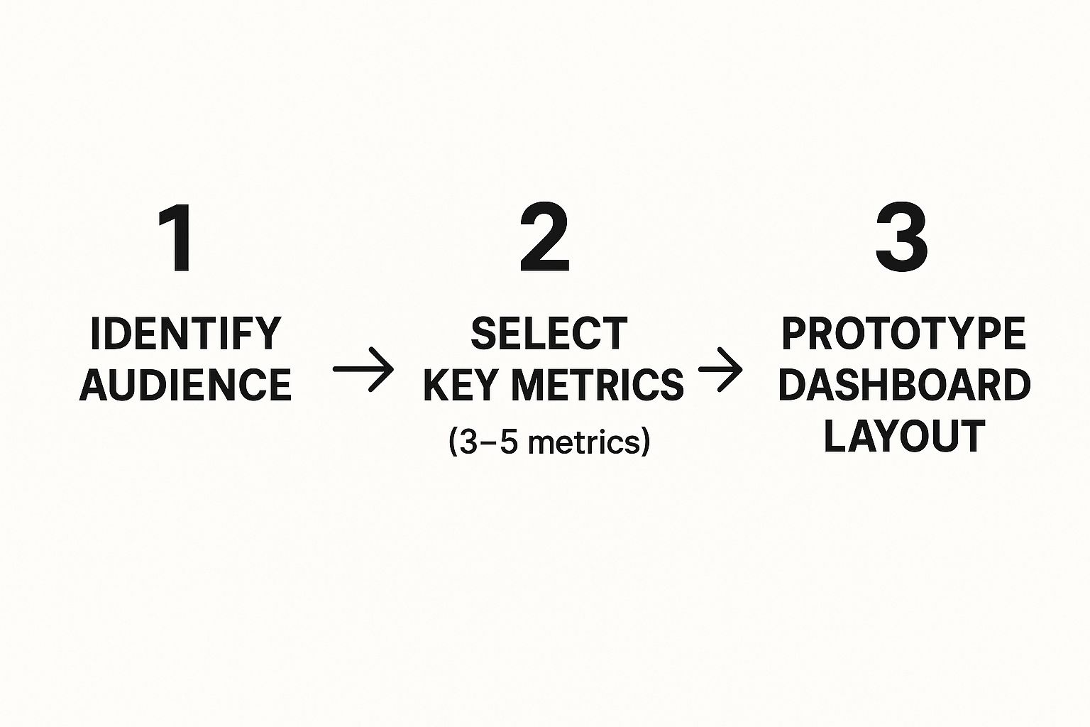
As you can see, a successful dashboard starts with strategic clarity—knowing your audience and what you need to measure—before a single visual is even considered.
Phase 4: Design the Visuals and Launch
Only when the data model is rock-solid do you start thinking about the visuals. With your business questions from Phase 1 as your guide, you'll choose the right charts and graphs to tell a clear, compelling story. This is the fun part, where you transform structured data into an intuitive, interactive experience your team can actually use to find insights on their own.
After the design is locked in, you launch the dashboard for your team. But the work doesn't stop there. Adoption is everything. This means training your team, getting their feedback, and tweaking the design to make sure it becomes an essential part of their daily routine. This iterative approach is critical for revamping your reporting with Power BI and seeing real results.
These tools are evolving at a breakneck pace. By 2024, AI's influence is becoming undeniable, with dashboards powered by predictive analytics and natural language queries making decision-making sharper for companies everywhere. You can read more about the future of real-time dashboards on dataintelo.com.
This structured roadmap makes the whole implementation process manageable. But having an expert partner can save you a ton of time and help you avoid costly mistakes, especially during that crucial data modeling stage.
Unlock Your Business Data with an Expert Partner
We've walked through the entire journey, from the daily grind of manual reporting to the strategic clarity that automated insights bring. You now see how data visualization dashboards can give small and medium-sized businesses back their precious time, fuel smarter decisions, and get the whole team aligned with a single source of truth.
These powerful tools aren't just for massive corporations with bottomless budgets anymore. They are accessible, essential, and a genuine game-changer for any growing business ready to compete.
From Learning to Doing
Now comes the most critical step: making the leap from learning about dashboards to actually implementing one. It’s time to stop fighting with siloed spreadsheets and start leading your business with the confidence that comes from clear, actionable insight.
The path forward means building a solid data foundation and then designing visuals that directly answer your most pressing business questions. This is where having an expert in your corner makes all the difference, turning what can be a complex project into a clear, manageable process. A partner helps you sidestep common pitfalls—especially in the crucial data modeling phase—to ensure your dashboard is built to last.
The real value of a dashboard isn’t just in the charts it shows. It’s in the focused conversations it sparks and the decisive actions it inspires. It turns data from a chore into your most valuable strategic asset.
If you're ready to build a Power BI dashboard that delivers complete clarity and control over your business, our experts are here to guide you. We specialize in connecting the dots within your data, turning complexity into a powerful competitive advantage.
Stop letting valuable insights stay locked away in spreadsheets. It's time to build the reporting engine your business truly deserves.
Book your free BI consultation with a Vizule expert today and let’s unlock the full potential of your business data.
Your Data Dashboard Questions Answered
Even with a clear path forward, it’s completely normal to have a few questions before you dive into a new way of looking at your business. We get it. Here are the most common questions we hear from founders and operators, with straight-up answers to help you make your next move.
How Much Does It Cost to Build a Power BI Dashboard?
This is always the first question, and the honest answer is: it depends. Think of it less as a one-time cost and more as an investment in making smarter, faster decisions. The final price tag is shaped by things like how many different places your data is coming from, how complex we need to get with the data model, and what kind of visuals will tell your story best.
At Vizule, our goal is to deliver a clear, measurable return. We build scalable solutions that tackle your biggest headaches first, so you see value right away without a massive upfront commitment. The dashboard then grows as your business grows.
How Long Until My Dashboard is Up and Running?
The timeline really hinges on the complexity of your current data setup. A straightforward, focused dashboard might only take a few weeks to get live. A more comprehensive system that pulls in data from multiple departments could take a couple of months.
Our whole process is built for speed. We prioritize getting an initial version into your hands that answers your most critical business questions first. This means you get actionable insights almost immediately, while we continue building out the full solution in the background.
Do I Need a Data Analyst on My Team to Use This?
Absolutely not. In fact, if you need a data scientist to understand your dashboard, it’s not a good dashboard. The whole point is to put the power of self-service analytics directly into the hands of your team.
We build data visualization dashboards that are so intuitive and clear that anyone on your team—from sales to operations—can explore the data, find their own answers, and make confident decisions. No advanced technical skills are needed to get value from day one.
Is My Business Too Small for a Data Dashboard?
It's actually the other way around. Dashboards are arguably more critical for smaller, agile businesses where every single decision can have a major impact. When you build a data-driven culture early on, you create a solid foundation for growth.
Putting a proper dashboard in place now helps you sidestep the "operational debt" that piles up after years of wrestling with messy spreadsheets and manual reports. It sets you up to scale intelligently, with a clear view of what’s actually moving the needle.
Ready to automate your reporting and finally trust your data? The team at Vizule is here to connect the dots in your data and build a Power BI dashboard that brings clarity and control to your business.
