


For small business owners, operators, and startup founders, the dream of data-driven decision-making often clashes with the reality of messy spreadsheets and siloed information. Your reports are outdated the moment they're created, finance and operations speak different languages, and you spend more time wrestling with Excel chaos than actually gaining insights. The problem isn't a lack of data; it's a lack of clarity. A well-designed dashboard transforms this chaos into a single source of truth, automating tedious financial reporting and surfacing the critical KPIs that actually drive growth and profitability.
This is not another list of generic tips. We're providing a practical guide to essential dashboard design best practices, specifically for busy leaders who need results, not just reports. The ultimate purpose of a well-designed dashboard is to turn raw data into actionable intelligence, such as that needed for effective signal-based selling or optimising cash flow. This article dives into 8 specific, actionable principles that will help you move beyond vanity metrics and build powerful Power BI dashboards that connect the dots in your business.
You will learn how to:
- Create dashboards that provide critical insights in seconds.
- Structure information logically to guide your team's focus.
- Select the right visualisations to tell a clear data story.
- Avoid overwhelming users with too much information at once.
Our mission is to help you connect the dots in your data, align your teams, and empower you to scale smarter. Let’s build dashboards that work.
1. Start with the 5-Second Rule
In the world of BI and finance dashboards, first impressions are everything. Your executive team doesn’t have time to decipher a complex report; they need immediate, actionable insights. This is where one of the most crucial dashboard design best practices comes into play: the 5-second rule. This principle dictates that any user should grasp the dashboard's primary purpose and key takeaways within five seconds of viewing it.
If your dashboard fails this test, it’s not a tool for decision-making; it's a source of cognitive friction. As trusted advisors, we see this all the time: a beautifully designed but confusing dashboard becomes shelfware. Achieving this level of clarity requires a ruthless focus on prioritization and an intuitive layout that guides the user's eye.
How to Implement the 5-Second Rule
The core idea is to structure your dashboard like an inverted pyramid (more on that next), placing the most critical, high-level information at the top. This ensures that even a brief glance delivers the most essential message.
- Position Critical KPIs: Place your three to five most important Key Performance Indicators (KPIs) in the top-left corner. This area naturally draws the eye first and should immediately answer the biggest questions, such as "Are we hitting our revenue target?" or "What is our current cash flow?"
- Limit Visual Noise: Stick to a simple color palette and a maximum of two font families. Excessive colors and fonts create distraction, forcing the brain to work harder to process the information, which directly violates the 5-second principle.
- Test for Comprehension: The only way to know if you've succeeded is to test it. Show the dashboard to a colleague who hasn't seen it before. After five seconds, hide it and ask them what the main takeaways were. If they can’t articulate the core message, your design needs refinement.
A great example is a well-designed executive Power BI dashboard that uses large, clear "Big Number" tiles for headline figures like Monthly Recurring Revenue (MRR) or Customer Acquisition Cost (CAC), answering the most vital questions instantly.
The following diagram illustrates the three foundational pillars that enable 5-second comprehension in effective dashboard design.
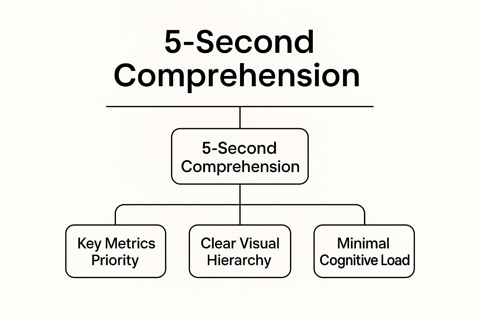
This hierarchy shows that achieving rapid understanding is not accidental; it’s the direct result of prioritizing key metrics, creating a clear visual structure, and minimizing the mental effort required from the user.
2. Follow the Inverted Pyramid Layout
Just as journalists put the most newsworthy information first, one of the most effective dashboard design best practices is to structure your layout like an inverted pyramid. This ensures that the most critical, high-level insights are placed at the very top. Busy founders can get the main story at a glance, while their finance and ops teams have the option to explore deeper, supporting details further down.
If a user has to scroll to find the answer to their most pressing business question, the dashboard has failed to provide immediate value. An inverted pyramid layout respects your team's time by presenting a top-down narrative, starting with the conclusion (the key metrics) and progressively revealing the context and granular data that supports it. This approach transforms a dashboard from a simple data repository into a strategic decision-making tool.
How to Implement the Inverted Pyramid Layout
The goal is to align the dashboard's information hierarchy with your organization's business priorities. This means the most strategic KPIs occupy the most valuable real estate: the top of the screen.
- Reserve the Top for Actionable Insights: The top section should be exclusively for headline KPIs and high-level summaries. For a marketing dashboard, this might be conversion rates and lead velocity; for a finance dashboard, it would be cash flow, net profit, and EBITDA.
- Use Card-Based Layouts: Organize your dashboard into distinct visual blocks or cards. This creates clear sections and guides the user's eye from the high-level overview at the top to the more detailed charts and tables below. This modular design also improves readability on different screen sizes.
- Implement Expandable Sections: For users who need to dig deeper, use expandable or drill-down features. This keeps the initial view clean and uncluttered while providing access to granular data on demand. A user can see the top-line revenue figure, then click to see a breakdown by product line or region within Power BI.
For more inspiration, you can explore these business intelligence dashboard examples from vizule.io that show this principle in action. Ultimately, this structure ensures your dashboard caters to multiple audiences simultaneously. The C-suite gets its quick summary, and the operational teams get the depth they need, all within a single, intuitive interface.
3. Choose the Right Chart Type for Your Data
Selecting the right visualization is one of the most fundamental yet frequently overlooked dashboard design best practices. The chart you choose is the vehicle for your data's story; the wrong choice can distort the narrative, confuse your audience, and hide the very insights you aim to reveal. The goal is not to create a visually impressive chart but one that communicates information with clarity and precision.
Different chart types are designed for specific purposes. A line chart is perfect for showing a trend over time, while a bar chart excels at comparing distinct categories. Using a pie chart to show a time-series trend, for instance, would be a critical design failure, making it nearly impossible for a finance director to spot performance changes month-over-month in their cash flow reporting.

How to Select the Right Chart for Your Story
The key is to first determine the primary message you want your data to convey. Are you showing a relationship, a comparison, a distribution, or a composition? Answering this question will immediately narrow down your options and guide you toward the most effective visual representation.
- For Comparing Categories: Use bar charts or column charts. They are ideal for comparing discrete items, like sales performance across different product lines or regional revenue figures.
- For Showing Trends Over Time: Always use a line chart. This is the undisputed champion for visualizing continuous data points over a time period, such as monthly recurring revenue (MRR) or website traffic over the last year.
- For Displaying Parts of a Whole: Use pie charts or donut charts sparingly. They are only effective for showing simple compositions with a maximum of five segments. For anything more complex, a stacked bar chart is a far better alternative.
- For Detailed Value Lookup: Sometimes, the best chart is no chart at all. When precise values are critical and users need to look up specific numbers, a well-formatted table is the most effective tool. In Power BI, you can incorporate sparklines within tables to add a quick visual trend without sacrificing space.
Mastering this principle is crucial for building dashboards that don't just present data but deliver clear, actionable insights for your financial and operational planning.
4. Implement Progressive Disclosure
One of the most common pitfalls in dashboard design is trying to show everything at once. This approach, born from a desire to be comprehensive, almost always leads to information overload, rendering the dashboard unusable for quick decision-making. This is where progressive disclosure, a core principle of user interface design, becomes one of the most effective dashboard design best practices. The technique involves showing only essential information upfront and revealing more complex data on demand.
By layering information, you create a clean, uncluttered primary view that respects the user's cognitive load. It empowers them to explore deeper details if they need to, without overwhelming them from the start. This method transforms a dense, intimidating report from Excel into an interactive, intuitive tool for discovery in Power BI, allowing users to move from a high-level overview to granular analysis seamlessly.
How to Implement Progressive Disclosure
The goal is to create an experience that guides the user from the "what" to the "why." You start with the top-level KPIs and then provide clear, intuitive pathways to the underlying data that explains those numbers.
- Use Clear Visual Cues: Guide users with intuitive icons like plus signs (+), arrows (►), or "Details" buttons to signify that more information is available. In Power BI, this is often achieved using drill-through buttons or bookmarks that navigate users to a more detailed page while maintaining context.
- Leverage Tooltips and Hover States: For quick, non-disruptive insights, use tooltips that appear when a user hovers over a data point. This is perfect for revealing specific numbers, definitions, or comparative data without forcing the user to leave their current view.
- Structure with Drill-Downs: Design your data model to support drill-down and drill-through actions. For instance, a user should be able to click on a total revenue figure to see a breakdown by product line, and then click on a specific product line to see sales by region. This hierarchical exploration is fundamental to effective analysis.
- Maintain Context: When a user drills down, ensure the new view clearly indicates how they got there. Use titles like "Sales Details for Q3" or breadcrumbs to help them maintain their bearings and easily navigate back to the summary view.
This approach ensures your dashboard serves both the executive who needs a quick summary and the analyst who needs to investigate the root cause of a dip in their cash flow reporting.
5. Use Consistent Color Coding and Visual Standards
In the fast-paced world of an SMB, a dashboard's credibility hinges on its predictability. When users have to re-learn how to interpret your visuals every time they open a report, you create cognitive friction that slows down decision-making. This is where one of the most vital dashboard design best practices, visual consistency, becomes non-negotiable.
An inconsistent dashboard is like a story with no narrative thread; it's just a collection of disconnected facts. By establishing and enforcing a consistent visual standard, you create an intuitive user experience, reduce the learning curve, and build trust in the data presented. This transforms your dashboard from a mere chart collection into a cohesive, reliable decision-making tool that aligns finance and ops.
How to Implement Visual Consistency
The goal is to create a predictable visual environment where users don't have to guess what colors or icons mean. This is achieved by creating a simple, repeatable set of design rules that are applied across every element of your dashboard.
- Establish a Standardized Color Palette: Assign specific meanings to colors and stick to them. For example, use a specific shade of green for positive performance (e.g., exceeding budget) and a specific red for alerts or negative variances (e.g., cash flow deficit). Limit your total palette to 6-8 colors to avoid overwhelming the user.
- Create a Style Guide: Document your standards for typography, spacing, chart types, and iconography. This "dashboard style guide" becomes the single source of truth for anyone building or updating reports, ensuring that a sales dashboard in Power BI has the same look and feel as a financial forecast dashboard.
- Test for Accessibility: Your color choices must be functional for all users, including those with color vision deficiencies. Use tools to check your palette against Web Content Accessibility Guidelines (WCAG) to ensure contrasts are sufficient and color is not the only means of conveying information.
A well-built finance dashboard in Power BI might use a consistent dark blue for all revenue-related metrics and a light gray for all operational expenses, creating an immediate, subconscious understanding for the CFO.
6. Optimize for Mobile and Responsive Design
In today's business environment, decisions aren't confined to the office desk. Your key stakeholders, from the founder to the sales team, need access to critical insights on the go, whether they're on a factory floor, in a client meeting, or commuting. This is why one of the most vital dashboard design best practices is ensuring your dashboards are fully optimized for mobile devices and employ a responsive design.
A responsive dashboard isn't just a shrunken-down version of its desktop counterpart; it’s a thoughtfully re-engineered experience. It intelligently adapts its layout, prioritizes content, and modifies interactions to fit the constraints and context of a smaller, touch-enabled screen. Failing to optimize for mobile renders your data inaccessible when it might be needed most, creating a critical gap in your insight-led culture.
How to Implement Responsive Design
The goal is to provide a seamless and intuitive experience, regardless of the device. This requires a "mobile-first" mindset, where you design for the smallest screen and then progressively enhance the experience for larger displays. This approach forces you to prioritize what truly matters.
- Prioritize Ruthlessly: Mobile screens have limited real estate. Identify the single most important metric or chart for each dashboard view and make it the focal point. Secondary information can be stacked vertically below or made accessible through taps and swipes, preventing a cluttered interface.
- Embrace Vertical Scrolling: Instead of trying to cram multiple columns side-by-side, adopt a single-column, vertical layout. This is a natural interaction pattern for mobile users and makes scanning information on a narrow screen far more efficient.
- Optimize for Touch: Ensure all interactive elements like buttons, filters, and slicers are large enough to be easily tapped with a finger. Implement intuitive touch gestures, such as swiping to navigate between reports or using pinch-to-zoom for detailed chart analysis in Power BI Mobile.
By adopting these principles, you ensure your insights are always within reach. To dive deeper into this topic, you can learn more about how to Optimize for Mobile and Responsive Design.
7. Include Context and Comparison Data
A dashboard showing "1,500 new leads" is just a number. Is that good? Is it a record-breaking month or a sign of a struggling pipeline? Without context, raw figures are meaningless and can lead to flawed interpretations. One of the most critical dashboard design best practices is to embed context directly into your visuals, transforming isolated metrics into meaningful insights.
Effective dashboards provide a frame of reference that helps users instantly gauge performance. This context turns data into a story, answering not just "what happened?" but "how are we doing compared to our goals, our past performance, or our expectations?" This is the key to unlocking true insight-led decision-making, moving beyond simple reporting to genuine business intelligence.
How to Implement Contextual Data
The goal is to make comparison intuitive, eliminating the need for users to mentally calculate or cross-reference other reports. By building context directly into the dashboard, you empower founders and operators to make faster, more accurate assessments.
- Show Percentage and Absolute Changes: Never present a number in isolation. Alongside the current value (e.g., "$520k Revenue"), display the change from a previous period (e.g., "+$45k" and "+9.5% vs. prior month"). This immediately signals the direction and magnitude of the performance trend.
- Utilize Targets and Thresholds: Visualize performance against predefined goals. A simple gauge chart or a bullet graph showing current performance against a target line instantly tells the user if they are on track. Color-coding based on thresholds (e.g., green for above target, red for below) adds another layer of at-a-glance comprehension.
- Incorporate Historical Trends: Use sparklines or small line charts next to key KPIs to show their performance over the last few weeks or months. This provides immediate historical context without cluttering the main view, helping users identify seasonality, anomalies, or emerging patterns in their forecasting model.
A well-built Power BI sales dashboard will not just show current sales but will compare them against the forecast, the same period last year, and regional benchmarks, providing a 360-degree view of performance. This comprehensive approach is fundamental to building dashboards that drive strategic action.
8. Design for Actionability and User Goals
A truly effective dashboard doesn't just present data; it provokes action. The most valuable dashboards are designed not as static information displays but as dynamic tools that guide users toward their next steps. This is a core principle of user-centric dashboard design best practices: understanding the user's role, their responsibilities, and the decisions they need to make, then building a dashboard that explicitly supports that workflow.
If a user sees a critical metric is off-target, the dashboard's job is only half-done. It must also answer the implicit question, "What should I do about it?" An actionable dashboard closes the gap between insight and execution, transforming a passive reporting tool into an active operational hub.
How to Design for Actionability
The goal is to embed the user's workflow directly into the dashboard, making it the starting point for business processes rather than just a reference document. This involves moving beyond mere visualization to integration and contextual guidance.
- Understand User Workflows: Before designing, we ask our clients, "When you see this number go down, what is the first thing you do?" or "Which system do you open next?" Mapping out these decision-making processes helps us identify opportunities for integration and action prompts.
- Embed Clear Calls-to-Action: Don't make users hunt for the next step. Place action buttons or links directly alongside the relevant data. For example, next to a list of overdue invoices in a finance dashboard, include a button to "Email Client" or "View in Accounting System."
- Use Progressive Disclosure: Avoid overwhelming users with too many options at once. Initially, show high-level metrics. When a user clicks on a specific area to investigate, progressively reveal more detailed data and the context-specific actions they can take. This keeps the interface clean while providing powerful functionality.
- Integrate with Business Systems: The ultimate form of actionability is direct integration. Connect your dashboard to the tools your team already uses. This could mean linking a Power BI dashboard to a CRM, an ERP, or even a messaging platform to trigger alerts or initiate tasks without leaving the analytics environment.
An AWS CloudWatch dashboard doesn't just report high server load; it can include controls to trigger automated scaling actions, directly linking the insight (high load) to the solution (add more resources). We aim for the same level of integration for our SMB clients.
Dashboard Design Best Practices Comparison
| Dashboard Principle | Implementation Complexity 🔄 | Resource Requirements ⚡ | Expected Outcomes 📊 | Ideal Use Cases 💡 | Key Advantages ⭐ |
|---|---|---|---|---|---|
| Start with the 5-Second Rule | Moderate – needs testing & refinement | Moderate – design and stakeholder alignment | Quick insight & decision-making | Dashboards needing immediate comprehension | Reduces time to insight, intuitive UX |
| Follow the Inverted Pyramid Layout | Moderate – requires content prioritization | Moderate – thoughtful layout design | Balanced overview with drill-down options | Executive summaries, multi-level data views | Supports different user types, reduces overload |
| Choose the Right Chart Type | High – deep visualization knowledge required | High – selection & custom chart creation | Accurate data interpretation and faster decisions | Diverse data stories, complex datasets | Improves comprehension, reduces misinterpretation |
| Implement Progressive Disclosure | High – interactive elements & layered info | High – advanced development complexity | Reduced visual clutter, user-driven exploration | Complex dashboards needing detail on demand | Focused UX, accommodates varied user needs |
| Use Consistent Color Coding | Moderate – requires style guideline setup | Moderate – ongoing governance | Faster scanning, professional and accessible design | All dashboards prioritizing consistency | Reduces cognitive load, supports accessibility |
| Optimize for Mobile & Responsive | High – adaptive layouts & touch UI | High – development cost and testing | Access anywhere, better user engagement | Mobile-first or multi-device environments | Future-proofs dashboards, supports mobility |
| Include Context & Comparison Data | Moderate – data integration & display | Moderate – data sourcing and storage | Better performance understanding & decision-making | Performance monitoring, trend analysis | Enables meaningful interpretation, prevents misreadings |
| Design for Actionability & User Goals | High – user research & workflow integration | High – integration with tools and alerts | Drives business outcomes and user engagement | Operational dashboards, role-specific workflows | Accelerates insight-to-action, clear ROI |
From Data Chaos to Actionable Clarity: Your Next Step
Moving from siloed spreadsheets to dynamic, insightful dashboards is not merely a technological upgrade; it's a fundamental shift in how your business operates. The journey from data chaos to actionable clarity is paved with intentional design choices. Throughout this guide, we've explored the core dashboard design best practices that transform a collection of charts into a strategic command center for your entire organization.
By embracing principles like the 5-Second Rule and the Inverted Pyramid Layout, you ensure your audience can immediately grasp the most critical information without getting lost in the details. Choosing the right chart for your data isn't just an aesthetic choice; it’s about accurately representing reality and preventing misinterpretation, a crucial factor for finance leaders who rely on precision for forecasting models and cash flow reporting.
Beyond the Basics: Building an Insight Engine
True mastery lies in elevating your dashboards from static reports to interactive tools. Implementing Progressive Disclosure allows you to cater to different user needs, from a C-suite executive needing a high-level overview to an operations manager drilling down into specific performance drivers. This layered approach, combined with Consistent Color Coding, creates a coherent visual language across all your reports, reducing cognitive load and accelerating comprehension.
Furthermore, providing Context and Comparison Data is what turns a simple number into a meaningful insight. A sales figure is just a number until it's compared against a target, a previous period, or an industry benchmark. This is the essence of effective financial and operational storytelling. By designing for Actionability, you close the loop, empowering users not just to see what's happening, but to understand why it's happening and decide what to do next.
Your Path from Theory to Implementation
Ultimately, these dashboard design best practices are about more than just aesthetics; they are about fostering an insight-led culture. An effective dashboard democratizes information, aligns teams around common goals, and empowers every decision-maker with the confidence that their choices are backed by a single source of truth. It's the engine that drives smarter business planning and a deeper understanding of your core drivers. To truly transform data chaos into actionable clarity, exploring additional strategies for transitioning from data to decisions can solidify informed decision-making across your organization.
For many SMB founders and operators, the challenge isn't understanding these principles but finding the bandwidth and technical expertise to implement them. The transition from manual Excel reporting to an automated Power BI analytics stack can feel daunting, especially when you're focused on running and growing the business. But you don't have to navigate this transformation alone.
Ready to stop wrestling with spreadsheets and start making insight-led decisions? The team at Vizule specialises in building the end-to-end Power BI solutions and financial models that growing businesses need to scale with confidence. Book your free BI consultation today and let's design a financial dashboard in Power BI that finally connects the dots in your data.


