


For small and medium-sized businesses trying to get a single, clear picture of their financial and operational health, Power BI usually hits the sweet spot. It's powerful, affordable, and surprisingly easy to start with if you're coming from Excel. This guide is designed to cut through the marketing fluff and give founders and operators a straightforward comparison of data visualization tools, focusing on what actually matters for a growing company trying to escape spreadsheet chaos.
Choosing the Right Data Tool for Your SMB

If you're an SMB owner drowning in a sea of spreadsheets, you already know there has to be a better way to track your business performance. You're not alone. The global data visualization market is on track to hit USD 22.85 billion by 2032, which just shows how essential these tools have become for making smart decisions. (See more on this market growth from SNS Insider).
This guide zeros in on what's truly important for businesses like yours:
- Ease of Use: Can your team—even the non-technical folks—actually use it?
- Practical Costs: Is the pricing straightforward without a bunch of hidden fees?
- Data Unification: Can it pull together your siloed financial and operational data into one place?
Our goal is to give you a clear framework for picking a tool that doesn’t just make pretty charts, but genuinely turns your data into your most valuable asset.
At-a-Glance Comparison for SMBs
For SMBs, the choice often comes down to balancing cost, features, and the learning curve. Here’s a quick rundown of how the big three—Power BI, Tableau, and Looker Studio—stack up for a typical growing business.
| Tool | Best For | Typical SMB Cost | Key Strength |
|---|---|---|---|
| Power BI | Businesses already in the Microsoft ecosystem looking for a powerful, cost-effective solution to automate reporting. | $10-$20 per user/month | Deep integration with Excel & other Microsoft products; very budget-friendly. |
| Tableau | Teams that need best-in-class, beautiful, and highly interactive visualizations for external presentations. | $75 per user/month (Creator) | Unmatched data visualization and storytelling capabilities. |
| Looker Studio | Startups and small teams needing a completely free, easy-to-use tool for Google-centric marketing data. | Free | Seamless integration with Google products (Analytics, Ads, Sheets); no cost. |
Ultimately, the "best" tool really depends on your specific situation. Power BI is a fantastic all-rounder if you're on a budget and need to connect finance and ops. Tableau is the premium choice for visual polish, and Looker Studio is a no-brainer if your data lives in the Google ecosystem and you need something free to start.
Power BI as Your Financial and Operational Hub
For small-to-medium businesses already operating within the Microsoft ecosystem, Power BI is more than just another tool—it's a natural and powerful evolution. If your team lives and breathes in Excel, the transition to Power BI is exceptionally smooth. Its greatest strength is this deep, native integration, turning what could be a disruptive change into a seamless upgrade.
This familiarity is key. It means you aren't starting from scratch. Instead, you're building upon a foundation your team already understands, which dramatically shortens the time it takes to see real value.
From Excel Chaos to Automated Clarity
Many founders and operators are all too familiar with the frustrations of spreadsheets—broken VLOOKUPs, version control nightmares, and the sheer time it takes to manually pull together weekly reports. Power BI directly attacks this pain by connecting to your source data and automating the entire reporting pipeline.
The platform truly shines in data transformation, which is a practical way of saying it’s brilliant at cleaning up messy data. Power BI can:
- Connect directly to a huge range of data sources like QuickBooks, your CRM, marketing platforms, and of course, Excel files.
- Merge these separate datasets into a single, unified view of your entire business.
- Let you build a robust forecasting model that becomes the single source of truth for your company.
What was once a tangled web of spreadsheets becomes an automated, reliable system. This shift frees up your team to focus on analyzing insights rather than getting bogged down in manual data compilation.
A Real-World Scenario: Automating Cash Flow Reporting
Think about a classic SMB challenge: managing cash flow. A typical small business might track this by exporting data from their accounting software and sales platform into separate Excel files each week. An operator then spends hours stitching sheets together, fixing formulas, and creating a static report that's out of date the moment it’s finished.
With Power BI, this whole process gets automated.
- Connect: Power BI establishes a live link to QuickBooks and your CRM.
- Model: We help build a data model that automatically calculates key metrics like cash in, cash out, and net burn based on the fresh data.
- Visualize: The output is a dynamic, real-time dashboard. You can instantly filter by date, customer segment, or product line to see exactly what's driving your cash flow.
The result is a game-changer. The weekly manual reporting marathon is gone. The leadership team gets a live, trustworthy view of cash flow, allowing for faster, more confident decisions on everything from hiring and inventory to spending.
Ultimately, Power BI empowers non-technical founders and operators to take control of their data without needing to hire a dedicated data science team. Its user-friendly interface, combined with its powerful back-end capabilities, makes it the perfect hub for unifying financial and operational reporting in a growing business.
Tableau for Advanced Visual Storytelling
Tableau has carved out its reputation as the master of pure data visualization, and for good reason. Its drag-and-drop interface is famously intuitive, built specifically to help users craft beautiful, deeply interactive dashboards that tell a real story. If your main goal is visual data exploration—slicing, dicing, and uncovering hidden trends with a layer of aesthetic polish—Tableau is an absolute powerhouse.
This visual-first philosophy makes it an ideal fit for certain kinds of businesses. Think of marketing agencies or e-commerce brands that need to present compelling data narratives to clients or stakeholders. For them, Tableau's ability to transform raw numbers into persuasive, polished visual assets is often indispensable.
The Cost and Learning Curve for SMBs
However, this premium visualization power doesn't come cheap, and the cost isn't just financial. For a small team, Tableau's pricing can be a real hurdle. The most common license, Tableau Creator, runs about $75 per user per month, a significant jump from Power BI's entry-level pricing. That cost adds up fast as you bring more people onto your team.
Beyond the sticker price, you're looking at a steeper learning curve compared to Power BI, especially if you don't have a dedicated analyst on staff. While creating visuals is user-friendly, getting the hang of its data connection and preparation features demands a much bigger time investment.
For many small and medium-sized businesses just looking to get a grip on core financial and KPI reporting, Tableau's advanced features can be overkill. The extra expense and training time might not deliver a proportional return if your primary goal is to automate existing reports and build straightforward operational dashboards.
When Does Tableau Make Sense for a Growing Business?
In any data visualization tools comparison, context is everything. Tableau isn't a bad choice; it's a specific one. The decision to invest should be driven by a clear, undeniable business need for advanced visual storytelling.
Here are a few scenarios where Tableau’s strengths really shine and justify the investment:
- Presenting to External Stakeholders: If you regularly build reports for investors, board members, or high-value clients, the visual polish from Tableau can make a massive difference in how your data is perceived.
- Complex Geospatial Analysis: The platform’s mapping capabilities are exceptional. It's perfect for businesses analyzing location-based data, like retail site selection or logistics planning.
- Deep Exploratory Analysis: For teams that need to dive into large, complex datasets and freely explore to find unknown patterns, Tableau’s fluid and interactive interface is simply second to none.
On the other hand, if your main challenges are managing cash flow, automating sales reports, and getting finance and operations on the same page, the robust data modeling and affordability of a tool like Power BI often present a more practical path forward. The key is to match the tool’s horsepower to your specific business challenges and budget.
Want to automate your reporting and finally trust your data? Book a free call with our BI consultants today.
Looker Studio: The Go-To for Google-Centric Analytics
For any business running its operations on the Google ecosystem, Looker Studio (which you might remember as Google Data Studio) is an incredibly compelling starting point for data visualization. If your world revolves around Google Analytics, Google Ads, BigQuery, or even good old Google Sheets, this tool’s advantage is undeniable.
Its main appeal? The native, seamless connection to all things Google, plus a price tag that's impossible to beat: it's completely free. This makes it a no-brainer for startups and SMBs, especially those focused on digital marketing. You can spin up a website performance dashboard or track your marketing ROI without spending a dime on software. For a founder just stepping away from manual spreadsheet reporting, it’s a powerful and accessible first move.
Where Looker Studio Shines for SMBs
The practical uses for a growing business are immediate. Looker Studio is fantastic at pulling data from your various Google sources and displaying it in clean, shareable dashboards. Its drag-and-drop interface feels intuitive, so even non-technical team members can build useful reports without a steep learning curve.
Think about these common scenarios where Looker Studio is often the perfect tool for the job:
- Marketing Analytics: Pull data from Google Analytics and Google Ads into one unified dashboard. Track everything from website traffic and user engagement to ad spend and conversion rates.
- Website Performance: Build live dashboards monitoring page views, bounce rates, and user demographics. Get instant feedback when you launch new content or make changes to your site.
- Simple Operational Reports: If you're tracking sales, inventory, or project milestones in Google Sheets, Looker Studio can instantly transform those static files into interactive, automated reports.
For a business whose data lives primarily within the Google suite, Looker Studio is a fast, cost-free way to automate reporting. It solves the immediate pain of manual data wrangling for marketing and web analytics with impressive speed.
Understanding Its Critical Limitations
But here's the catch: Looker Studio's greatest strength is also its biggest weakness. While it excels at visualizing data from Google sources, it starts to buckle when you need to perform the kind of complex data modeling required for true, integrated financial reporting.
This tool simply wasn't built to be a heavy-duty data modeling engine. The moment you try to connect and blend non-Google data from platforms like QuickBooks, your CRM, or other operational software, you'll quickly discover its limits. This is where it can accidentally create the very data silos you were trying to break down. You might have a brilliant marketing dashboard, but it will exist in isolation from your core financial data, making a single, holistic view of the business impossible.
This is the fundamental difference between a pure visualization tool and a genuine business intelligence platform like Power BI. Looker Studio is great at showing you what is happening with your web traffic. A platform like Power BI is built to help you understand why it's happening by connecting those marketing numbers directly to your financial results.
If your goal is to unify finance and operations into a single source of truth, Looker Studio's limitations will eventually become a major bottleneck. Are you ready to build a reporting system that connects all the dots? See how Vizule can help automate your entire reporting stack.
Comparing Core Features for Business Impact
Picking a data visualization tool isn't about ticking off technical specs on a feature list. It's about business impact. For a founder or operator, the right tool is the one that plugs into your actual data sources, solves your immediate problems, and doesn't require a Ph.D. or a venture-sized budget to get running.
Let's cut through the marketing noise. We'll put Microsoft Power BI, Tableau, and Looker Studio head-to-head across the five areas that truly matter for a growing business. This isn't just about features; it's a practical guide to match your specific pain points with the right solution.
Data Connectivity and Integration
A visualization tool is completely useless if it can't talk to your software. For most small and mid-sized businesses, this means getting it to connect smoothly with essentials like QuickBooks, your CRM (like HubSpot or Salesforce), and whatever operational platforms you rely on.
- Power BI: This is its home turf. The sheer number of native connectors is a huge advantage. It's built to integrate seamlessly with the entire Microsoft world (Excel, Azure, Dynamics 365) but also plays nicely with hundreds of third-party apps. This makes it a beast for creating a single source of truth from a data warehouse or direct sources.
- Tableau: It also has a wide range of connectors, but you might find yourself needing a bit more technical know-how to get them working, especially for less common data sources. Its real power shines when connecting to dedicated data warehouses.
- Looker Studio: As you'd expect, it excels at connecting to other Google products—Analytics, Ads, BigQuery, Sheets. It's a different story with non-Google systems. Hooking up something like QuickBooks often means paying for a third-party connector, which adds both cost and complexity.
This infographic gives a quick snapshot of how these tools stack up on the metrics that matter most to SMBs: cost, features, and overall adoption.
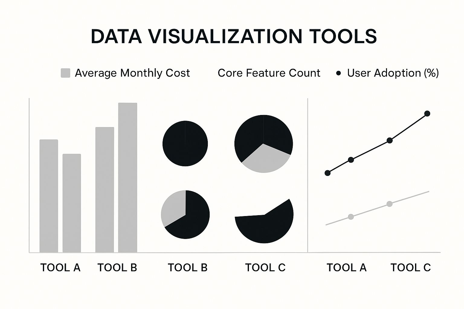
As the visualization shows, while features and popularity vary, the price tag is a huge differentiator. For growing businesses, Power BI often hits that sweet spot between capability and cost.
Ease of Use for Non-Technical Teams
How fast can a founder who isn't a data analyst get real value? For a resource-strapped business, this is a make-or-break question. The learning curve determines whether a tool actually gets used or just gathers digital dust.
- Looker Studio: Definitely the winner for out-of-the-box simplicity. If you've ever used a Google product, its drag-and-drop interface will feel instantly familiar. It's incredibly fast for whipping up basic marketing dashboards.
- Power BI: Feels like home for anyone who's spent time in Excel. The learning curve for creating simple reports is quite gentle. Unlocking its real power in data modeling, however, requires a bit more expertise—which is exactly where a consultancy like Vizule can step in to build that solid foundation for you, streamlining your Excel to Power BI transition.
- Tableau: While its visualization-building interface is user-friendly, the data preparation and modeling side of things is more complex. It typically demands a bigger time commitment or a dedicated analyst to really get the hang of it.
Data Modeling Power
Let's be honest: real-world SMB data is messy. It's scattered across a dozen different systems and is rarely clean or consistent. A tool's power to clean, transform, and model this data is what separates a simple chart from true business intelligence.
A great visualization built on a weak data model is just a pretty picture. The real value comes from creating a robust, reliable data engine that consistently feeds your dashboards with trustworthy information.
For most SMBs, Power BI is the clear standout here. Its built-in Power Query engine is exceptionally capable for data transformation, letting you merge and clean up complex datasets without writing a single line of code. Tableau's capabilities are also formidable but are often geared toward users with more of a data science background. Looker Studio, on the other hand, really lacks a true data modeling engine, making it a poor choice if your goal is to create a unified view of your financial and operational data.
For a deeper dive into why this matters, check out our guide on the data visualization best practices that turn data into genuinely impactful reports.
True Cost of Ownership
The sticker price is just the beginning. The real cost includes the licenses, the time it takes to implement, training for your team, and any sneaky add-ons you'll need for essential connectors.
- Looker Studio: It’s free, which is an undeniably attractive entry point. The catch? Costs can creep in when you discover you need paid third-party connectors to get your non-Google data into the system.
- Power BI: Offers a very reasonably priced Pro license, typically around $10/user/month. When you combine that affordability with its raw power, the return on investment for an SMB is incredible.
- Tableau: This is the most expensive of the three, with its Creator license starting at $75/user/month. That price can be a tough pill to swallow for smaller teams.
Reporting and Sharing
So you've built the perfect dashboard. Now, how easily can you get it into the hands of your team—automatically? The whole point is to kill manual report distribution and make sure everyone is looking at the same, up-to-date numbers.
All three platforms have cloud-based sharing, scheduled refreshes, and options for embedding dashboards. However, Power BI's native integration with Microsoft Teams and Office 365 makes sharing exceptionally fluid for businesses already living in that ecosystem.
The table below provides a side-by-side breakdown of these key features from an SMB's perspective, helping you see at a glance where each tool shines and where it might fall short for your specific needs.
Detailed Feature Breakdown Power BI vs Tableau vs Looker
| Criteria | Microsoft Power BI | Tableau | Looker Studio |
|---|---|---|---|
| Ideal Use Case | Building a comprehensive, scalable "single source of truth" for finance, sales, and operations. Ideal for businesses in the Microsoft ecosystem. | Deep-dive visual analysis, especially with large, clean datasets from data warehouses. Best for teams with dedicated data analysts. | Quick and easy marketing dashboards, especially for businesses heavily invested in the Google ecosystem (Ads, Analytics, etc.). |
| Data Connectivity | Excellent. Huge library of native connectors for both Microsoft and third-party apps. Best in class for SMB needs. | Very Good. Wide range of connectors but can require more technical setup for non-standard sources. | Limited. Fantastic for Google products but weak for others (e.g., QuickBooks), often requiring paid third-party connectors. |
| Ease of Use | Good. Familiar interface for Excel users. Gentle learning curve for basic reports, steeper for advanced data modeling. | Moderate. Intuitive for creating visuals but has a steeper learning curve for data prep and modeling. | Excellent. Extremely intuitive drag-and-drop interface. The fastest tool to get started with for simple dashboards. |
| Data Modeling | Excellent. Power Query is a powerful, user-friendly tool for complex data transformation without code. | Good. Strong capabilities, but geared more towards data professionals and those comfortable with more technical data prep. | Poor. Lacks a true, integrated data modeling engine. Not suitable for complex data blending from multiple sources. |
| Pricing Structure | Very Affordable. A free version exists, with the Pro license at $10/user/month. Offers the best value for SMBs. | Expensive. The Creator license starts at $75/user/month, which can be prohibitive for small teams. | Free. The core tool is free, but hidden costs can arise from needing paid third-party data connectors. |
Ultimately, this comparison shows there's no single "best" tool—only the best tool for your business. The choice hinges on your budget, your existing tech stack, and how complex your data really is.
The software itself is just one piece of the puzzle. Recent market analysis shows this software accounted for 66% of the data visualization market share in 2023. While large enterprises have historically led the charge, demand from SMBs is exploding as they look for scalable BI solutions to compete.
Why Power BI is the Smart Choice for Most SMBs

After a detailed data visualization tools comparison, our recommendation for most small-to-medium businesses is clear: Microsoft Power BI. This conclusion isn't based on a simple feature checklist; it's forged from years of hands-on experience helping founders and operators just like you escape Excel chaos and achieve automated clarity.
While Tableau offers stunning visual analytics and Looker excels within the Google ecosystem, Power BI provides the best all-around platform for the core challenge facing most SMBs—unifying messy financial and operational data into a single, trustworthy source of truth. It just hits that sweet spot of affordability, power, and usability that growing companies desperately need.
The Winning Combination for SMBs
Power BI's real strength is its practical, business-first design. For companies already swimming in the Microsoft pool, the transition is remarkably smooth. The interface feels familiar to anyone who’s spent time wrestling with formulas in Excel, which dramatically shortens the learning curve.
But what truly sets it apart for an SMB is its robust data modeling engine. This is the behind-the-scenes powerhouse that lets you:
- Clean and combine data from disparate sources like your accounting software, CRM, and inventory systems.
- Build a central data model that becomes your undisputed source for all financial and operational reporting.
- Automate the KPI dashboards you currently spend hours building by hand each week.
For an SMB, this isn't just about making prettier charts. It's about reclaiming countless hours lost to manual reporting and killing off the costly errors that creep into complex spreadsheets. Power BI automates the grunt work, so you can focus on making decisions, not just compiling data.
The need to turn complex data into clear insights is driving massive growth in this space. The market for these tools, valued at USD 7.65 billion in 2024, is projected to nearly triple as more businesses seek this competitive advantage. Read more on the growth of data visualization tools from Verified Market Research.
Ultimately, Power BI’s cost-effective licensing and seamless integration with the tools you already use make it the most pragmatic and intelligent choice. At Vizule, we use Power BI to build the automated reports your business needs to scale intelligently.
Frequently Asked Questions
As you explore the world of data visualization tools, it's completely normal for a few questions to pop up. Here are the straight answers to the most common ones we hear from founders and SMB owners who are ready to move beyond spreadsheets.
Can I Really Replace All My Excel Reports With One Tool?
Yes, and honestly, that’s the whole point. While Excel is great for a quick, one-off analysis, a proper BI tool like Power BI is designed to automate those repetitive, time-sucking reports you run every week or month. It plugs directly into your data sources—like QuickBooks or your CRM—so the reports are always live and up-to-date. No more copy-pasting.
The initial legwork involves setting up a solid data model. But once that foundation is in place, it frees up an incredible amount of time and pretty much kills the risk of human error from fiddly formulas.
How Much Technical Skill Do I Need for Power BI?
Getting the basics down is surprisingly easy, especially if you already know your way around Excel. Building a simple, first-pass dashboard is something most non-technical folks can tackle. But to get the real magic—connecting multiple messy data sources and building a reliable financial model—you'll need to go deeper into its data transformation and modeling engine.
This is where a partner like Vizule makes an immediate impact. We handle that heavy technical lifting for you, which fast-tracks your time-to-insight and lets your team focus on analyzing the business, not fighting with the setup.
What Is the Real Cost of Implementing a BI Tool?
The total investment really breaks down into two parts: software licenses and the implementation itself. Power BI Pro licenses are incredibly affordable, often just $10 per user per month. The bigger piece of the investment is usually the initial setup.
This phase involves:
- Mapping out your data strategy.
- Hooking up all your different data sources.
- Building the core dashboards that will actually run your business.
A professional implementation makes sure this groundwork is done right the first time. It saves you a ton of headaches down the road and pays for itself quickly through better, faster, and more confident decisions. This commitment to a solid foundation is what makes genuine data-driven decision-making possible.
How Do I Get My Team to Actually Use a New Tool?
Adoption is everything. The trick is to start small and solve a real, painful problem for one specific team. Automate that weekly sales report everyone hates, or give your operations lead a live inventory view they've only dreamed of.
When a team sees the immediate value and learns to trust the data, adoption spreads naturally. We focus on building simple, intuitive dashboards that are centered around the user—the kind of tool people want to use because it makes their job easier.
Tired of battling spreadsheets and ready to unlock the insights hidden in your data? The team at Vizule specialises in building the automated reporting systems that help SMBs scale with confidence. Book your free BI consultation today to see how we can design the perfect financial dashboard in Power BI for your business.


