


It's late. You're staring at a mountain of spreadsheets, painstakingly copying and pasting data from a dozen different systems. Your goal is a single, coherent management report, but you already know the ugly truth—by the time you’re done, the data will be obsolete.
This isn't just frustrating. It’s a strategic bottleneck holding your business back. For small and medium business owners, this manual grind is a time-sink that prevents you from focusing on what really matters: growing the business. This is where modern management reporting templates, built in tools like Power BI, can fundamentally change how you operate.
From Data Chaos to Strategic Clarity

For most founders and SMB operators, this scene is all too familiar. You're trying to connect the dots between sales, marketing, and finance, but all your critical data lives in separate, disconnected silos. This manual process, often called "Excel Hell," does more than just eat up your time; it creates a dangerous lag between an event happening in your business and your ability to react.
Decisions end up being made on gut feelings and old information, not on what’s happening right now.
This is exactly where modern management reporting templates change the game. But let's be clear: we aren't talking about some static Word or Excel file you download once. We're talking about dynamic, automated dashboards built in powerful business intelligence (BI) tools like Power BI.
The shift is fundamental: you move from a manual, administrative chore to an automated, strategic asset. Your reports stop being a look back at what happened last quarter and start becoming a real-time guide for what you should do next.
Why Static Spreadsheets Fail to Scale
Let's face it, spreadsheets were never designed to be the central nervous system for a growing business. As your company gets more complex, they start to break down in very predictable ways, creating serious risks and killing efficiency.
For any founder looking to scale intelligently, seeing these limitations is the first step toward building a better system.
Here’s a quick look at the classic pain points of relying on manual reporting.
Manual Excel Reporting vs Automated BI Templates
Traditional reporting is a grind. You spend hours wrangling data, and by the time you're done, the insights are already stale. Automated templates in a BI tool flip the script entirely, turning reporting from a reactive task into a proactive asset. The difference is night and day.
| Attribute | Manual Excel Reporting (The Old Way) | Automated BI Templates (The Vizule Way) |
|---|---|---|
| Time Investment | Countless hours spent on manual data entry, copying, and formatting. | Data refreshes automatically, freeing up your team for analysis and strategy. |
| Data Integrity | High risk of human error. One wrong formula can corrupt an entire report. | Connects directly to data sources, creating a single source of truth with minimal error. |
| Decision Speed | Decisions are based on outdated, historical data (days or weeks old). | Enables real-time decision-making with up-to-the-minute dashboards. |
| Collaboration | Leads to "version control" chaos, with conflicting numbers in different files. | Centralized dashboards ensure everyone sees the same data, ending debates over numbers. |
| Scalability | Becomes incredibly cumbersome and error-prone as the business grows. | Easily scales with your business, handling more data and complexity without extra effort. |
This table really just scratches the surface. The move to automated templates isn't just an upgrade; it's a complete change in how you approach business intelligence. You stop being a data janitor and start becoming a data-driven strategist.
This reality is why so many companies are finally moving to more structured solutions. Industry watchers predict that by 2025, over 80% of mid-to-large organizations will have adopted structured reporting templates inside their BI platforms to drive clarity.
If you're stuck in the old way, it's time to find a path From Dashboard Hell To Conversational Heaven. Making this jump from manual data wrangling to automated insight is the key to unlocking proactive, smarter decision-making and finally escaping Excel Hell for good.
Designing Reports That Actually Drive Growth
Look, effective reporting isn't about drowning your team in data. It’s about cutting through the noise to focus on the handful of metrics that actually move the needle. A great management reporting template is more than just a document; it's a strategic tool that spotlights what matters for growth.
So, where do you start? Forget the vanity metrics like website traffic or social media likes. Those don't pay the bills. The real starting point is your core business objectives. Your reporting foundation has to be built on Key Performance Indicators (KPIs) that directly track your progress toward those goals.

From Business Goals to Actionable KPIs
Defining KPIs can feel like a huge task, but it gets a lot easier when you anchor everything back to your strategy. Think about your business in terms of its core functions—Finance, Sales, and Operations. Each area has a specific mission, and your KPIs need to reflect that.
For instance, a subscription startup is all about sustainable growth. Their reporting template needs to be obsessed with metrics like:
- Monthly Recurring Revenue (MRR): The lifeblood of the entire business.
- Customer Churn Rate: How fast are customers walking out the door?
- Customer Lifetime Value (LTV): The total revenue you can expect from a single customer.
- Customer Acquisition Cost (CAC): How much does it cost you to land a new customer?
A service-based business, on the other hand, like a consultancy or a digital agency, lives and dies by its efficiency and client happiness. Their reports would zero in on different things:
- Project Profitability: Is every project actually making money?
- Billable vs. Non-Billable Hours: How is your team's most valuable resource—their time—being used?
- Client Satisfaction Score (CSAT): Are your clients happy enough to come back for more?
A well-designed report tells a story. It should immediately answer three questions: What happened? Why did it happen? And what should we do next? If your current reports can’t do that, they are just collections of numbers.
Building Your Departmental KPI Scorecard
To get a truly complete picture, you need to pin down the vital metrics for each pillar of your business. This is how you ensure every department is aligned and pulling in the same direction. The goal is to create a scorecard that gives you a 360-degree view of your company's health at a glance.
Financial KPIs
These are the bottom-line measures of your business's viability and stability. They tell you if the model is actually working.
- Cash Runway: How many months can you stay afloat before the money runs out?
- Burn Rate: How much cash are you spending every month?
- Gross & Net Profit Margin: The most fundamental indicators of profitability.
- Days Sales Outstanding (DSO): How quickly are you actually collecting cash from invoices?
Sales KPIs
These metrics show how effective your revenue engine is. They're the leading indicators of your future financial performance.
- Sales Cycle Length: How long does it take to close a deal, from first contact to signed contract?
- Lead-to-Close Ratio: What percentage of your leads are turning into paying customers?
- Average Deal Size: Is the value of your typical customer going up over time?
Operational KPIs
These track the efficiency of your internal processes and service delivery. They're critical for maintaining quality and satisfying customers as you scale.
- On-Time Delivery Rate: Are you consistently meeting your promises to customers?
- Order Accuracy Rate: A must-have metric for e-commerce and product-based businesses.
- First Contact Resolution (FCR): For support teams, how many issues get solved on the very first try?
Choosing the right KPIs is one of the most important things you'll do when creating useful reports. To dive deeper, check out our guide on management reporting best practices to really nail your approach. Getting this step right ensures your management reporting templates are built on a solid foundation, setting you up for decisions driven by real insight.
Want to design a KPI framework that aligns your entire team and automates your reporting? Book your free BI consultation with a Vizule expert today.
Choosing the Right Tools for Your Reporting Stack
Once you’ve figured out what to measure, the next question is always how. For most businesses just starting out, the answer is spreadsheets. Excel or Google Sheets are familiar, they’re right there, and frankly, they’re good enough for the early days. They get the job done—until they don't.
That tipping point happens when your reporting process becomes a genuine bottleneck. Instead of giving you clarity, it just creates more work. This usually coincides with growth. The spreadsheets get clunky, they're riddled with hidden errors, and they’re completely disconnected from your live business data. Real automation? Forget about it.
Moving Beyond Spreadsheets
Trying to run a scaling business on spreadsheets is like navigating a cross-country road trip with a folded paper map. Sure, it can work, but it’s painfully slow, demands constant manual effort, and by the time you figure out where you are, you’re already behind. The limitations become painfully obvious as your data grows.
You’ll know it’s time for an upgrade when you see these classic problems:
- Data Integrity Risks: One bad copy-paste or a broken formula can poison your entire report, and you might not even know it. Suddenly, you’re making critical decisions based on junk data.
- Lack of Automation: Your team is burning hours, maybe even days, every month. They’re manually pulling data from Xero, HubSpot, your project management tools, and then trying to stitch it all together into something that makes sense.
- Siloed Information: This is a big one. Finance has their numbers, sales has a different version, and operations has another. There's no single source of truth, which just leads to frustrating meetings where everyone argues about whose data is "right."
To truly break free from this cycle, you need to look at modernizing your stack. Exploring the best financial reporting software available can help frame what’s possible when you move from basic tools to a properly integrated system.
Embracing Modern Business Intelligence
This is where Business Intelligence (BI) platforms come into play. A BI tool isn’t just a fancy spreadsheet; it’s a totally different way of thinking about your data. For small and medium-sized businesses ready to make this leap, Microsoft Power BI often hits that sweet spot of power, cost, and integration.
Think of a tool like Power BI as a central nervous system for your business data. It connects directly to all the software you already use—your accounting platform, CRM, operational tools—and pulls it all together into one clean, unified view.
The whole point of a BI tool is to build a reliable, automated pipeline from your raw data to an interactive dashboard. It's designed to give you back countless hours and, more importantly, give you absolute confidence in your numbers.
How Power BI Creates a Single Source of Truth
The "magic" behind Power BI is really just a few core concepts that directly solve all those classic spreadsheet headaches. You don’t need to be a data scientist to get it.
Data Modeling is how you connect different data sets together logically. For example, you can link the sales data from HubSpot to the financial data from Xero using something they have in common, like a customer ID or an invoice date. This creates a powerful, interconnected model of your entire business.
Automated Refreshes kill the manual update process for good. You can tell your reports to refresh on a schedule—every hour, every day, whatever you need. This means your dashboards are always showing the latest information, and no one has to lift a finger to make it happen.
This kind of connected system is becoming non-negotiable. For instance, the project management software market—a huge source of operational data—is projected to jump from $7.24 billion in 2025 to $20.50 billion by 2030. As businesses rely on more specialized tools, a central BI platform is the only way to keep the data from becoming a chaotic mess.
Ultimately, a well-implemented BI tool turns your management reporting templates from static, historical documents into dynamic, forward-looking assets you can actually use to steer the business. If you’re starting to look at what’s out there, our business intelligence tools comparison guide is a great place to start.
Ready to connect the dots in your data and build a reporting system you can finally trust? Book a free discovery call with a Vizule consultant today.
Bringing Your Data to Life with Smart Visualization
A great report doesn't just throw numbers on a page; it tells a story. And for a busy, non-technical founder, that story needs to be crystal clear in seconds, not minutes. This is where smart data visualization elevates your management reporting templates from a glorified spreadsheet into a genuine decision-making engine.
The whole point isn't just to make pretty charts. It’s about radically shrinking the time it takes for you to get from data to a confident decision, turning a sea of complex numbers into instant, "aha!" moments.

Guiding the Eye to What Matters Most
An effective dashboard layout is never an accident. It's deliberately designed to guide the user's focus from the highest-level summary right down to the nitty-gritty details, answering key questions along the way. Think of it like the front page of a newspaper—the most critical information is impossible to miss.
A well-designed dashboard anticipates the next question. It guides a logical journey from "How are we doing overall?" to "Which specific area needs my attention right now?"
One of the most foundational principles I always start with is placing the most critical KPIs in the top-left corner. This is where our eyes naturally land first when scanning a page. Metrics like Total Revenue, Net Profit, or Cash Runway should live here, giving you an immediate health check of the business.
Choosing the Right Chart for the Job
Not all charts are created equal. Far from it. The type of visualization you pick has to match the story you're trying to tell. Using the wrong one can completely bury the very insight you're trying to highlight.
Here are a few go-to examples I use for common business scenarios:
- Tracking Performance Over Time: To show monthly recurring revenue (MRR) or website traffic over the last year, a trend line is your best bet. It instantly reveals growth, decline, or seasonality.
- Comparing Categories: When you need to stack up sales performance across different product lines or regions, a simple bar chart is perfect. It makes it painfully obvious which category is leading and which is lagging.
- Showing Parts of a Whole: Need to visualize the breakdown of your marketing budget by channel (e.g., Google Ads, social media, content)? A pie or donut chart can work, but only for a handful of categories. For anything more complex, a stacked bar chart is often much clearer.
Getting these fundamentals right is absolutely key. If you want to go deeper, our guide on data visualization best practices offers a ton more specific techniques.
Using Color and Layout Strategically
Color should be used with purpose, not just to make things look nice. A simple but incredibly powerful technique is using color to signal performance. For instance, you can set up your charts so KPIs hitting their targets show up in green, while those falling short automatically turn red. This simple change instantly draws attention to problem areas before anyone even has to read the numbers.
Likewise, the overall layout needs to flow logically. A structure I find works incredibly well time and again is:
- Top Row: High-level KPIs and summary cards for an instant, at-a-glance overview.
- Middle Section: More detailed charts and graphs that explore the "why" behind those top-line numbers.
- Bottom Section: Granular data tables for anyone who needs to dig into specific transactions or details.
This kind of structured approach makes your reports intuitive for everyone, from the C-suite down to operational managers. It transforms your data from a passive collection of facts into an active, strategic guide for making faster, smarter decisions.
Tired of reports that confuse more than they clarify? See how Vizule can help design financial dashboards in Power BI that tell a clear story.
Automating Reports for Real-Time Insights
This is where everything we've talked about really comes together. We’ve hammered out the right KPIs, picked our tools, and designed some smart, intuitive visuals. Now it's time to connect all the dots and finally put an end to manual reporting for good. This is the step that turns your reporting process from a recurring headache into a powerful, automated strategic asset.
Picture this: it's Monday morning. Instead of a frantic scramble to pull figures from five different systems for the leadership meeting, you just wake up, grab a coffee, and open a fully updated dashboard on your phone. All the critical numbers—from sales performance to cash flow—are right there, refreshed and ready to go. This isn't some far-off dream; it's the reality of a well-architected business intelligence system.
This fundamental shift moves you away from reactive reporting, where you're always looking in the rearview mirror, to proactive, always-on business intelligence that helps you see what's coming around the corner.
From Manual Pulls to Automated Pipelines
An automated reporting system is essentially a direct pipeline from your raw data sources to your finished dashboard. A tool like Power BI can be set up to automatically pull data from systems like Xero, HubSpot, and your own operational software on a schedule you decide—daily, hourly, or even every 15 minutes.
From there, it cleans, transforms, and organizes this data based on the business rules you’ve established, populating your dashboards with fresh insights without anyone having to lift a finger.
This is the engine driving real-time decision-making in modern companies. For instance, the global AI-enhanced CRM market, which is expected to hit $11.04 billion by 2025, is built on this very principle. Companies are using predefined report templates to instantly turn massive volumes of customer interactions into clear, actionable intelligence for their sales and marketing teams. To get a better sense of how data management platforms are changing the game, you can dig into more insights about the growth of the data platform market here.
The Quiet Hero: Data Governance
Of course, all this automation is worthless if you can't trust the numbers. This is where data governance becomes the quiet hero of your entire reporting system.
Simply put, data governance is the framework of rules and processes that makes sure your data is accurate, consistent, and secure across the whole organization.
It’s what provides the definitive answers to critical questions like:
- What is our "single source of truth" for revenue? Is it the accounting software or the CRM? A solid governance plan decides this and enforces it.
- Who gets to see sensitive financial data? It establishes clear, role-based access controls.
- How do we define key metrics? It ensures "customer churn" means the exact same thing to the finance team as it does to the sales team, eliminating confusion.
Without good governance, an automated system will just serve up the wrong answers faster. A solid framework ensures that as data flows automatically through your system, it remains reliable and trustworthy every step of the way.
Building this automated, trustworthy reporting engine is the final piece of the puzzle. It’s what gives you back countless hours, ends the arguments over conflicting spreadsheets, and delivers the real-time visibility you need to steer your business with confidence.
Ready to build a reporting system that runs itself and delivers insights you can actually trust? Book your free BI consultation with a Vizule expert to get started.
Your Next Steps Toward Automated Reporting
We've walked through the entire process, from untangling spreadsheet chaos to achieving automated clarity. The journey is clear: define what matters, pick the right tools, bring your data to life visually, and finally, automate the whole thing.
But you don't have to go it alone.
Building a solid, dependable reporting system takes deep expertise in things like data modeling and BI architecture. Let's be honest, those aren't usually in a founder's day-to-day skillset. Bringing in a specialist partner can rocket you forward and help you sidestep expensive mistakes that can set you back months.
This flow chart gives you a bird's-eye view of how automation really works, turning messy raw data into clean, actionable dashboards.
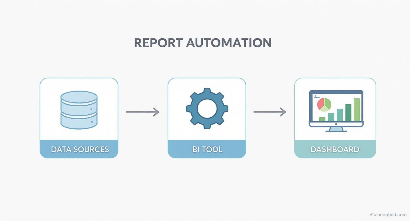
As you can see, a BI tool is the central engine. It connects all your scattered data sources and funnels them into one unified dashboard. By getting this system in place—and leaning on expert guidance—you can finally get the real-time visibility you need to scale your business with total confidence.
Your time is best spent running your business, not wrestling with spreadsheets. Let us build the reporting engine that empowers your growth.
Ready to automate your reporting and finally trust your data? Book a free discovery call with our BI consultants today and see how Vizule can design your custom reporting stack.
Still Have Questions?
When you're running a business, jumping into a modern reporting system can feel like a huge leap. It's totally normal to have questions about the process, the tools, and what it actually means for your bottom line. We get these questions all the time from founders, so let's tackle a few of the most common ones.
"Which KPIs Are Most Important for My Business?"
Honestly, the best KPIs are the ones tied directly to your top one or two strategic goals for the year. It's that simple. If your main goal is to "increase profitability," a supporting objective might be to "hit a 15% net profit margin." Right there, you've found your core KPIs: Net Profit, Revenue, and Cost of Goods Sold. Those are the numbers that tell you if you're winning or losing.
A good way to start is to pick just one primary KPI for each part of the business:
- Finance: Cash Runway or Net Profit Margin.
- Sales: Customer Acquisition Cost (CAC) or Sales Cycle Length.
- Operations: On-Time Delivery Rate or Customer Satisfaction (CSAT).
The big mistake is trying to track everything. Don't do it. Focus on the vital few metrics that give you the clearest signal on how your business is doing and whether you're getting closer to your goals.
"Is Power BI Too Complex for a Small Business?"
I'll be straight with you—Power BI is an absolute beast of a tool. But getting it set up right, especially the data modeling part, can be tricky if you haven't done it before. The good news? You don't need a full-time, in-house data team to get incredible results from it.
For most small and mid-sized businesses, the smartest move is to bring in a consultant to build the foundational data model and automated dashboards. Once that heavy lifting is done, the reports themselves are incredibly intuitive for non-technical founders to use every single day.
This approach gives you enterprise-level analytics without the enterprise-level price tag. It’s a solution that works for you today and scales as you grow.
"How Long Does It Take to Set Up Automated Reporting?"
The timeline really hinges on two things: the complexity of your business and how clean your data sources are. If your data is already well-organized in modern cloud systems like Xero or HubSpot, the whole process can be surprisingly quick.
Typically, we can get a foundational set of automated management reporting templates designed and deployed in just 4-6 weeks. That timeframe includes sitting down with you to define KPIs, connecting to your data sources, building out the data model, and designing the final interactive dashboards.
Think of it this way: a one-time investment that pays for itself over and over by saving you hundreds of hours of manual spreadsheet work every year.
Ready to stop wrestling with spreadsheets and start making decisions with real confidence? The team at Vizule lives and breathes this stuff—we build the automated reporting systems that help founders scale their businesses.


