


For small-to-medium business owners and founders, manual reporting in Excel is a major bottleneck. Data is siloed, reports are constantly out-of-date, and you spend more time copy-pasting than actually making decisions. This isn't just frustrating; it's a barrier to scaling smartly and achieving clear visibility across your operations and finances.
The good news is you don't need a massive budget to escape this 'Excel chaos'. The right data visualization tool can connect the dots in your data, automate your KPI dashboards, and give you the clarity needed to align your entire business. But with so many options, which one is right for you?
This guide breaks down the best free data visualization tools available, helping you move from tedious manual reports to automated, insight-led decision-making without the enterprise price tag. We cut through the noise to provide a practical analysis of each platform, complete with screenshots, direct links, and honest assessments of their limitations. We’ll look at everything from user-friendly dashboard builders like Power BI Desktop to more developer-focused libraries like D3.js, ensuring you find the perfect fit for your specific business needs and technical comfort level.
1. Microsoft Power BI Desktop
Microsoft Power BI Desktop is an industrial-strength, free-to-download application for Windows that allows users to build sophisticated data models and create fully interactive reports. It stands out as one of the best free data visualization tools for businesses already embedded in the Microsoft ecosystem, offering seamless integration with Excel and Azure. This makes it an ideal starting point for finance directors and SME owners looking to graduate from cumbersome spreadsheets to automated, dynamic dashboards.
The platform's core strength lies in its powerful data modeling engine. Using Power Query, you can connect to hundreds of data sources, clean and transform messy data, and prepare it for analysis without writing a single line of code. This is a game-changer for operators frustrated with manual data preparation.
Key Features & Considerations
- Robust Data Modeling: Power BI Desktop includes Power Query for data transformation and a DAX formula language for complex calculations, providing a level of analytical depth that most free tools cannot match.
- Extensive Visuals: A vast library of built-in and custom visuals allows you to create everything from standard financial charts to custom KPI cards.
- Availability: The desktop application is completely free for individual use. However, publishing and sharing reports with others requires a paid Power BI Pro license.
- Limitations: Its biggest drawback is the Windows-only availability, which excludes Mac users. Furthermore, true collaboration is locked behind a paywall. For a more detailed breakdown, you can explore this Microsoft Power BI Desktop data visualization tools comparison.
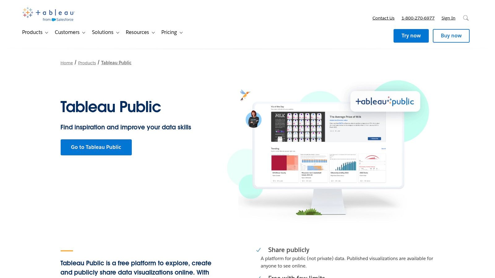
2. Tableau Public
Tableau Public is a free platform that allows anyone to create and share interactive data visualizations online. It’s widely regarded as one of the best free data visualization tools for individuals looking to build a professional portfolio or learn the powerful Tableau software. For operators and analysts, it serves as an excellent, no-cost entry point to master the drag-and-drop interface that defines the Tableau ecosystem.
The platform's greatest strength is its vibrant community and the massive gallery of inspirational dashboards. This makes it a fantastic resource for learning visual storytelling and design best practices from the world's top data artists. Unlike desktop-only tools, Tableau Public is fully hosted, meaning you can publish your work to a personal gallery and share it with a simple link, making your insights instantly accessible.
Key Features & Considerations
- Drag-and-Drop Authoring: The intuitive interface allows users to build complex charts, maps, and dashboards without writing code, making advanced visualization accessible to non-technical users.
- Strong Community: Access to a vast public gallery provides endless inspiration and learning opportunities, including the popular "Viz of the Day" showcase.
- Availability: The tool is completely free to use. However, the critical trade-off is that any data workbook or visualization you save is published publicly online.
- Limitations: The public-only nature makes it unsuitable for any sensitive or proprietary business data. Furthermore, the free version has limited data connection options and lacks the automated data refresh capabilities found in the paid Tableau products. You can find more details on the Tableau Public platform.
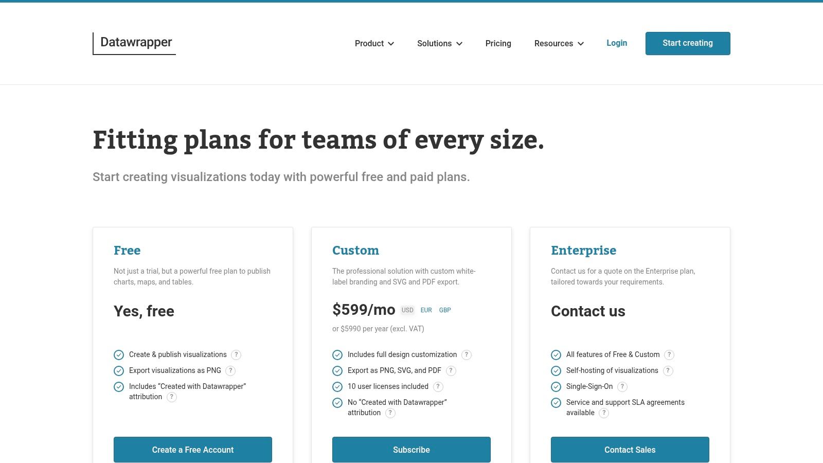
3. Datawrapper
Datawrapper is a web-based tool designed for creating clean, responsive, and embeddable charts, maps, and tables with remarkable ease. It's a favorite among journalists and organizations that need to quickly communicate data insights to a broad audience without any coding. For business operators needing to create a simple, clear chart for a report or presentation, Datawrapper offers one of the fastest workflows available.
Its core philosophy revolves around sensible defaults and a guided user interface. This approach removes the typical design friction, helping users produce professional-looking visuals that are both accessible and effective. This makes it an excellent choice for teams without a dedicated data analyst or designer who need to maintain a high standard of communication.
Key Features & Considerations
- User-Friendly Interface: The simple, step-by-step process (upload data, visualize, publish) makes it incredibly fast to learn and use, even for absolute beginners.
- Excellent Design Defaults: Charts are created with a strong focus on readability and accessibility, ensuring your data is presented clearly right out of the box.
- Generous Free Plan: The free tier is very capable, allowing for unlimited chart creation and views, making it a sustainable choice for ongoing use.
- Limitations: The free plan includes Datawrapper branding on all visuals. Exporting to high-quality vector formats like SVG or PDF and removing the branding requires upgrading to a paid plan. Learn more at the Datawrapper pricing page.
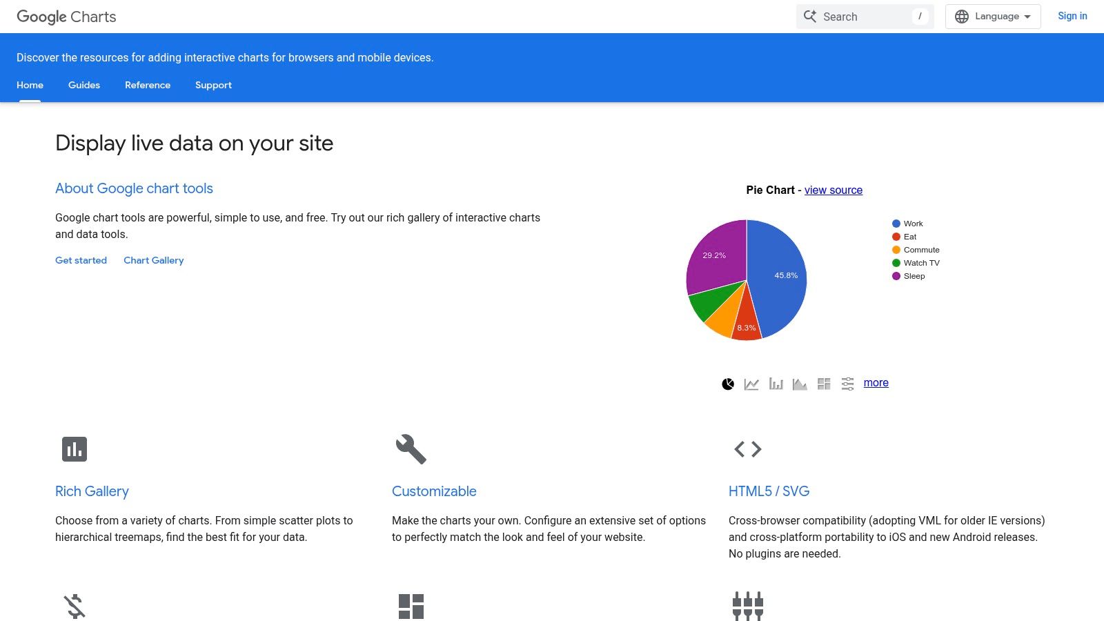
4. Google Charts
For developers and operators needing to embed interactive charts directly into websites or internal applications, Google Charts is a powerful and reliable JavaScript-based library. It stands out among the best free data visualization tools for its simplicity and direct approach to web-based charting. Its primary purpose is to render dynamic, interactive charts using HTML5/SVG, ensuring they work flawlessly across all modern browsers and platforms without plugins.
This tool is perfect for teams who need to add data-driven visuals to a web page with minimal setup. Instead of a standalone application, you use simple JavaScript that takes your data and renders it client-side. This makes it a lightweight and highly accessible choice for displaying live data on a company dashboard or a public-facing website.
Key Features & Considerations
- Web-Native Integration: Google Charts is designed from the ground up to be embedded in web pages. It offers a rich gallery of chart types, from basic line and bar charts to more complex gauges, timelines, and geo charts.
- Extensive Documentation: Google provides excellent documentation and a gallery with live examples and code snippets, making it easy for developers to get started quickly.
- Availability: The library is completely free to use for any purpose, with no licensing fees or restrictions on commercial use.
- Limitations: It requires some basic JavaScript knowledge to implement, making it less suitable for non-technical users. It also operates primarily on the client-side and has fewer built-in integrations with modern data frameworks compared to some newer open-source libraries. For more insights into creating effective visuals, explore these data visualization best practices.
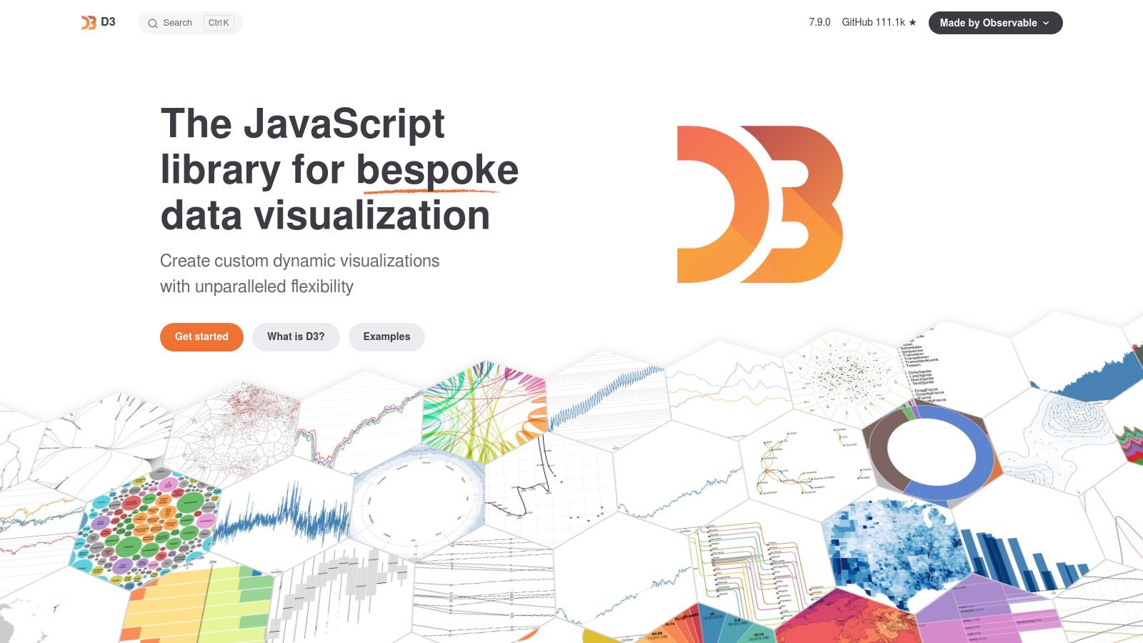
5. D3.js
D3.js (Data-Driven Documents) is a foundational open-source JavaScript library, not a standalone application, for creating completely custom data visualizations in a web browser. It provides developers with unparalleled control over the final output, making it the engine behind many of the most innovative and bespoke data stories seen online. For businesses with in-house development talent, D3.js is one of the best free data visualization tools for building unique, high-performance visuals that perfectly match brand identity and specific reporting needs.
Unlike out-of-the-box platforms, D3.js gives you direct access to the Document Object Model (DOM), allowing you to bind arbitrary data to web elements and then apply data-driven transformations. This low-level approach offers maximum flexibility, from animated transitions to complex, interactive diagrams that go far beyond standard charts.
Key Features & Considerations
- Maximum Customization: D3.js gives you complete control over every pixel. If you can imagine a visualization, you can likely build it, allowing for truly bespoke dashboards and reports that are impossible with template-based tools.
- Powerful Selections & Transitions: Its core strength lies in efficiently selecting and manipulating DOM elements based on data, enabling smooth, animated transitions that can help tell a compelling story.
- Availability: As a JavaScript library, D3.js is completely free and open-source. It can be integrated into any web project.
- Limitations: The biggest hurdle is its steep learning curve. It requires a solid understanding of JavaScript, HTML, and CSS, making it unsuitable for non-technical users looking for a quick drag-and-drop solution.
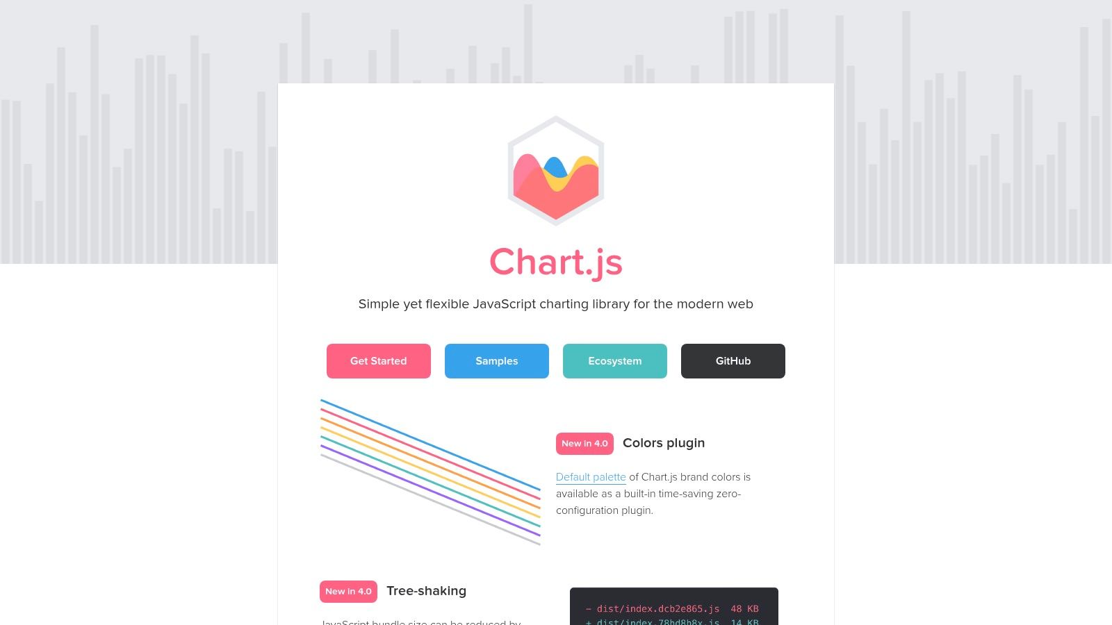
6. Chart.js
For developers and operators who need to quickly embed simple, responsive charts into web pages, Chart.js is an outstanding open-source solution. This lightweight JavaScript library allows for the rapid creation of clean, modern visualizations using HTML5 Canvas. Its simplicity is its greatest strength, making it an excellent choice for teams needing to add data dashboards to a web application without the steep learning curve of more complex libraries.
Chart.js is perfect for displaying straightforward operational metrics or KPI dashboards directly within an internal tool or website. Its ease of use means a developer can get a chart up and running in minutes, which is a significant advantage for businesses focused on rapid prototyping and agile development. It offers a clear path to visualizing data without requiring a deep specialization in data visualization.
Key Features & Considerations
- Lightweight & Simple API: Chart.js has a very small footprint and a straightforward API, making it easy to integrate and learn. It supports eight core chart types, which cover most standard business reporting needs.
- Responsive & Animated: Charts are fully responsive, adapting to different screen sizes, and include simple animations out-of-the-box for a more engaging user experience.
- Availability: As an open-source library under the MIT license, it is completely free for both personal and commercial use. The project is actively maintained by its community.
- Limitations: While great for standard charts, it lacks the deep customization capabilities found in libraries like D3.js. It is not a standalone tool but a library, so it requires some web development knowledge to implement effectively.
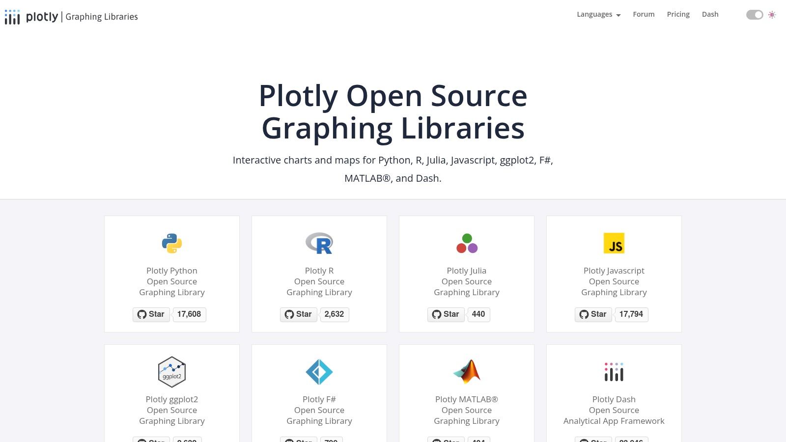
7. Plotly
Plotly is an open-source suite of graphing libraries that empowers data scientists, analysts, and developers to create sophisticated, interactive charts. It is revered in the scientific and analytics communities for its ability to produce publication-quality visualizations directly from code in languages like Python, R, and JavaScript. This makes it one of the best free data visualization tools for operators who are comfortable with scripting and need precise, highly customizable graphical outputs.
The core strength of Plotly lies in its high-level APIs that make building complex charts, including 3D and WebGL-accelerated visuals, remarkably straightforward. For businesses with in-house technical talent, Plotly allows for the seamless integration of dynamic charts into web applications, Jupyter notebooks, or custom-built Dash dashboards, moving far beyond the constraints of typical drag-and-drop interfaces.
Key Features & Considerations
- Code-First Approach: Offers unparalleled flexibility for developers to create custom interactive charts using Python, R, and JavaScript. This is ideal for bespoke analytics and scientific visualization.
- Rich Interactivity: Visualizations are inherently interactive, supporting features like zoom, pan, hover-text, and selections out of the box, which enhances data exploration.
- Availability: The core graphing libraries are completely free and open-source. However, enterprise-grade features like advanced hosting, collaboration, and dedicated support are part of paid plans.
- Limitations: Plotly requires coding knowledge, which presents a steep learning curve for non-technical users. While powerful for individual creation, seamless team collaboration and dashboard deployment are gated behind its enterprise solutions. For more on its capabilities, you can review Plotly's graphing libraries.
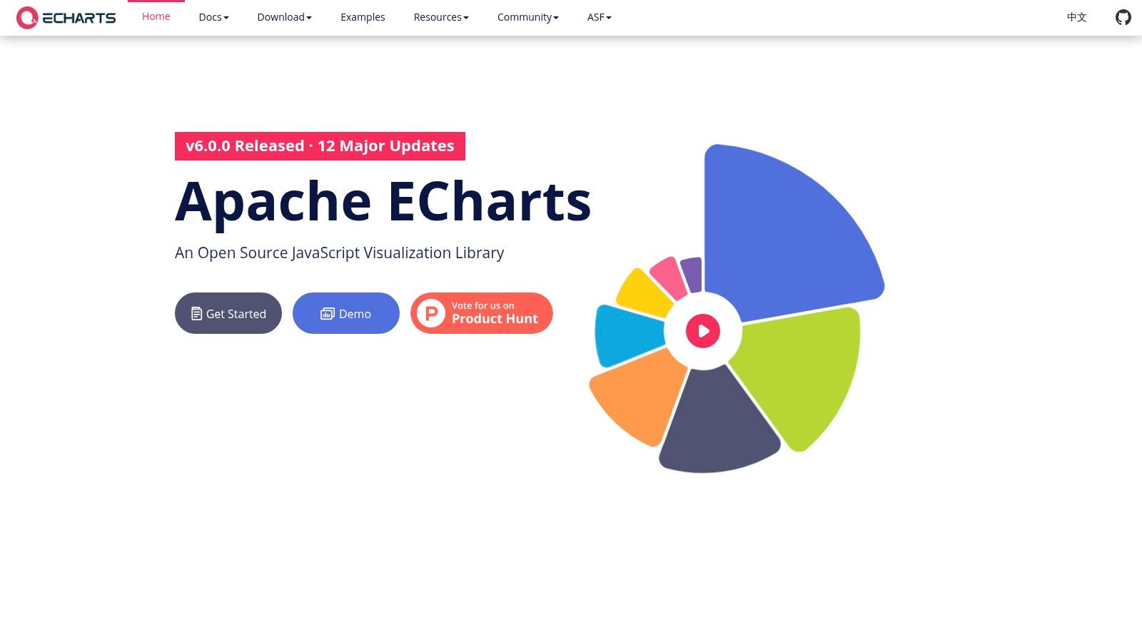
8. Apache ECharts
Apache ECharts is a powerful, open-source JavaScript charting library that excels at rendering complex, interactive charts directly in the browser. Maintained by the Apache Software Foundation, it’s a go-to for developers needing high performance, especially when dealing with large datasets. Its robust architecture is a key reason it's used as the charting engine for data exploration platforms like Apache Superset, making it ideal for business intelligence managers creating heavy, custom dashboards.
The library’s strength is its ability to handle millions of data points without compromising on smooth, interactive user experiences. This is achieved through progressive rendering and a choice between Canvas or SVG, giving developers fine-grained control over performance. For operators looking to build bespoke analytics solutions or embed dynamic charts into existing applications, ECharts offers a highly flexible and free framework.
Key Features & Considerations
- High Performance: ECharts is built to handle big data, using progressive rendering to display large-scale datasets smoothly and efficiently.
- Rich Chart Variety: It supports over 20 chart types and various components, enabling the creation of sophisticated and highly customized visuals.
- Availability: As a completely free and open-source JavaScript library, it can be used in any commercial or personal project without licensing fees.
- Limitations: The documentation, while improving, can be less mature than competitors like Chart.js. Its community is also smaller in the U.S., which may mean fewer English-language tutorials and third-party resources. For more information, visit the Apache ECharts website.
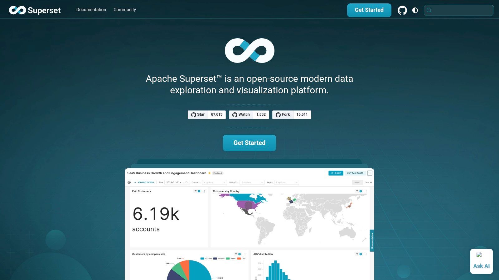
9. Apache Superset
Apache Superset is a modern, open-source data exploration and business intelligence platform designed for scalability. It empowers users with a no-code visualization builder and a powerful SQL IDE, making it a versatile choice for organizations that want enterprise-grade features without the associated license fees. For finance directors and BI managers with access to technical resources, Superset offers unparalleled control and customisation.
The platform's core advantage is its flexibility. It connects to nearly any SQL-speaking database and is built to scale with your existing infrastructure, from a small startup server to a massive, distributed environment. This makes it one of the best free data visualization tools for companies planning for significant growth.
Key Features & Considerations
- Extensive Visualizations: Offers over 40 pre-installed visualization types and a plugin system to create custom charts, ensuring you can build the exact financial or operational dashboard you need.
- Enterprise-Ready: Includes a lightweight semantic layer for defining business metrics, plus granular, role-based access control for secure data governance.
- Availability: Superset is completely free and open-source. However, it requires self-hosting, which involves technical setup and maintenance. Managed SaaS solutions are available from third-party vendors for a fee.
- Limitations: The primary drawback is the technical skill required for installation and configuration. Unlike out-of-the-box SaaS tools, you are responsible for the underlying infrastructure, which can be a significant hurdle for non-technical SME owners.
10. Grafana
Grafana is a leading open-source observability platform renowned for its powerful dashboards, primarily for monitoring time-series data like server metrics, application logs, and real-time performance analytics. It stands out as one of the best free data visualization tools for engineering, DevOps, and IT operations teams who need to unify data from dozens of sources into a single, cohesive view. For operators managing infrastructure, Grafana provides unparalleled visibility into complex systems.
Its core strength is the ability to query, visualize, alert on, and understand metrics no matter where they are stored. The platform's extensive plugin ecosystem allows it to connect to popular databases like Prometheus, InfluxDB, and Elasticsearch, creating a centralized hub for all monitoring activities. This flexibility makes it indispensable for technical teams seeking to move beyond siloed monitoring tools.
Key Features & Considerations
- Unified Dashboards: Grafana excels at combining data from multiple sources (e.g., application performance, infrastructure health, and business KPIs) onto a single dashboard for holistic analysis.
- Powerful Alerting: Configure sophisticated alert rules and get notified via Slack, PagerDuty, email, and other channels when metrics cross critical thresholds.
- Availability: The core open-source software is completely free to self-host. Grafana Cloud also offers a generous "Free forever" plan with usage limits, making it highly accessible.
- Limitations: While excellent for time-series data, it is not optimized for traditional business intelligence or financial reporting out-of-the-box. Setting it up for general business analytics requires significant configuration and technical expertise compared to dedicated BI tools. You can learn more about how different tools handle specific reporting needs by exploring our guide to business intelligence for finance.
11. Kibana
Kibana is the free and open user interface for the Elastic Stack, making it a powerful tool for exploring and visualizing Elasticsearch data. It is an exceptional choice for technical operators, particularly those in IT and DevOps, who need to analyze large volumes of time-series data like logs, metrics, and application performance data. Its core strength is providing an interactive window into the massive datasets stored in Elasticsearch, transforming raw logs into actionable insights.
The platform excels at operational intelligence. Using its drag-and-drop interface, Kibana Lens, even non-experts can quickly build charts and dashboards to monitor server health, track application errors, or analyze security events in real-time. This makes it one of the best free data visualization tools for anyone already invested in the Elastic ecosystem for log aggregation or site reliability engineering.
Key Features & Considerations
- Seamless Elasticsearch Integration: As the native UI for Elasticsearch, Kibana provides unparalleled performance and compatibility for visualizing data stored within the Elastic Stack.
- Real-time & Time-Series Analysis: It is purpose-built for slicing, dicing, and visualizing time-stamped data, making it ideal for log analytics, security information and event management (SIEM), and observability.
- Availability: The core Kibana interface is free to use under the Elastic Basic License. However, advanced features like machine learning, alerting, and enterprise-grade security require paid subscriptions.
- Limitations: Its primary drawback is its tight coupling with Elasticsearch. It is not a general-purpose business intelligence tool for connecting to multiple SQL databases or spreadsheets, making it a niche choice for finance or sales reporting. For more details on its specific use cases, visit the official Kibana page.
Top 12 Free Data Visualization Tools Comparison
| Tool | Core Features / Integration ✨ | User Experience ★★★★☆ | Value Proposition 💰 | Target Audience 👥 | Unique Selling Points 🏆 |
|---|---|---|---|---|---|
| Microsoft Power BI | Robust data modeling; Excel/Azure integration ✨ | Industrial strength; Windows only ★★★★☆ | Free desktop; paid cloud 💰 | Professional BI developers 👥 | Power Query/Pivot; wide connectors 🏆 |
| Tableau Public | Drag-drop authoring; public dashboards ✨ | Strong community; great learning ★★★☆☆ | Free but public 💰 | Data storytellers, learners 👥 | Largest public viz gallery 🏆 |
| Datawrapper | No-code charts and maps; responsive design ✨ | Fast learning; good docs ★★★★☆ | Free & paid plans 💰 | Media, nonprofits 👥 | Accessible, no coding needed ✨ |
| Google Charts | JavaScript chart library; variety & filters ✨ | Easy embedding; reliable ★★★☆☆ | Completely free 💰 | Web developers, basic dashboards 👥 | Broad chart types; client-side use ✨ |
| D3.js | Custom visualizations; SVG/Canvas support ✨ | Steep learning curve ★★★☆☆ | Free, open source 💰 | Advanced devs, custom viz 👥 | Maximum customization 🏆 |
| Chart.js | Lightweight Canvas charts; simple API ✨ | Easy setup; supportive community ★★★★☆ | Free, open source 💰 | Quick dashboard devs 👥 | Small footprint; plugins support ✨ |
| Plotly | Interactive charts; multi-language libs ✨ | Great for analytics; strong interactivity ★★★★☆ | Open source + paid plans 💰 | Scientists, analysts 👥 | 3D & WebGL support; Jupyter/Dash ready 🏆 |
| Apache ECharts | 20+ chart types; progressive large data rendering ✨ | User friendly syntax; improving docs ★★★☆☆ | Free, open source 💰 | Developers needing scale 👥 | Robust for big data; theming capabilities ✨ |
| Apache Superset | 40+ viz types; SQL IDE; role-based access ✨ | Enterprise features; setup skill required ★★★☆☆ | Free, open source 💰 | Data engineers, BI teams 👥 | Scalable BI platform; plugins 🏆 |
| Grafana | Multi-source dashboards; alerts; plugin ecosystem ✨ | Mature ecosystem; time-series focus ★★★★☆ | Free core + cloud tier 💰 | Ops, monitoring teams 👥 | Strong for logs/metrics; alerting 🏆 |
| Kibana | Elasticsearch UI; drag-drop; no-code Lens ✨ | Great for logs/time series ★★★☆☆ | Free basic + paid plans 💰 | Elastic Stack users 👥 | Elastic integration; Kibana Lens no-code ✨ |
Ready to Transform Your Reporting from a Chore into a Strategic Asset?
We've explored a powerful lineup of the best free data visualization tools, from the accessible dashboards of Power BI Desktop to the sophisticated, code-driven libraries like D3.js. Your journey into data-driven decision-making doesn't require a significant upfront investment, a fact proven by the robust capabilities of platforms like Apache Superset and Grafana. The key takeaway is that a "free" tool doesn't mean a "lesser" tool; it simply means you need a clearer strategy to leverage it effectively.
The right tool for your business depends entirely on your specific circumstances. A startup founder might find the rapid, shareable reports from Datawrapper perfect for investor updates. A finance director, on the other hand, will likely gravitate toward the deep analytical power of Power BI Desktop for building complex financial models and cash flow forecasts. The challenge, however, isn't just picking a tool from a list. It's about building a sustainable data ecosystem around it.
Your Next Step: From Tool Selection to Strategic Implementation
Choosing a platform is the first step. The real transformation happens when that tool is integrated into a cohesive data strategy that eliminates manual work and data silos. As you move forward, consider these critical questions:
- Scalability: Will this tool grow with you? A solution like Tableau Public is great for showcasing data, but it won't support the secure, internal reporting your business will need as it scales.
- Data Integration: How easily can you connect all your disparate data sources, from your accounting software to your CRM? A unified view is non-negotiable for accurate insights.
- Team Skillset: Do you have the in-house expertise to manage a more technical tool like Apache ECharts or are you better served by a low-code platform that empowers your existing team?
- The "Last Mile" Problem: Once you build a dashboard, how do you ensure it gets used? True value comes from embedding these insights into daily workflows and strategic meetings, turning static reports into a dynamic asset.
The limitations of free tools often become apparent when you try to bridge these gaps. Sharing reports securely from Power BI Desktop is a common pain point for growing businesses. This is usually the moment when a business realises it needs more than just software; it needs a system. An automated, reliable reporting stack becomes your single source of truth, giving you the confidence to make critical decisions about hiring, spending, and growth.
Feeling overwhelmed by the options or hitting the limits of your current setup? At Vizule, we specialize in helping SMBs and founders move beyond the constraints of standalone tools. We connect the dots in your data, building automated reporting and financial modelling systems in Power BI that provide clarity and drive growth.
Ready to automate your reporting and finally trust your numbers? Book your free BI consultation today and let our experts build the data foundation your business deserves.


