


Are your sales reports a chaotic mess of spreadsheets that are out of date the moment they’re finished? For most SMB owners and founders, sales analysis is a manual, time-consuming process of digging through siloed data. It’s about moving away from gut-feel decisions and toward strategies backed by actual proof. Effective data analysis in sales helps you focus your team's efforts where they'll make the biggest impact on your bottom line.
Beyond Spreadsheets: The True Cost of Manual Sales Reporting

If you're like most founders we work with, your sales data is probably tangled up in a web of spreadsheets. It’s a familiar setup, but relying on manual reporting is a massive bottleneck that quietly bleeds resources and stifles your growth. The real cost isn't a software license; it's paid in lost hours, missed opportunities, and decisions based on shaky, out-of-date information.
Think about this all-too-common scenario: it's month-end, and you need a clear snapshot of sales performance. You download a CSV from your CRM, another from your e-commerce platform, and then pull your latest ad spend. What follows is a painstaking ritual of copying, pasting, and wrestling with VLOOKUPs. We call this ‘Excel chaos’—a time-suck that keeps you buried in data entry when you should be focused on strategy.
The Hidden Risks of Manual Workflows
This hands-on approach isn't just inefficient; it's dangerously unreliable. A single formula error or a copy-paste mistake can throw off your entire analysis, leading you to precisely the wrong conclusion. This old way of doing things comes with some serious baggage:
- Wasted Time: Your team is burning hours—sometimes days—every month building reports that are already out of date. That’s valuable time they could be spending selling.
- Lack of Trust: When different reports tell different stories, confidence plummets. You can't make decisive moves if you're constantly second-guessing whether the numbers are right.
- Siloed Information: With data trapped in separate systems (your CRM, your accounting software, your marketing tools), you never get a single, unified view of performance. It’s nearly impossible to see how your marketing spend really impacts sales or which channels bring in your most profitable customers.
The biggest problem with manual reporting isn't the grunt work itself—it's the strategic paralysis it causes. When you can't trust your data, you hesitate on crucial decisions about hiring, inventory, and where to invest your marketing budget.
This struggle is a classic—and completely solvable—growing pain for businesses. Effective https://vizule.io/data-analytics-for-small-business/ is all about breaking free from these manual chains. By automating how you collect and consolidate data, you can finally shift from reactive reporting to proactive, insight-driven leadership.
Identifying the Metrics That Actually Matter
Effective sales analysis isn't about getting lost in a sea of numbers; it's about tracking the right ones. For founders, the goal is to pinpoint the Key Performance Indicators (KPIs) that tell the true story of your company's sales health. This means looking past surface-level vanity metrics and zeroing in on the numbers that reveal momentum, efficiency, and profitability.
Without this clarity, you're essentially flying blind. You might be celebrating a record revenue month while your customer acquisition costs are silently spiraling out of control, eating away at your margins without you even realizing it.
Moving Beyond Total Revenue
Real insight comes from connecting the dots between different data points. A SaaS company, for example, lives and breathes by its Monthly Recurring Revenue (MRR) and Churn Rate. Together, these two metrics paint a vivid picture of sustainable growth. An e-commerce brand, on the other hand, will be obsessed with its Average Order Value (AOV) and Repeat Purchase Rate to gauge customer value.
The metrics you track must be a direct reflection of your business model. Here are a few foundational KPIs that provide a much clearer picture than revenue alone:
- Customer Acquisition Cost (CAC): How much are you spending to land each new customer? If your CAC is climbing, it’s a red flag for marketing inefficiency.
- Customer Lifetime Value (LTV): This forecasts the total revenue you can expect from a single customer. A healthy business model demands an LTV that's significantly higher than its CAC.
- Sales Cycle Length: How long does it take to turn a lead into a paying customer? Knowing this helps you forecast revenue more accurately and spot bottlenecks in your sales process.
- Lead Conversion Rate: Of all the leads that come in, what percentage actually become customers? This is a critical measure of your sales team's performance and the quality of your leads.
A great starting point for a more granular view is understanding POS data and smarter sales tracking, as this can reveal crucial trends right at the point of sale.
Your KPIs should act as your business's vital signs. They don't just tell you what happened; they help you understand why it happened. This empowers you to make strategic adjustments instead of just guessing what to do next.
Once you have a handle on the right KPIs, you have the foundation for your entire reporting structure. By focusing on these high-impact numbers, you can build a dashboard in a tool like Power BI that gives you an honest, at-a-glance picture of your business's health, pointing you directly toward your biggest growth opportunities.
Essential Sales KPIs for SMBs
To help you get started, here is a table of the most critical sales KPIs for small and medium-sized businesses. Think of these as your starting dashboard—the core metrics that will give you immediate, actionable insights into your performance.
| KPI | What It Measures | Why It's Important for Founders |
|---|---|---|
| Customer Acquisition Cost (CAC) | The average cost to acquire a single new customer. | Directly impacts profitability. A rising CAC needs immediate attention to ensure marketing spend is efficient. |
| Customer Lifetime Value (LTV) | The total predicted revenue from a single customer account. | Informs how much you can afford to spend on CAC. A high LTV:CAC ratio (e.g., 3:1) indicates a healthy, scalable business model. |
| Sales Cycle Length | The average time from first contact to a closed deal. | Helps with cash flow forecasting and identifying inefficiencies in the sales process. A shorter cycle means faster revenue. |
| Lead-to-Customer Conversion Rate | The percentage of leads that become paying customers. | A direct measure of sales team effectiveness and lead quality. A low rate might signal issues with your pitch or target audience. |
| Monthly Recurring Revenue (MRR) | Predictable revenue generated each month (for subscription models). | The lifeblood of SaaS and subscription businesses. Tracks growth, stability, and helps in long-term financial planning. |
| Churn Rate | The percentage of customers who cancel their subscription in a given period. | Measures customer retention. High churn can cripple a subscription business, even with strong new sales. |
| Average Order Value (AOV) | The average amount a customer spends per transaction. | A key lever for e-commerce growth. Increasing AOV through upselling or bundling can boost revenue without needing more customers. |
Focusing on these KPIs will ensure you're not just tracking activity, but measuring the actual health and momentum of your business. They provide the clarity needed to make sharp, data-backed decisions that drive real growth.
Building Your Central Sales Data Engine
Once you know which metrics really drive your business, the next move is to gather all the raw data. For most SMBs, this data isn’t sitting in one neat box; it’s scattered across multiple platforms. Your customer info lives in a CRM, transaction details are in Shopify, and ad spend is in Google Ads.
The first step is simply to map out these sources. Don’t worry about pulling the data just yet. Simply identify every system that holds a piece of the sales puzzle. This initial audit creates the blueprint for your central data engine.
Creating a Single Source of Truth
With your data sources identified, the real work begins. This is where a lot of business owners get stuck, picturing themselves manually exporting and cleaning endless spreadsheets. But the goal here isn't a one-time cleanup; it's to build an automated system that does the heavy lifting for you.
This process, often called building a data pipeline, is all about creating a reliable, automated flow of information from all your sources into one central hub. You can get into the technical weeds with our detailed guide on how to build a data pipeline, but the concept is simple. This automated approach is what creates a single source of truth—one trusted, unified dataset that everyone in your company can rely on.
This centralized approach is quickly becoming standard practice, which explains the explosive growth in the global data analytics market. Valued at a staggering $64.99 billion in 2024, the market is projected to rocket to $402.70 billion by 2032. This incredible 25.5% compound annual growth rate is fueled by the demand for precisely these kinds of integrated insights.
The Critical Role of Data Cleansing
Let's be honest: raw data is messy. It often arrives with inconsistencies that can derail your analysis before it even starts.
You'll run into common culprits like:
- Duplicate Entries: A customer might exist in your CRM and your billing system with slight name variations.
- Formatting Issues: Dates might appear as "10/01/2024" in one system and "Jan 10, 2024" in another.
- Missing Values: Incomplete addresses or missing lead source information can create frustrating gaps in your analysis.
Modern business intelligence tools like Power BI are designed to handle this chaos. Instead of manual cleaning, you can build automated rules that standardize formats, merge duplicates, and flag missing information as data flows in.
Think of it like a quality control checkpoint. By setting up automated cleansing rules, you ensure that only clean, reliable data enters your reporting system. This builds trust and eliminates the "Are these numbers right?" conversations for good.
This infographic shows how a simple, clean data flow can turn raw numbers into measurable growth.
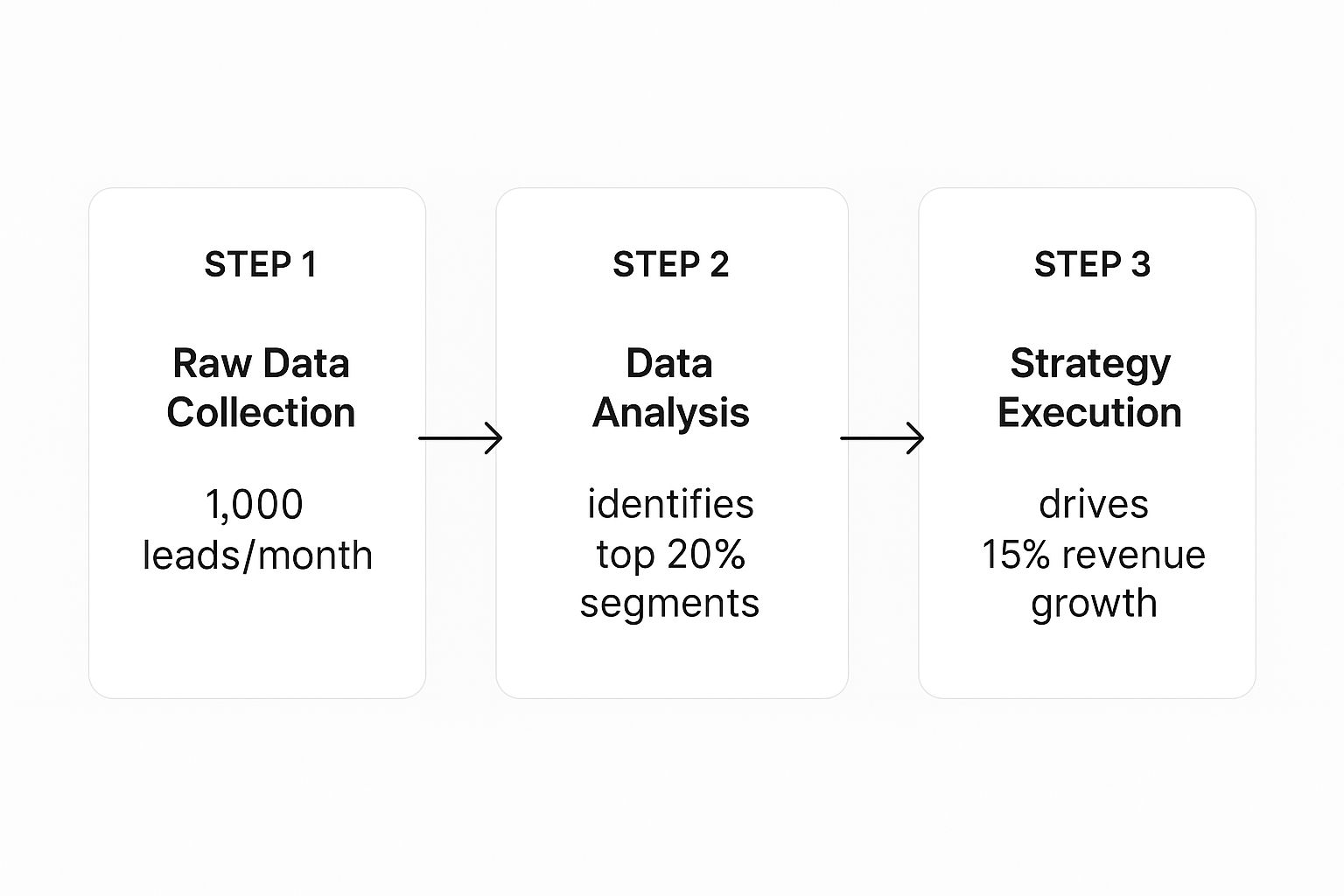
The visualization demonstrates a clear ROI. It shows how a systematic analysis of monthly leads can pinpoint high-value segments, directly resulting in a 15% revenue increase. By setting up this central engine, you stop wrestling with data and start using it to make strategic decisions that directly impact your bottom line.
Crafting Actionable Sales Dashboards in Power BI
Once your data is clean, centralized, and flowing automatically, it’s time to bring it to life. This is where the real power of data analysis in sales starts to shine. A well-designed dashboard in a tool like Power BI isn't just a collection of charts; it’s a tool for telling a clear, compelling story about your business performance.
The goal is to create clarity, not a data dump. A truly actionable dashboard pulls your focus to what really matters. It should give you a 30,000-foot view of your core KPIs—like sales revenue, lead conversion rates, and customer acquisition costs—and then let you drill down with a simple click.
From Data Points to Strategic Decisions
Think of your main dashboard as the executive summary. It needs to immediately answer your biggest questions: Are we hitting our targets? Where is our revenue really coming from? How healthy is our sales pipeline right now?
From that starting point, every single element should be interactive. For example, clicking on a region in a map should instantly filter the entire dashboard to show performance for just that area. This turns you from a passive report-viewer into an active investigator, letting you spot trends and flag outliers in seconds. If you're looking for inspiration, checking out some effective sales performance dashboard examples can spark some great ideas.
Here’s a great example of a Power BI sales management dashboard that gives a crystal-clear, top-level view of performance against targets.

This dashboard instantly tells a story. You can immediately see the $6M variance against the budget and which sales managers are leading the pack. This makes it incredibly easy to spot both wins and areas that need attention.
Best Practices for Dashboard Design
To ensure your dashboard drives action instead of confusion, it pays to stick to a few core principles. You want a design that's clean, intuitive, and laser-focused on telling a story.
- Always Start with "Why": Before you add a chart, ask yourself what business question it answers. If a visual doesn't help someone make a better decision, it's just clutter.
- Embrace the Funnel: For any sales team, a pipeline funnel is non-negotiable. It gives you a visual walkthrough of your entire sales process, showing you exactly where leads are dropping off and helping you pinpoint bottlenecks.
- Prioritize Trends Over Time: A single number is interesting, but a trend line is powerful. Showing metrics like sales growth month-over-month or quarter-over-quarter adds critical context that a static number can't provide.
The most effective dashboards are not static reports; they are dynamic tools for exploration. They should provoke questions and then provide the means to answer them, all within a few clicks. This interactive approach is what turns raw data into actionable intelligence.
By bringing your reporting into a tool like Power BI, you're swapping hours of tedious, manual report-building for an always-on, automated system that brings opportunities and risks to the surface in real time.
Using Your Data to Accurately Forecast Sales

Once your dashboards tell the story of your past performance, it’s time to look ahead. Sales forecasting isn't about gazing into a crystal ball; it's about transforming historical data into a powerful strategic tool. It gives you the confidence to make critical decisions on everything from hiring and inventory to cash flow management.
It all starts with a deep dive into your past sales trends. This is where you'll spot predictable patterns, like seasonality. An e-commerce brand, for example, will see a clear spike around the holidays. Recognizing these cycles is the first step to planning marketing campaigns and managing stock levels effectively.
From Pipeline Health to Revenue Prediction
Your sales pipeline is a goldmine for forecasting, but only if you know how to read it. Simply adding up the total value of all deals is a recipe for disappointment. The real trick is to apply historical conversion rates to each stage of your pipeline.
Let's say you know that deals in your "Proposal Sent" stage have historically closed at a 40% rate. A £100,000 pipeline at this stage isn't projected as £100,000 in revenue—it's a much more realistic £40,000. Applying this weighted logic across every stage gives you a data-backed revenue prediction you can actually trust.
This level of insight is absolutely crucial. Global eCommerce sales are projected to hit an incredible $7.5 trillion in 2025, a massive jump from $5.7 trillion in 2023. This explosive growth shows why data-driven sales strategies are no longer just an option. (Find out more about digital commerce trends at Cimulate.ai).
An accurate sales forecast is more than a prediction; it's a strategic asset. It allows you to anticipate challenges and seize opportunities before they arrive, turning reactive problem-solving into proactive business management.
Modeling Different Business Scenarios
The best forecasting doesn't just plan for one outcome. By using your data to model different scenarios in Power BI, you can prepare your business for whatever the future holds and dramatically reduce uncertainty.
You should create three distinct forecasts:
- Best-Case: This model assumes aggressive growth, your highest conversion rates, and a shorter sales cycle.
- Worst-Case: Here, you'll model potential downturns, using lower conversion rates and a longer sales cycle.
- Most-Likely: This forecast is your baseline, built on your current, weighted pipeline and historical averages.
This multi-scenario approach gives you a clear financial picture for each potential future, allowing you to develop contingency plans ahead of time. It’s the ultimate strategic advantage, providing the clarity needed to navigate challenges and scale your business with confidence.
Want to automate your reporting and finally trust your data? Book a free call with our BI consultants today.
From Dashboards to Decisions: Making Your Sales Insights Count
A dashboard packed with colorful charts looks great, but it's just the start of the story. The real value of data analysis in sales isn’t found in the data itself—it’s in how you use that data to make sharp, strategic moves. This is the final, crucial step where you connect your automated reports to real, tangible business results.
It's all about translating what the numbers are telling you into a concrete business strategy. For instance, what happens when you discover your most profitable customer segment isn't the one you've been pouring your budget into? That single insight should immediately spark a conversation about rethinking your entire marketing and sales focus.
From Diagnosis to Decisive Action
Picture this: a founder is looking at their Power BI dashboard and notices a sudden 15% drop in their lead-to-customer conversion rate. Instead of panicking, they dig into the interactive report. With a few clicks, they filter the data and trace the issue back to one specific lead source—a recent partner marketing campaign.
The data lays it all out. While this campaign is generating a high volume of leads, their quality is abysmal. The sales team is burning precious hours chasing prospects who were never going to convert.
Armed with this clarity, the founder takes immediate, data-backed action. They aren't guessing; they know exactly where the problem is and how to fix it. This is the difference between reactive problem-solving and proactive, insight-led leadership.
This ability to quickly diagnose a problem and pivot is absolutely essential today. The B2B sales process has become more complex; by 2025, it's expected that an average of 7.4 decision-makers will be involved in a typical purchase. This makes it more critical than ever to know which channels are delivering genuinely qualified leads and which are just noise. You can read more about the evolving B2B sales landscape here.
Unlocking Insight-Led Decision Making
When you build an automated reporting stack, it fundamentally changes your approach to growth. Your focus shifts from the mind-numbing task of data collection to high-impact strategic thinking. Instead of your team debating whether the numbers are right, they can pour their energy into figuring out the best next move.
This is where having an expert partner can change the game. At Vizule, we specialise in connecting the dots in your data. We design and build the automated systems that plug directly into your data sources, clean up the information, and serve up the insights you need to make decisions with confidence. It’s about getting you to a place where you can finally trust your data and use it as the strategic asset it’s meant to be.
Common Questions About Sales Data Analysis
Jumping into a more structured approach to sales data can feel like a big leap. It almost always brings up a few valid questions, so let's tackle the most common concerns we hear from business owners.
A lot of founders worry their company data is just too messy to even start. The good news? You don't need to clean it up first. In fact, that's a core part of what we do.
We connect directly to your raw data sources—your CRM, Shopify, accounting software—and build automated cleansing workflows right inside a tool like Power BI. This is how we create your 'single source of truth' without you ever having to manually clean another spreadsheet.
Is This Really for Small Businesses?
Another frequent misconception is that powerful business intelligence tools are too complex or expensive for an SMB. While a platform like Power BI is incredibly capable, its entry-level versions are surprisingly affordable and often bundled with Microsoft 365 plans you may already have.
The key isn't for you to become a Power BI expert. It's about having a specialist like Vizule design and build the specific dashboards your business needs. This gives you enterprise-level insights without the enterprise-level price tag or the steep learning curve.
Finally, you might be wondering how quickly you can expect to see a return. The initial setup—connecting data sources and building foundational dashboards—can happen in a matter of weeks.
But you'll start seeing valuable insights almost immediately. The first time you see all your sales, marketing, and financial data in one unified view, you will spot trends and opportunities you never knew existed. It's a real lightbulb moment for founders.
Ready to stop wrestling with spreadsheets and start making confident, insight-led decisions? The team at Vizule can help you connect the dots in your data and build the automated reporting stack you need to scale smart.


