


A data-driven decision-making process is a structured way of collecting information, pulling out useful insights, and letting those insights guide your business strategy. It's about moving past pure intuition and gut feelings.
For founders and operators, it’s the difference between saying, “I think this will work,” and confidently stating, “The data shows this is our best move.” This process turns your raw data into a clear roadmap for smart, scalable growth.
From Guesswork to Growth: Why Your SMB Needs a Data Process

Let's be honest. Are you steering your company with gut feelings or hard facts? So many small and mid-sized businesses are drowning in Excel chaos, with messy spreadsheets and reports that don't talk to each other. When your data is siloed and manual, you're forced to make critical calls based on what feels right—which is no way to scale a business.
Adopting a data-driven approach doesn't mean you need to become a data scientist overnight. It’s about building a solid framework that brings clarity and confidence to your entire operation. This guide will walk you through exactly how to do that, turning your data from a headache into your most powerful asset.
Why Data Is No Longer Optional
The shift to data-backed choices isn't just a buzzword; it's a competitive necessity. We're seeing some compelling numbers. Approximately 25% of organizations now make nearly all their strategic decisions based on data. On top of that, 44% report that most of their decisions are now informed by data insights.
This isn't just a trend for the big players. It's a massive competitive advantage for SMBs trying to carve out their space. As a founder, this means getting precise answers to crucial questions like:
- Which of my marketing channels are actually bringing in profitable customers?
- Where are the hidden inefficiencies quietly draining my cash flow?
- How can I improve our forecasting model to stop running out of stock or tying up cash in overstock?
To put it into perspective, let's compare the old way of doing things with a modern, data-informed approach.
Gut Feel vs. Data-Driven Decisions
| Aspect | Gut-Feel Decision Making | Data-Driven Decision Making |
|---|---|---|
| Foundation | Intuition, personal experience, anecdotal evidence. | Hard data, objective metrics, statistical analysis. |
| Process | Often reactive, informal, and inconsistent. | Proactive, structured, and repeatable. |
| Risk Factor | High. Heavily biased and difficult to justify. | Low. Decisions are defensible and evidence-based. |
| Scalability | Poor. Relies on a single founder's "feel." | High. Processes can be taught and scaled across teams. |
| Outcome | Hit-or-miss results, slow learning curve. | Consistent improvement, faster learning, and adaptation. |
The difference is night and day. One path is based on hope, the other on evidence.
The real goal of a data-driven process is simple: make consistently better, more profitable choices. It gives you the power to answer your most important business questions with proof, not just assumptions.
This guide will lay the foundation you need to build a practical, effective process in your own business. We'll cover everything from defining the right questions to acting on real insights—creating a clear roadmap for smart, scalable growth.
Establishing Your Data-Driven Framework
Building a reliable data process doesn't mean you need a data science degree. It’s about creating a practical, repeatable framework that any business owner can adopt. Forget the complex jargon; the core of a strong data driven decision making process is simply about asking the right questions and getting clear answers.
For instance, a vague question like, "Is our marketing working?" is impossible to answer. A much better, more specific question is, "Which marketing channel delivered the highest customer lifetime value last quarter?" This is answerable, actionable, and directly tied to your bottom line.
Start With Your Most Pressing Questions
Your journey into data should always begin with the pain points you're feeling right now. Think about the recurring problems or nagging questions you face daily. A founder frustrated with cash flow reporting might start by asking:
- Which of our products consistently sell out during peak seasons?
- How much capital is tied up in inventory that just isn't moving?
- What's the average time a product sits in our warehouse before it sells?
These kinds of questions give your data a job to do. They define the scope of your analysis and stop you from getting lost in a sea of irrelevant metrics. The goal here is to focus on just a few critical areas where getting answers can have an immediate, tangible impact.
Gather and Centralise Your Data
Once you've locked in your questions, the next logical step is to figure out where the answers live. For most businesses, this information is usually scattered all over the place: sales data in your CRM, financial data in Xero, and operational data in inventory software or a mess of spreadsheets. This is the definition of data silos.
The key is to start pulling these disparate sources together. This doesn't have to be some massive, complex project on day one. You can start small by connecting just your most critical systems, like moving from Excel to Power BI for your reporting. This creates a foundational data layer and gets your finance and operations teams aligned around a single set of numbers.
This infographic breaks down the simple, three-stage flow of turning raw data into something genuinely useful.
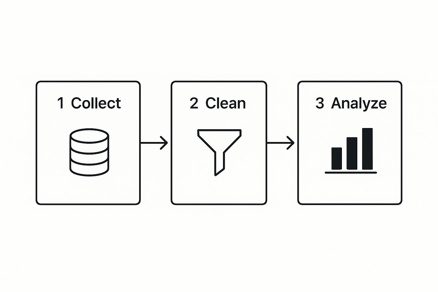
As you can see, the process moves from systematically collecting raw information from various sources to cleaning it for accuracy, and finally, analyzing it to uncover real insights.
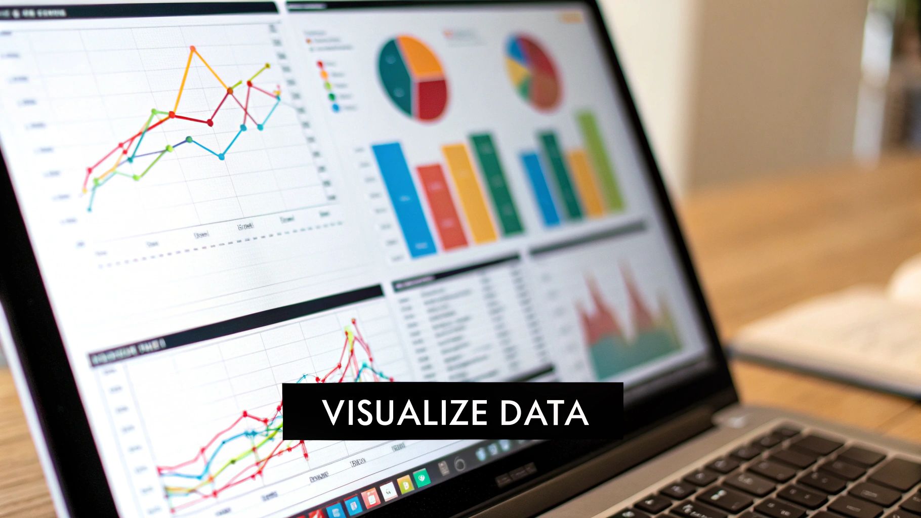
Visualise Insights and Take Action
Let's be honest—raw numbers in a spreadsheet rarely inspire anyone to act. The real magic happens when you transform that data into visual, easy-to-digest insights. This is where tools like Power BI are incredibly powerful. A well-designed KPI dashboard can instantly show you trends, outliers, and how you’re tracking against your goals.
For our founder with inventory issues, a Power BI financial dashboard could bring the problems to life by visualizing:
- Inventory turnover rates broken down by product category.
- Days of supply on hand for the top-selling items.
- The mounting carrying costs of slow-moving stock over time.
Seeing this information laid out visually makes it impossible to ignore. It turns abstract numbers into a clear, compelling story about what’s really happening in the business.
The final, and most crucial, part of the framework is creating a feedback loop. You absolutely must act on the insights you find, measure the results of those actions, and then continuously refine your strategy. Data is completely useless if it doesn't lead to better decisions.
This iterative cycle of questioning, analyzing, acting, and measuring is the true engine of sustainable growth. To explore this topic further, check out our comprehensive guide on the fundamentals of data-driven decision making. It provides an even deeper dive into putting these principles into practice.
Creating a Single Source of Truth for Your Business
The phrase ‘single source of truth’ gets thrown around a lot, but what does it actually mean for an SMB? Put simply, it’s having one central, undisputed place where all your key business data lives and, crucially, agrees with itself.
It’s the polar opposite of what most founders are dealing with: a chaotic mess of data silos.
You've probably lived this nightmare. The sales data in your CRM tells one story, but the numbers in your accounting software tell a completely different one. The result? Conflicting reports, hours wasted manually trying to match things up, and a deep-seated lack of trust in your own numbers. This disconnect is a massive roadblock in any genuine data driven decision making process.
Breaking down these walls between your data is the very first step toward getting clarity. It's all about making your different systems finally talk to each other without you having to play translator.
Integrating Your Disparate Data Sources
The end goal here is to build a central data hub—often called a data warehouse—that automatically pulls information from all your most important platforms. Imagine it like spokes on a wheel, all feeding into the centre. For most businesses, the key sources are:
- Financial Systems: Your core financial truth lives in tools like Xero or QuickBooks.
- Customer Relationship Management (CRM): This is where vital sales pipeline and customer info is stored, usually in platforms like HubSpot or Salesforce.
- Operational Software: This is a broad category, covering everything from inventory systems and project management tools to e-commerce platforms like Shopify.
Tying these together doesn't require a huge, expensive IT project. Modern business intelligence (BI) tools are built to connect to these common platforms easily, pulling all that crucial data into one place for analysis and BI automation.
The Critical Role of Data Cleaning and Structuring
Just connecting your data isn't enough. The next, and honestly most critical, step is cleaning and structuring it. Raw data is almost always messy—full of duplicates, weird formatting, and inconsistencies that will completely throw off your analysis. This is the source of that "Excel chaos" that drives so many founders crazy.
Data cleaning is about standardizing formats and getting rid of errors to ensure accuracy. Structuring, then, is about organizing that clean data logically so you can actually use it—for instance, making sure your sales data from your CRM maps correctly to the right financial periods in your accounting software.
A single source of truth isn’t just about having all your data in one place; it's about having all your trusted data in one place. This foundational work is what allows for true automation and reliable insights.
Power BI as Your Central Engine
This is where a tool like Power BI really shines, acting as the engine for your entire data strategy. It doesn't just connect to your various data sources; it also handles the heavy lifting of cleaning and transforming the data. From there, it presents everything in cohesive, interactive dashboards.
For SMBs, the benefits are felt almost immediately. Your teams stop arguing over which spreadsheet has the "right" numbers. Reports that used to take someone half a week to compile are now automated and updated in near real-time.
This newfound efficiency and alignment give you the confidence to actually trust your data and make bold moves based on it. With the global datasphere expected to hit an unbelievable 175 zettabytes by 2025, having a system to make sense of your small slice of it is no longer a nice-to-have; it's essential for survival. In fact, studies show this approach can boost operational efficiencies by 15-20%. You can find more surprising stats on how data is boosting business performance at Number Analytics.
Ready to stop wasting time on manual reports and finally align your teams around a single source of truth? Book your free BI consultation and see how Vizule can design your financial and operational dashboards in Power BI.
Designing Dashboards That Drive Action

Let's be honest, a dashboard crammed with charts is pretty useless on its own. Raw data is just noise. What you need is a well-designed dashboard that cuts through that noise and gives you a clear signal—one that guides your strategy and actually makes you do something.
For founders and operators, the goal isn't to show off every metric you can track. It’s about building a visual command centre that makes your most critical business insights impossible to ignore.
This is a massive part of a successful data driven decision making process. Instead of getting mesmerized by vanity metrics, the best dashboards laser-focus on a handful of KPIs that are a true reflection of your business's health.
For an SMB, this means zeroing in on the numbers that really move the needle, like:
- Cash Flow Reporting: Are you bringing in enough cash to keep the lights on and fund growth? A simple line chart tracking cash-in vs. cash-out is often the most important visual in the entire business.
- Sales Pipeline Health: What’s the total value of deals at each stage of your pipeline? How does that stack up against last quarter? Visualizing your pipeline gives you a much clearer picture for revenue forecasting.
- Customer Acquisition Cost (CAC): How much are you spending to get a new customer? Critically, is that number trending up or down over time?
The best dashboards tell a story. With a quick glance, you should be able to see what’s working, spot the problems, and know exactly what questions you need to ask next.
From Data Points to a Coherent Story
Building a dashboard that tells a compelling story is all about thoughtful design. It's not a competition to see how many charts you can squeeze onto one screen. It’s about arranging them logically to guide the viewer’s eye and reveal the connections between different metrics.
For example, put your marketing spend right next to your new customer numbers. This instantly shows the relationship between the two. If one chart shows a big spike in ad spend, the next one should show a corresponding lift in new leads. If it doesn't, well, that tells a powerful story all by itself.
Here is a sample Power BI dashboard tile that gets straight to the point.
This single tile instantly shows that Total Sales are on track. It highlights a positive variance against the goal and provides immediate context by comparing it to last year's performance. No digging required.
Practical Tips for Actionable Dashboards
To make your data impossible to ignore, you have to be smart with your visual cues. A few simple choices can completely change how your team understands and acts on the information you're showing them.
Key Design Principles:
- Use Colour with Purpose: Don't just make things colourful for the sake of it. Use colour to draw attention where it's needed. Think green for positive trends (like rising revenue) and red for negative ones (like increasing customer churn). Keep the rest of your colour palette simple and neutral.
- Choose the Right Chart for the Job: A line chart is perfect for showing a trend over time. A bar chart is fantastic for comparing different categories. A pie chart? Honestly, you should rarely use it for more than two or three categories. Picking the right visualization makes the insight jump off the screen.
- Put the Most Important Stuff First: Your most critical KPI—whether it’s revenue or cash flow—should live in the top-left corner of your dashboard. That’s where our eyes naturally go first. Less critical metrics can be placed further down or to the right.
When you apply these principles, you stop just reporting on data and start communicating insights that actually push people to take action.
For more ideas on using data to fuel your company's growth, you can learn more about how to drive growth with effective data analysis in our guide.
Fostering a Data-Driven Company Culture
Having the right tools and perfectly designed dashboards is a fantastic start, but it's only half the battle. A truly data-driven organization weaves data into the very fabric of its daily operations—its meetings, its conversations, and its core mindset.
Without this cultural shift, even the best business intelligence setup will fall flat and fail to deliver its full potential.
Cultivating this culture isn't about top-down mandates or trying to turn everyone into an analyst. It's about making data a shared, accessible resource that empowers your entire team. The goal is simple: move from a culture of opinions to a culture of inquiry, where "What does the data say?" becomes the most common and important question in the room.
Lead by Example
Change always starts at the top. As a founder or operator, you set the tone for how your company values information. One of the most powerful ways to do this is to completely change how you run your meetings.
Instead of kicking off a weekly sales meeting with anecdotes or gut feelings, put the Power BI sales dashboard on the big screen first. Walk through the numbers together. This one simple act sends a clear, powerful message: our decisions start with data, not assumptions. It instantly reframes the conversation around objective reality and pushes the team to think critically about performance.
Democratise Access to Data
Fear and resistance to a data-driven culture often come from a simple lack of access and understanding. When data is locked away in silos, accessible only to a select few, it feels like a tool for scrutiny, not a resource for improvement.
The key is to empower your team. Give them direct access to the dashboards and reports that are relevant to their roles. Encourage them to explore the data, ask their own questions, and find their own answers. When a team member can independently figure out why a particular initiative is succeeding or failing, they develop a genuine sense of ownership over the outcomes.
A data-driven culture isn’t about micromanagement. It’s about giving everyone on your team the clarity they need to make smarter, more autonomous decisions. It builds trust and aligns the entire company around shared, measurable goals.
Frame Data as a Tool for Improvement
It's absolutely crucial to address the human element of this transition. Some of your team members will inevitably see data as a way to "catch them out" or pass judgment on their performance. You have to proactively frame it as a tool for collective learning and improvement.
Use data to celebrate wins and diagnose challenges collaboratively. For example, if marketing campaign performance dips, the conversation shouldn't be about blame. Instead, it should be a collective investigation: "The data shows a drop in lead conversion. Let's dig into the dashboard together and figure out what changed."
This approach fosters psychological safety, making people far more willing to engage with the numbers honestly and openly. If you're looking for more guidance on this topic, our article on what is data-driven decision-making provides deeper insights into these principles.
Ultimately, building this culture is what transforms your organization from being reactive to proactive, paving the way for real, sustainable growth.
Common Questions About Building a Data Process
Jumping into a data-driven decision making process can feel like a huge undertaking, especially when you're an SMB owner already wearing a dozen other hats. It's totally normal to have questions about the complexity, the cost, and just… where to begin.
Let's tackle some of the most common concerns we hear from founders every day.
Is This Process Too Complex For a Small Business Owner?
Absolutely not. The goal isn't to turn you into a data scientist overnight. It’s about using data to get straight answers to your most important business questions. The secret is to start small and stay focused.
You don't need a hundred different metrics on day one. Just pick 3-5 critical KPIs that really show you the health of your business. For most, that means starting with things like:
- Monthly Recurring Revenue (MRR)
- Customer Acquisition Cost (CAC)
- Cash Flow
Modern tools like Power BI are built to be more intuitive than ever. Better yet, a consultancy like Vizule can build the foundational systems for you. That frees you up to focus on what really matters: interpreting the insights and making smart moves, not getting tangled up in the technical weeds.
How Much Does It Cost To Implement a System Like Power BI?
This is almost always less than founders think, especially when you stack it up against the hidden costs of not having a clear data process. Think about the real price of a bad inventory decision, or the dozens of hours your team sinks into manually pulling reports every single month.
A Power BI Pro license itself is just a low monthly fee per user. The main investment is in the initial setup—getting your scattered data sources talking to each other and designing dashboards that actually answer your questions. At Vizule, we specialize in creating cost-effective setups for SMBs that deliver a huge ROI by automating reporting and surfacing insights that directly boost your bottom line.
My Data Is a Mess. Where Do I Even Start?
Welcome to the club. This is the single most common starting point for our clients, and it's nothing to be ashamed of. You are not alone in the "Excel chaos."
The first practical step is a simple data audit. We'll sit down with you, identify the most crucial data points you need to hit your goals, and then map out where all that information currently lives. From there, we build an efficient pipeline to pull it all together and clean it up.
You don’t need to fix everything at once. We focus on getting your most important financial and operational data into a reliable, automated system first. This provides immediate value and a solid foundation you can build on over time.
The key is simply to start. The world of decision-making is moving fast, with 75% of leaders expecting Generative AI to completely shake up their industries. Gen AI is already speeding up the quality and pace of decisions by layering in advanced automation, which makes having a solid data foundation more critical than ever. You can read more about how Generative AI is transforming business decisions on Techment.
Ready to trade messy spreadsheets for clear, actionable insights? The team at Vizule can build the automated reporting stack you need to scale with confidence. Book your free BI consultation today and see exactly how we can help.


