


Are you staring at a spreadsheet, trying to figure out why sales dipped last quarter? Wondering which of your marketing channels are actually pulling their weight? You’re not alone. So many founders and operators feel like they’re drowning in data but starved for real answers. The whole point of trend analysis is to move beyond just what happened and uncover the why behind the numbers. It’s the key to shifting from reactive fire-fighting to proactive, insight-led decision-making.
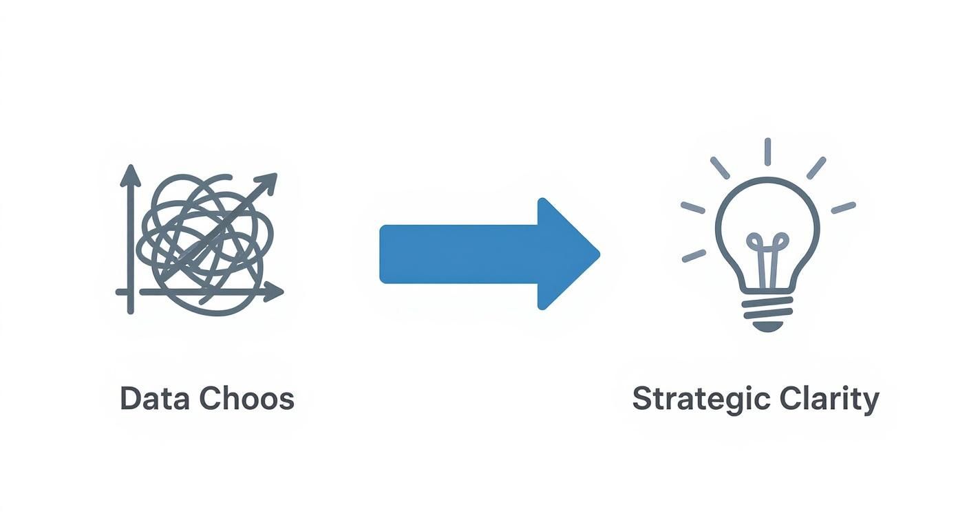
From Data Chaos to Strategic Clarity
Most SMBs have data everywhere—in Shopify, QuickBooks, and Google Analytics—but it’s all siloed. Stitching it together into a single, coherent picture feels like a full-time job. This is what we call “data chaos”—where your valuable time is spent copying and pasting numbers into fragile Excel models instead of spotting real growth opportunities.
Trend analysis is the way out of that mess.
It’s the practice of looking at your historical data to spot patterns, understand momentum, and make smarter decisions for the future. This isn’t a complex strategy reserved for enterprise corporations with large analytics departments. It’s a powerful, practical method for any SMB owner looking to scale smart.
The Power of Looking Back to Move Forward
The core idea is simple: what happened in the past holds the keys to your future. This approach has its roots in financial markets, where analysts have used historical charts for decades to understand market cycles. You can get a good primer on the concept of historical trend analysis over at diversification.com.
For your business, this translates into powerful advantages. You can finally:
- Pinpoint seasonal sales patterns to optimize inventory and marketing campaigns.
- Identify emerging customer preferences long before your competitors.
- Understand the real impact of a pricing change or a new ad campaign.
Let’s break down the shift that happens when you move from manual, siloed data to a clear, automated approach.
| Common Pain Point | Trend Analysis Solution | Business Impact |
|---|---|---|
| “I spend hours every week just pulling reports.” | Automated data aggregation that connects all your sources into a single, unified view. | Time Saved: Frees you and your team to focus on strategy and growth, not manual data entry. |
| “Our Shopify and ad spend data don’t line up.” | A “single source of truth” where all metrics are standardized and reconciled automatically. | Increased Trust: You can finally make decisions with confidence, knowing your numbers are accurate. |
| “Why did our sales suddenly drop last month?” | Historical performance dashboards that reveal patterns, seasonality, and the impact of key events. | Proactive Strategy: Move from reacting to problems to anticipating them and capitalizing on opportunities. |
| “I’m not sure which marketing channels are working.” | Clear attribution models that show the direct link between marketing activities and revenue. | Higher ROI: Stop wasting money on what isn’t working and double down on your most profitable channels. |
See the difference? It’s about turning a reactive, time-consuming task into a proactive, strategic advantage.
Trend analysis transforms your historical data from a simple record of what happened into a strategic roadmap for what to do next. It shifts the conversation from “What were last month’s sales?” to “Why did sales increase, and how can we make that happen again?”
Ultimately, figuring out how to perform trend analysis lets you stop guessing and start knowing. It connects the dots between your daily operations and your bottom line, turning messy data into a clear competitive advantage.
Want to automate your reporting and finally trust your data? It all starts with getting your data house in order.
Preparing Your Data for Meaningful Analysis
Great trend analysis doesn’t start with a fancy chart. It starts with a sharp, focused question. A vague goal like “increase sales” is too broad to be actionable. The real magic happens when you ask specific, business-focused questions that guide your entire process.
For example, instead of a fuzzy objective, ask: “What is the trend in customer lifetime value for customers we acquired through paid social media over the last 18 months?” Now that’s a question with teeth. It gives you a clear metric (LTV), a specific segment (paid social acquisition), and a concrete timeframe (18 months).
Defining Your Objectives Clearly
Before you pull any data, you must nail down what you’re trying to figure out. This clarity prevents you from drowning in a sea of numbers and ensures every step you take has a purpose.
For an SMB founder or operator, effective questions might sound like this:
- Which product categories have seen the most significant sales growth quarter-over-quarter?
- How has our average customer acquisition cost (CAC) trended since we adjusted our ad spend strategy six months ago?
- Is there a seasonal pattern to customer churn that we can proactively address?
Framing these precise questions upfront is crucial. It dictates exactly which data you need to consolidate and analyze.
Consolidating and Cleaning Your Data
Once you know what you’re looking for, you hit the biggest hurdle for most SMBs: getting the data. Your information is likely scattered. Shopify holds your sales data, QuickBooks has the financials, and Google Analytics tracks website behavior. These platforms don’t talk to each other, creating data silos—a major roadblock to accurate analysis.
Trying to pull this all together manually is not just a massive time-sink; it’s a recipe for errors. Inconsistencies, duplicate entries, and missing values can completely torpedo your results, leading you to the wrong conclusions.
The quality of your insights is directly tied to the quality of your data. You can’t build a reliable strategy on a shaky foundation of messy, inconsistent information.
This is where you move from data chaos to strategic clarity. When your data is organized in a single source of truth, you can finally unlock actionable insights.
This journey from a tangled mess of disconnected data to a state of clarity is the whole point of a structured analysis. This is where tools like Power BI become so valuable, letting you build a central, automated system that pulls all your different data sources together into a proper data model.
Preparing your data isn’t just about tidying up spreadsheets. It’s about building a foundation you can trust. For a deeper dive into this foundational step, check out our detailed guide on how to improve data quality. Once that’s sorted, you can start uncovering the trends that truly matter to your business.
Choosing the Right Trend Analysis Method
Once your data is clean and organized, it’s time to let the numbers tell their story. There’s no single, one-size-fits-all method for trend analysis; the best approach depends entirely on the business question you want to answer.
Think of these methods as different lenses, each designed to bring a specific part of your business into sharp focus. Let’s walk through a few practical techniques that are incredibly useful for SMBs, using a simple e-commerce store as our example.
Temporal Analysis: What Happened Over Time?
Temporal analysis is typically the first stop. It’s the practice of tracking your data over specific periods—days, weeks, months, or years—to spot patterns, seasonality, and momentum. It answers the most fundamental questions about your business rhythm.
For an e-commerce store, this might reveal that a particular line of outdoor gear consistently sees a sales spike every September. That’s not a random blip; it’s a predictable trend. Armed with that insight, you can plan your inventory, ramp up your marketing spend in August, and prepare your team for the surge. This is the heart of time-series analysis, a core part of business forecasting.
Temporal analysis moves you from simply reporting on past performance to actively anticipating future demand. It turns historical data into a strategic calendar for your business operations.
Geographic Analysis: Where Are Things Happening?
Geographic analysis helps you understand the “where” behind your performance. By mapping your data, you can spot regional patterns and opportunities that are invisible in a spreadsheet. This is powerful for businesses with a physical presence or those running targeted marketing campaigns.
Imagine your e-commerce store launches a new digital marketing campaign. A geographic analysis might show that while overall traffic is up, the campaign is resonating exceptionally well in a specific city, like Austin, Texas. That insight is pure gold. It tells you exactly where to double down on your ad spend or perhaps explore local partnerships to capitalize on the momentum.
Comparative and Correlation Analysis
Beyond looking at your own data in a vacuum, a few other methods can offer deeper strategic value.
- Comparative Analysis: This is all about benchmarking your performance against competitors or industry standards. While getting direct competitor sales data is tough, you can compare metrics like market share, social media engagement rates, or website traffic using third-party tools.
- Correlation Analysis: This technique helps you see the relationship between two different variables. It’s less about direct cause-and-effect and more about understanding what moves together. For example, does your website traffic increase when you spend more on Google Ads? A simple correlation analysis can confirm that relationship, giving you more confidence in your marketing budget.
Selecting the right method comes down to the question you’re trying to answer. The table below can help you match your business question to the right technique.
Which Trend Analysis Method Is Right For You?
This table is a practical guide to help you select the appropriate analysis technique based on the question you are trying to answer.
| Business Question | Recommended Method | Example Application |
|---|---|---|
| “How did our sales perform each month last year?” | Temporal Analysis | Plotting monthly sales figures on a line chart to identify seasonality and growth trends. |
| “Which of our marketing campaigns is driving the most traffic?” | Comparative Analysis | Comparing website traffic from different sources (e.g., social media, email, paid ads) in a bar chart. |
| “Are there specific regions where our new product is popular?” | Geographic Analysis | Using a map visualization to show sales concentration by city or state to find emerging markets. |
| “Does our ad spend actually lead to more sales?” | Correlation Analysis | Creating a scatter plot with ad spend on one axis and sales revenue on the other to see if there’s a relationship. |
| “What are our projected sales for the next quarter?” | Time-Series Forecasting | Using historical sales data to build a predictive model that forecasts future performance. |
Understanding which method to apply is a key step in mastering time-series forecasting techniques, which allow you to build much more accurate financial and operational models. The goal is always to move beyond raw numbers and find the patterns that drive strategic, confident decisions.
Bringing Your Trends to Life with Power BI
You’ve got clean data and a solid analysis plan. But rows of numbers in a spreadsheet don’t scream “actionable insight.” This is where a modern business intelligence tool like Microsoft Power BI comes in, turning that raw data into a visual story that your team can actually use to make smart decisions.
This is how you graduate from static Excel charts to dynamic, automated dashboards. Let’s walk through how to build a simple but effective trend analysis dashboard that finally tells you what your data has been trying to say.
Choosing the Right Visuals for Your Story
The first rule of Power BI is to pick the right chart for the job. Every visual is designed to answer a different kind of question, and using the right one makes your trends obvious in seconds.
- Line Charts: These are your go-to for any time-series data. Tracking monthly recurring revenue (MRR) or website traffic over the past two years? A line chart is the simplest, most powerful way to show if things are trending up, down, or moving with the seasons.
- Bar & Column Charts: Perfect for straightforward comparisons. Need to know which product category brought in the most revenue last quarter? A bar chart makes the winner jump off the screen.
- Maps: You can’t beat a map for geographic analysis. Trying to figure out where your customers are concentrated? A map instantly highlights hotspots and regional patterns that a table of city names would obscure.
Nailing the right visual means your team gets the message instantly, without having to squint at a spreadsheet and try to connect the dots themselves.
Designing a Dashboard That Drives Action
A great dashboard isn’t just a gallery of pretty charts. It’s a focused, interactive tool built for exploration and decision-making. Good design naturally guides the user’s eye to what’s most important.
It’s all about making connections. For example, in financial analysis, you wouldn’t just look at the MSCI USA Index in a vacuum. You’d compare it to the MSCI All Country World Index (ACWI) to see how U.S. stocks are performing against the global market. A dashboard lets you see these correlations—how one trend influences another—and that’s where the real insights are found.
A well-designed dashboard doesn’t just present data; it invites questions. It empowers you to drill down, filter, and explore the ‘why’ behind the numbers in real-time.
You don’t need to be a graphic designer to get there. Stick to a few core principles. Use color sparingly to highlight what’s critical. And most importantly, build in slicers and filters. These interactive elements let anyone—from sales to marketing—slice the data by date range, product, or region to answer their own questions.
For a deeper dive into building reports that are both beautiful and effective, check out these best practices for Power BI.
Ultimately, your goal is to create a living report that makes your old manual spreadsheets obsolete. Our guide on dashboard design best practices is a great place to start. This is how you shift trend analysis from a painful, periodic project into a continuous, automated part of your business rhythm.
Turning Your Analysis into Actionable Decisions
A stunning Power BI dashboard is a great start. But its real value isn’t in the charts themselves—it’s in the smart, confident decisions they empower you to make. The final, most critical step is translating those visual patterns into a concrete action plan.
This is where you switch from observer to strategist. When you spot a trend, the goal is to look past the obvious and start asking deeper “why” questions. A dip in sales isn’t just a dip; it’s a signal to investigate.

From Interpretation to Action Plan
To get to the root cause of any trend, you need to peel back the layers with your questions.
- Is this a blip or a fundamental shift? Compare what you’re seeing to historical data. A single bad month might be an anomaly, but a steady six-month decline is a clear sign that something has changed.
- What external factors are at play? No business operates in a vacuum. Did a new competitor launch? Was there an industry-wide policy change? Sometimes the cause of a trend lives outside your own four walls.
- What internal actions line up with this trend? Look at your own activities. Did that spike in website traffic start right after you launched a new ad campaign? Did the drop in customer retention coincide with a pricing change?
A trend is a conversation starter, not a conclusion. Your job is to use the data to ask better questions, investigate the root causes, and build a hypothesis you can actually test.
Building a Framework for Response
Once you have a strong hypothesis, you can build an actionable response.
Let’s say your analysis reveals a consistent decline in repeat customer purchases over the last two quarters. Your hypothesis is that customer loyalty has weakened.
Your action plan might involve a few targeted initiatives:
- Launch a Customer Loyalty Program: Directly incentivize repeat business with exclusive rewards.
- Conduct Customer Exit Surveys: Email customers who haven’t purchased in 90 days and ask for direct feedback to find out why they left.
- A/B Test a Re-engagement Email Campaign: Try different offers to see which is most effective at bringing back lapsed customers.
This framework applies to any industry. For a different practical application, exploring reports on market trends in golf course operations can provide valuable insights into turning sector-specific analysis into actionable decisions.
Historical trend analysis also applies on a macroeconomic scale. Analyzing indicators like GDP growth rates and inflation gives valuable insights into global economic trends that influence investment decisions and policy-making. You can discover more about how global economic data informs strategy at Trading Economics.
The final piece of the puzzle is monitoring the impact of your actions. Your dashboard isn’t just for finding problems; it’s for confirming your solutions are working.
Want to bridge the gap between data and decisive action? See how Vizule can help automate your reporting stack.
Answering Your Trend Analysis Questions
Even with a clear roadmap, a few practical questions always pop up when business owners first start with trend analysis. Let’s tackle the most common ones to get you started on the right foot.
How Often Should I Actually Be Looking at This Stuff?
There’s no magic number. The right frequency depends on the metric and the natural pace of your business.
Here’s a simple framework:
- Operational Metrics: These are fast-moving numbers like daily website traffic or weekly sales. A weekly review is perfect for these. They’re the canaries in the coal mine, giving you an early warning if something’s off.
- Strategic Metrics: Think bigger picture here—things like customer lifetime value or quarterly profit margins. These don’t shift dramatically day-to-day. A monthly or quarterly check-in is plenty to see long-term patterns without getting lost in daily noise.
The key is consistency. Pick a rhythm that works for you and stick with it. That’s how you build an intuitive feel for the patterns in your business over time.
Don’t fall into the “analysis paralysis” trap. Smart trend analysis isn’t about staring at every metric every day. It’s about setting a consistent cadence to review the right data at the right time.
What’s the Best Tool for a Small Business to Use?
Look, everyone starts with Excel. It’s familiar and it works… for a while. But it quickly becomes a bottleneck. All that manual exporting, updating formulas, and tweaking charts is a massive time sink—and it’s incredibly prone to error.
For any business serious about growth, moving to a dedicated business intelligence (BI) tool like Power BI is the logical next step. It’s a game-changer. It automates your entire data pipeline, connecting directly to your sources—like Shopify or QuickBooks—to create a single source of truth.
This means your dashboards are always up-to-date with live data. This saves you dozens of hours a month and, more importantly, gives you numbers you can finally trust.
Making the leap from Excel chaos to a modern BI platform is the single most impactful change you can make to turn trend analysis into a sustainable, strategic part of your operations.
Ready to stop wrestling with spreadsheets and start getting clear, automated insights? Vizule specialises in building the BI and financial reporting engines that empower SMBs to make truly data-driven decisions.
Book your free BI consultation and let’s talk about how we can connect the dots in your data.


