


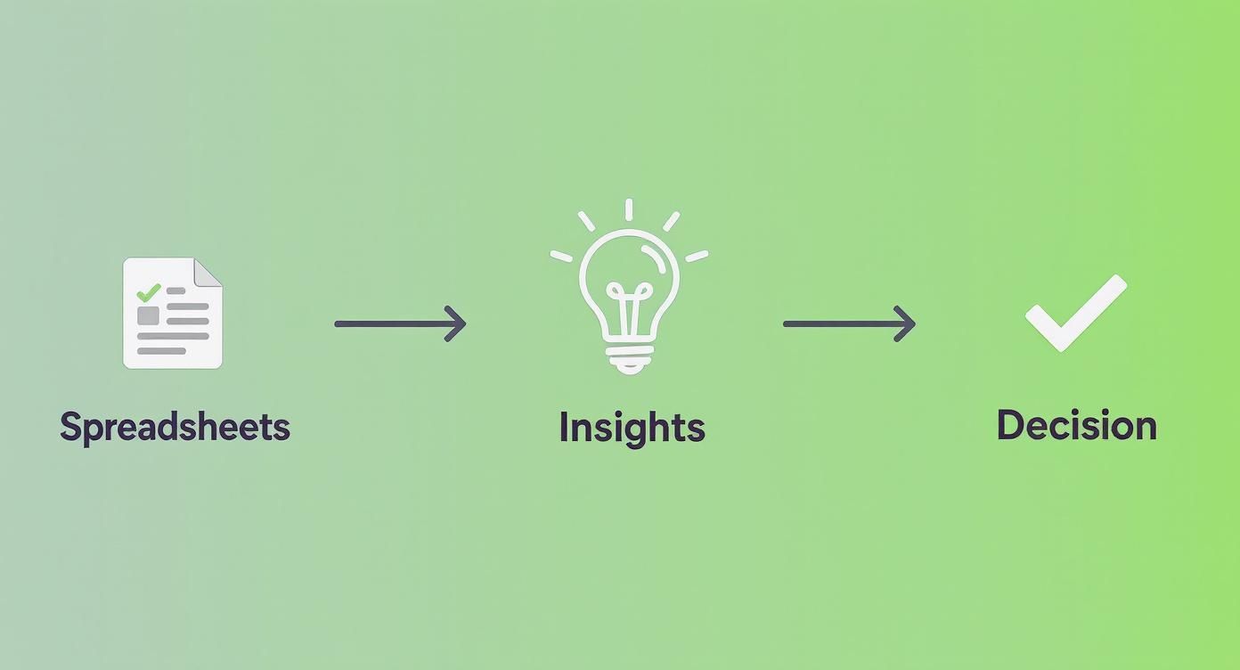
Actionable insights are what turn raw, messy numbers into clear, confident business decisions. For small and medium-sized business owners, this means transforming your data from a source of stress into your most valuable strategic asset. This isn't a luxury reserved for massive corporations anymore; it’s a non-negotiable for scaling smart.
The real shift happens when you move from simply reporting what happened to truly understanding why it happened—and what you should do about it next. This guide will walk you through the practical steps to get there.
Why Your Spreadsheets Are Costing You More Than You Think
If your business is stitched together with a patchwork of spreadsheets and disconnected software, you're not alone. So many founders I talk to feel like they're making critical decisions with one hand tied behind their back. But this frustration is more than just an inconvenience; it's a massive bottleneck holding your business back from its true potential.
The real costs of guesswork and manual reporting are steep. You're constantly wrestling with outdated numbers, conflicting data from different teams, and a nagging uncertainty about how you're really performing. This isn't just a technical problem—it's a strategic one that hits your bottom line, hard.
The Hidden Costs of Manual Data Management
Leaning on static spreadsheets creates a few expensive problems that often fly under the radar until it's too late:
- Wasted Hours: Think about how much time your team spends manually exporting, copying, and pasting data. They should be analyzing, not just assembling. This repetitive work is a breeding ground for human error, which can lead to disastrous decisions based on faulty information. Tackling common data quality issues is always the first step to winning back those lost hours.
- Delayed Decisions: By the time a manual report is finally pieced together, the data is already old news. In a market that moves at lightning speed, making calls based on last week's—or last month's—numbers means you’re always playing catch-up.
- Lack of Trust: What happens when the sales spreadsheet doesn't match the finance report? Who do you believe? This kind of data distrust kills confidence and turns meetings into endless debates instead of forums for decisive action.
The biggest issue with spreadsheets isn't just their limitations; it's the false sense of security they provide. They make you feel like you're in control while hiding the most critical insights between the rows and columns.
Moving from Guesswork to Growth
Shifting to a data-driven operation isn't just a trend; it's a proven strategy for serious growth. Back in 2021, about 67% of business leaders had already launched initiatives to become more data-driven. The payoff? Businesses using predictive analytics saw an average revenue bump of 15%. That's the real-world value of turning raw numbers into strategic guidance.
Moving beyond static reports and embracing modern financial services business intelligence tools is how you start making smarter, faster decisions. It’s about building a system where your data finally works for you, automatically surfacing the actionable insights you need to scale with confidence.
Creating a Single Source of Truth for Your Business
If you want to pull genuinely actionable insights from your data, you first need a reliable place where all your numbers live and agree with each other. For most business owners, this sounds like an expensive, complex project reserved for data engineers. It isn't.
Think of it as connecting the dots between the systems you already use—your accounting software, CRM, sales platform, you name it. The goal is to build a single, trustworthy view of your business. This is what we call a single source of truth, and it’s the key to ending the dreaded "Which spreadsheet is the right one?" debate for good.
Essentially, we're bringing fragmented information together into one unified data warehouse. It’s a simple concept that takes you from scattered data to clear, confident decisions.
This journey from manual spreadsheets to insight-driven choices is the absolute core of building a data-first culture.
Why Power BI Is a Game-Changer for SMBs
For years, creating this kind of unified view felt out of reach for smaller businesses. That’s all changed. Tools like Microsoft Power BI now offer enterprise-level capabilities without the massive budget.
Power BI lets you connect directly to hundreds of data sources, from basic Excel files to cloud apps like QuickBooks Online or HubSpot. It becomes the central hub where all your business logic lives, making sure every report and KPI is calculated the same way, every time. You can dive deeper into this foundational concept in our guide to creating a single source of truth for your data.
A Real-World Scenario: Project Profitability
Let’s get practical. Imagine you run a service-based business. You track project hours in one system, invoices in another, and your sales pipeline in a third. Answering a simple question—"Which of our projects are actually profitable?"—turns into a nightmare of manual data wrangling.
By linking these three systems in Power BI, you can instantly see the whole story.
- Financial Data (QuickBooks): Revenue and direct costs per project.
- Operational Data (Time-Tracking App): Billable vs. non-billable hours logged by your team.
- Sales Data (CRM): The initial project scope and quoted price.
Suddenly, you can see that a project that looked great on paper actually lost money because of scope creep and excessive non-billable hours. This is a classic actionable insight—one you would have completely missed when your data was stuck in different silos.
Getting this right is critical. Data-driven companies are 23 times more likely to acquire new customers and six times more likely to retain them. And according to McKinsey, over 90% of organizations in 2023 saw real value from their analytics investments, from better efficiency to happier customers.
This initial step isn’t just about the technology; it’s about building a foundation of trust in your numbers. It’s the essential groundwork for everything that comes next: automating reports, designing powerful dashboards, and finally making decisions with complete confidence.
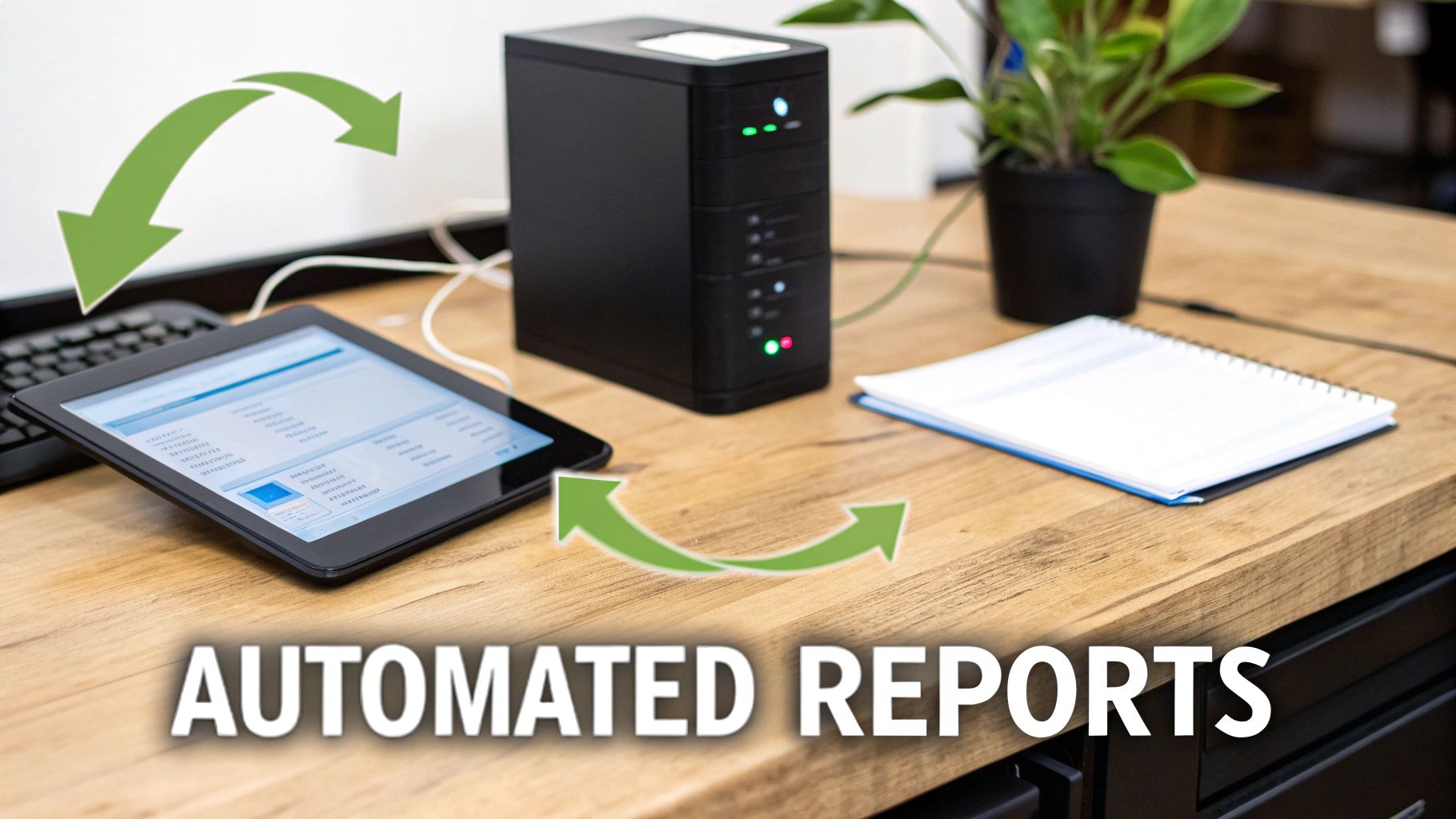
How to Automate Your Reporting and Analysis
Once your data lives in a single, trusted place, the real fun begins: putting your reporting on autopilot.
Let's be honest, manual reporting is a massive time sink. I’ve seen founders and their teams lose countless hours every week to the mind-numbing cycle of exporting, cleaning, and copy-pasting numbers into a spreadsheet. This isn't just inefficient; it’s a breeding ground for costly human errors. One wrong copy-paste can throw off your entire forecast.
Setting up automated data workflows completely changes the game. Imagine this: data is automatically pulled from all your sources, cleaned up, and refreshed in your dashboards every single morning before you’ve even had your coffee. This shift moves your team’s focus from building reports to actually analyzing them—finding the insights that actually drive growth.
From Static Reports to Dynamic Models
Automation is about so much more than just updating charts. It unlocks the potential for dynamic, driver-based financial models, a seriously powerful tool for any SMB operator. Instead of plugging numbers into a fragile spreadsheet, you can build models directly in a tool like Power BI that allow you to run powerful "what-if" scenarios on the fly.
Suddenly, you can get instant answers to critical business questions:
- "What happens to our cash flow if we hire two new salespeople this quarter?"
- "How will a 10% price increase on our core product affect our gross margin?"
- "If we invest an extra $5,000 in marketing, what’s the projected impact on lead generation and customer acquisition cost?"
These aren't just hypotheticals. This is strategic planning powered by data that is always accurate and up-to-date. Instead of spending your time chasing down numbers, you can explore possibilities. If you're currently stuck in the spreadsheet cycle, our guide on how to automate Excel reports is a great place to start reclaiming your time.
By automating the 'what,' you free up your team's brainpower to focus on the 'so what' and 'now what.' That's where the real value is created.
This move toward automation is only getting faster. The integration of AI into analytics has dramatically improved the speed and quality of insights. By 2025, it’s predicted that 75% of businesses will have integrated AI into their analytics. Companies that jump on this are expected to see a 25% increase in operational efficiency. It means you can spot trends and flag anomalies with minimal human intervention.
Ultimately, automation isn't about replacing people; it's about empowering them to make smarter, faster decisions. It’s the engine that consistently delivers the actionable insights you need to navigate challenges and jump on opportunities.
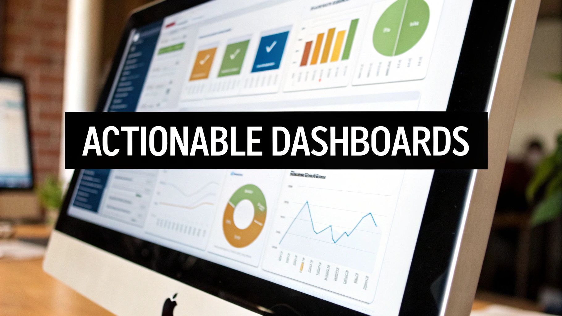
Designing Dashboards That Actually Drive Decisions
Once your reporting is automated, the real work begins: presenting that information in a way that sparks action, not confusion. A dashboard is only as good as the decisions it helps you make. For small and medium-sized businesses, it's all too easy to fall into the trap of tracking everything, which just creates cluttered, overwhelming visuals that nobody ends up using.
Let's be clear: the goal isn't to build pretty charts. It’s to design a decision-making engine. This means zeroing in on a handful of core Key Performance Indicators (KPIs), using visuals that directly answer your most pressing business questions, and creating an obvious information hierarchy. Your most important number should always be the biggest and most prominent. Simple as that.
From Vanity Metrics to Actionable Metrics
One of the biggest pitfalls for any business owner is getting distracted by "vanity metrics." These are the numbers that look great on the surface and feel good to report, but they don't actually reflect the health or growth potential of your business. Generating actionable insights from data demands a ruthless focus on the metrics that truly matter.
For example, a big spike in website traffic feels fantastic, but if none of those new visitors convert into paying customers, it’s just noise. Real insight comes from connecting that traffic to tangible business outcomes. We've actually put together a detailed guide that dives deeper into these principles, covering essential dashboard design best practices to help you separate the signal from the noise.
To make this crystal clear, you need to distinguish between metrics that feel good and metrics that actually drive strategic decisions.
Vanity Metrics vs Actionable Metrics
| Metric Category | Vanity Metric (What to Avoid) | Actionable Metric (What to Track) | Why It Matters |
|---|---|---|---|
| Marketing | Social Media Followers | Customer Acquisition Cost (CAC) | CAC tells you precisely how much you're spending to get a new customer, directly impacting profitability. Followers don't pay the bills. |
| Sales | Number of Demos Booked | Sales Conversion Rate by Source | This shows which channels are delivering valuable leads that turn into revenue, allowing you to double down on what works. |
| Product | Total App Downloads | Monthly Active Users (MAU) | Downloads don't indicate engagement. MAU tells you how many people find your product valuable enough to use it regularly. |
| Finance | Total Revenue | Gross Profit Margin | Revenue is a top-line number, but margin shows how efficiently your business is operating and what's left to reinvest in growth. |
This distinction is fundamental. Actionable metrics are the ones that, when they change, demand a specific response from you or your team. They force a conversation.
A great dashboard doesn't just show you data; it asks you a question. "Our customer churn rate increased by 3% this month. What are we going to do about it?" That's the start of an insight-led conversation.
Real-World Dashboard Examples
To bring this out of the theoretical, let's look at two common scenarios for SMBs.
-
The Consulting Firm Cash Flow Dashboard: A consulting firm lives and dies by its cash flow. An effective dashboard here wouldn't just show the current bank balance. It would visualise cash-on-hand, your projected monthly burn rate, accounts receivable aging (who owes you money and for how long), and a 90-day cash flow reporting forecast based on your current sales pipeline. This view immediately highlights if you need to start chasing invoices or pull back on spending.
-
The B2B Sales Pipeline Dashboard: A B2B company needs a clear, unflinching view of its pipeline health. A powerful dashboard would track the total value of deals at each stage, the average sales cycle length, and the lead-to-close conversion rate. This allows a founder to see at a glance if the pipeline is healthy enough to hit next quarter's revenue target or if the team needs to generate more top-of-funnel leads—pronto.
To see more examples of how dashboards can be built to provide these kinds of insights, you can explore various use cases for Analytics Reporting Dashboards. When designed this way, your dashboards are transformed from static reports into dynamic tools that fuel your daily decisions and long-term strategy.
Building a Culture That Runs on Data
Powerful dashboards and automated reports are fantastic tools, but they can't drive growth on their own. The real value is unlocked only when your team actually uses them to make smarter decisions—every single day. Honestly, uncovering actionable insights from data is only half the battle. The other half is creating a culture where data becomes the default language for talking about performance.
This is the human side of your data journey. It’s all about shifting from gut-feel decisions to ones backed by solid evidence. You can’t just drop a new dashboard in your team's lap and expect them to use it. You have to intentionally weave it into the very fabric of your operations.
Making Data a Daily Habit
Embedding data into your company’s DNA starts with small, consistent actions. The goal is simple: make data-driven conversations the norm, not a rare event.
Here are a few practical ways I’ve seen work wonders:
- Kick off meetings with data. Start every weekly leadership or sales meeting with a five-minute review of the relevant KPI dashboard. This immediately frames the entire conversation around objective numbers.
- Ask the right questions. Get your team into the habit of asking, "What does the data say?" before proposing a new idea or making a significant decision. That one simple question can completely transform your internal dialogue.
- Make it visible. Put key dashboards up on screens in common areas. When performance metrics are always visible, they stay top-of-mind for everyone.
The ultimate goal is to reach a point where your team feels uncomfortable making a key decision without consulting the data first. That’s the real sign the cultural shift is taking hold.
Measuring the ROI of Your BI Investment
So, how do you know if all this effort is actually paying off? Measuring the return on your business intelligence investment isn't just about tracking dashboard usage. It's about connecting your data initiatives to tangible business outcomes.
You should be able to draw a straight line from your insights to real improvements in core metrics like profit margins, customer retention, or operational efficiency. For instance, did the insights from your new sales dashboard lead to a 10% reduction in customer acquisition costs? That's a clear, measurable win.
Guiding your team through this kind of change is a critical discipline in itself. For a deeper look at making new habits stick, you can explore the principles of effective organizational change management.
Ultimately, building this culture isn't a one-off project; it's an ongoing commitment. It takes leadership buy-in, team training, and a constant focus on turning those hard-won insights into action.
Want to automate your reporting and finally trust your data? Book a free call with our BI consultants today, and let's map out your path from data chaos to confident decision-making.
Your Questions Answered
Even after laying out the full journey from messy spreadsheets to clear, confident decisions, it's completely normal to have a few practical questions. For most business owners I talk to, it usually boils down to three things: cost, the sheer complexity of it all, and getting the team to actually use the new tools.
Let's tackle those head-on.
How Much Will This Actually Cost? I'm Thinking of Power BI.
This is almost always the first question, and the answer is usually much less than founders brace themselves for. The main tool where all the magic happens, the Power BI Desktop application, is completely free to download and use.
The real cost kicks in when you need to share reports and work together as a team. That requires a Pro license, which is a surprisingly affordable per-user, per-month subscription.
Honestly, the software is the cheap part. The true investment is in getting the setup right from the start. Partnering with a specialist like Vizule to build that solid, scalable data foundation is almost always more cost-effective than the months of frustration and dead-ends that come from trying to figure it all out internally.
My Data Is a Complete Mess. Where Do I Even Begin?
If you're thinking this, welcome to the club. You're in the majority. Nearly every single client we work with starts right here, feeling buried under years of inconsistent data scattered across a half-dozen different systems.
The secret is to stop trying to boil the ocean.
The best way forward is to pick one single, high-impact business question and start there.
- What is our true cash flow, day by day?
- Which service line is actually our most profitable?
- What are our real sales pipeline conversion rates at each stage?
We help our clients nail down that one critical question. Then, we focus only on the data needed to answer it and build a simple, powerful dashboard around it. This first win delivers immediate value, builds momentum, and proves the concept to your entire team.
Don't let the hunt for perfect data stop you from getting good data. Actionable insights come from asking the right questions, not from having flawless spreadsheets. The process of building that first dashboard is what shines a light on the data issues you need to fix.
How Do I Make Sure My Team Actually Uses These Dashboards?
This is the most important question of all. A brilliant dashboard that no one looks at is just a pretty picture—it's worthless. Adoption is everything.
The key is to build the dashboards with your team, not just for them.
Get your key people involved from day one in defining the KPIs that matter to their jobs. When they have a hand in creating the tool, they're invested in its success.
Then, you have to bake it into your daily operations. Make it a non-negotiable part of your meetings. If your weekly leadership huddle now starts by reviewing the main KPI dashboard on a big screen, it stops being "another piece of software" and quickly becomes the indispensable tool you use to run the business.
Ready to stop guessing and start making confident, data-backed decisions? The team at Vizule helps businesses just like yours turn data chaos into a serious competitive advantage. Book your free BI consultation and let's map out your path to actionable insights.


