


Are you tired of navigating a maze of spreadsheets just to answer a simple question: "How is the business really doing?" For SMB owners, founders, and operators, this isn't just an inconvenience; it's a critical blind spot that hinders growth. Manual reporting is slow, error-prone, and creates data silos that prevent a holistic view of performance across finance and operations. This spreadsheet chaos keeps you stuck in reactive fire-fighting instead of proactive, insight-led growth.
The solution is a well-designed executive dashboard—your single source of truth for strategic decision-making. But finding the right inspiration can be a challenge. This guide cuts through the noise. We have curated a list of the best executive dashboard examples and templates from leading platforms like Power BI, Tableau, and Looker Studio.
Each example includes a breakdown of its strategic value, key KPIs, and what makes it effective for a founder or SMB leader. You will learn not just what to track, but how to design dashboards that transform raw data into actionable clarity. For more inspiration, particularly within the financial domain, explore these additional 7 Top Financial Dashboard Examples.
Let’s dive into the blueprints that will help you automate your reporting and finally trust your data.
1. Vizule: Custom Power BI Dashboards for SMBs
Instead of a one-size-fits-all template, Vizule's consultancy-led approach delivers custom-built executive dashboards in Power BI, tailored specifically to the strategic needs of small and medium-sized businesses (SMBs). This is a standout solution for founders and operators aiming to move beyond manual spreadsheet chaos and embed a culture of data-driven decision-making. The service combines business intelligence advisory, data automation, and driver-based financial modelling to transform scattered data into a unified, actionable asset.
The core of the offering is a rapid, three-step Map → Model → Mobilise process designed to deliver tangible results—and a fully functional dashboard—within approximately 30 days. This accelerated timeline is ideal for agile businesses that need to see a return on investment quickly. The hands-on, consultative method ensures the final product is not only technically sound but also strategically aligned with your company's most critical key performance indicators (KPIs).
Strategic Analysis: From Messy Data to Actionable Insights
What sets Vizule apart is its commitment to an automation-first philosophy. The primary goal is to eliminate the routine, error-prone tasks of manual data aggregation that often consume finance and operations teams. By building automated data pipelines from your existing tools (like Xero, HubSpot, or your CRM), they create dynamic Power BI dashboards where metrics update in real-time. This frees up your team to focus on high-value strategic analysis rather than data entry.
Furthermore, the engagement goes deeper than surface-level metrics. Vizule integrates driver-based financial modelling to uncover the true levers of business growth.
Key Strategic Insight: By focusing on driver-based models, Vizule helps executive teams move from asking what happened to understanding why it happened. This allows for more accurate forecasting and effective scenario planning, giving you a powerful tool to test the potential impact of strategic decisions before they are made.
This approach is particularly valuable for founders and finance leaders, who can leverage these models to align financial forecasts with operational realities, creating a single source of truth that the entire organisation can trust. For a deeper look at the tools involved, their guide to choosing the right business intelligence software provides excellent context on building a modern data stack.
Actionable Takeaways & Implementation
- Start with a Discovery Call: Before committing to a full-scale dashboard project, engage in a discovery call. Vizule’s "Map" phase identifies your data sources, defines key business questions, and aligns on KPIs. This foundational step is crucial for success.
- Focus on Adoption: A dashboard is only effective if your team uses it. Vizule’s model includes team training and iterative deployments—best practices for any SMB. Involve your team in the process to build ownership and proficiency.
- Think End-to-End: Avoid siloed solutions. Vizule’s strength lies in its integrated service covering data integration, financial modelling, Power BI visualisation, and strategic advisory. This reduces complexity and ensures a cohesive final product.
| Feature Analysis | Key Benefit for Executives |
|---|---|
| Automation-First Pipelines | Reduces manual reporting overhead by up to 90%, freeing up your team for strategic work. |
| Driver-Based Financial Models | Enables dynamic scenario planning and more accurate, defensible financial forecasts. |
| Advanced Causal Analysis | Uncovers hidden growth levers, moving beyond vanity metrics to identify high-impact initiatives. |
| Consultancy-Led Delivery | Provides expert guidance to ensure the final dashboard aligns with strategic goals and drives adoption. |
While a custom build requires a greater initial investment than a simple software subscription, the ROI is delivered through deep strategic alignment, automation, and the creation of a sustainable data asset. It is an exceptional choice for leadership teams ready to invest in a true data-driven foundation for their business.
Want to automate your reporting and finally trust your data? Book a free discovery call with Vizule's BI consultants today.
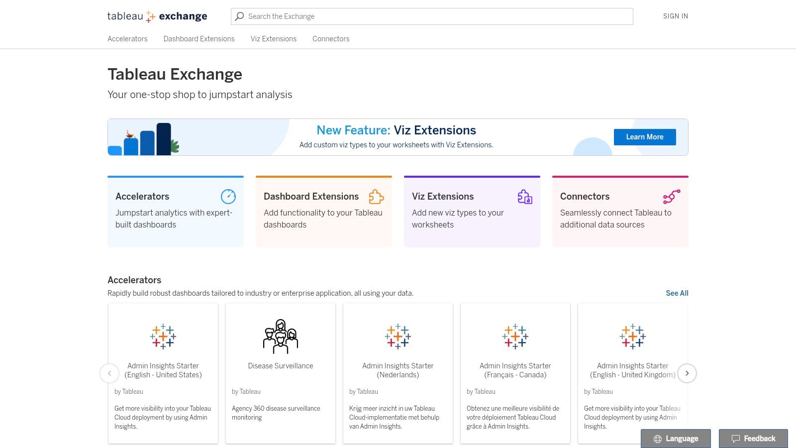
2. Tableau Exchange (Accelerators – Executive dashboards)
For teams already using Tableau, the Tableau Exchange offers a potent shortcut to creating high-impact executive dashboard examples. Instead of starting from scratch, the Exchange provides "Accelerators": pre-built, enterprise-grade dashboards designed by Tableau experts. This is an ideal resource for leaders who want to move from concept to a functional, data-connected dashboard with minimal delay.
The core value of Tableau Accelerators is speed and best-practice implementation. These aren't just static images; they are fully functional workbooks you can download and connect directly to your data sources. For a BI manager, this means you can see your actual financial or operational data populate a professionally designed executive dashboard within hours, not weeks. This provides immediate, tangible value and helps secure executive buy-in for broader BI initiatives.
Strategic Analysis & Key Features
Tableau Exchange's primary advantage is its curated, plug-and-play nature. Each Accelerator comes with guidance on the required data structure, helping your team prepare and map data sources correctly. This sidesteps the common "blank canvas" problem that can paralyze new dashboard projects.
- Key Executive Dashboards: The library includes templates like the "Executive KPI Dashboard," "CFO Dashboard," and industry-specific options.
- Data-Mapping Helpers: Accelerators include sample data and schema instructions, simplifying the process of connecting your live data from sources like Salesforce, Snowflake, or your internal data warehouse.
- Best-Practice Design: Visuals are curated to align with Tableau's established design principles, ensuring clarity and a focus on actionable insights right out of the box.
Key Strategic Takeaway: Use Tableau Accelerators to rapidly prototype an executive dashboard with your own live data. This hands-on approach is far more compelling for stakeholders than static mockups and provides a solid foundation for further customization.
Actionable Takeaways for Your Business
To effectively leverage the Tableau Exchange, start by identifying an Accelerator that closely matches a critical business function, such as financial performance or sales pipeline management.
- Select a Relevant Accelerator: Browse the Exchange and filter for your specific function (e.g., finance). Download an Accelerator that aligns with your most pressing reporting needs.
- Prepare Your Data: Use the provided documentation to structure a small, clean dataset from your systems. This initial connection doesn't need to be perfect; the goal is a quick proof-of-concept.
- Connect and Evaluate: Link your prepared data to the Accelerator. Assess the pre-built KPIs and visuals. Do they answer your key business questions? What needs to be adjusted?
- Iterate and Customize: Treat the Accelerator as a starting point. Use Tableau's tools to modify KPIs, change chart types, and add new data sources to tailor the dashboard to your exact specifications. While Tableau is a powerful tool, you can get a better sense of its capabilities by reviewing our in-depth data visualization tools comparison.
Access Requirements: Using Accelerators requires a paid Tableau license. While this presents a barrier for those not already using Tableau, it offers immense value for existing users looking to scale their analytics efforts efficiently.
Website: Tableau Exchange
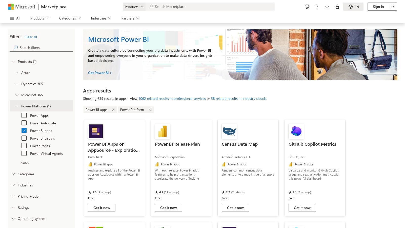
3. Microsoft AppSource (Power BI apps/templates with Executive dashboards)
For organizations integrated into the Microsoft ecosystem, AppSource is the go-to repository for accelerating Power BI dashboard development. It acts as an official marketplace, offering pre-built Power BI apps and templates from Microsoft and certified partners. This makes it an invaluable resource for finance and operations leaders who want to leverage their existing Microsoft data sources (like Dynamics 365, Business Central, or Azure) to create powerful executive dashboard examples without starting from a blank canvas.
The primary value of AppSource is its direct, native integration. These are not just visual templates; they are installable applications that often include sample data, data models, and pre-configured calculations. For an SMB owner, this means you can quickly deploy an "Executive Summary Pack," connect it to your own data, and immediately see how professional-grade reports are built in Power BI. This dramatically shortens the learning curve and provides a tangible, functional asset from day one.
Strategic Analysis & Key Features
AppSource's key advantage is its ability to provide a blueprint for best-practice Power BI implementation. By deconstructing a pre-built app, your team can learn advanced techniques like drill-through logic, KPI benchmarking, and optimal data modeling.
- Key Executive Dashboards: The catalog contains numerous apps for functions like financial analysis, project management, and sales operations.
- One-Click Installation: Apps can be installed directly into your Power BI service with a single click, often including sample data to explore functionality before connecting your own sources.
- Drill-Through and Benchmarking Patterns: Many partner-built apps demonstrate sophisticated interaction patterns, showing how executives can drill from a high-level KPI down to the underlying transactional details.
- Native Microsoft Integration: The templates are designed for seamless connection to data from Dynamics 365, Azure, and other common enterprise sources.
Key Strategic Takeaway: Use AppSource templates not just as end products, but as educational tools. Analyze their data models and DAX formulas to understand how to build robust and scalable Power BI solutions for your executive team.
Actionable Takeaways for Your Business
To get the most out of AppSource, use the templates as a starting point for a proof-of-concept that addresses a specific executive reporting pain point.
- Identify a Relevant App: Search AppSource for a template that aligns with a critical reporting need, such as consolidating financial statements or tracking sales pipeline health.
- Install and Explore: Install the app into a development workspace in your Power BI service. Use the sample data to thoroughly explore its reports and filters.
- Analyze the Backend: Open the accompanying .pbix file (if available) in Power BI Desktop. Study the data model relationships and the DAX measures used to calculate the KPIs. This is where the deepest learning occurs.
- Adapt and Connect: Create a copy of the template and begin connecting your own data sources. Modify the existing visuals and KPIs to match your specific business logic. For a deeper dive into effective visual storytelling, review these dashboard design best practices.
Access Requirements: Using and sharing AppSource apps requires a Power BI Pro or Premium license. While many apps are free, some are paid or serve as a lead-in for a partner's consulting services.
Website: Microsoft AppSource (Power BI Apps)
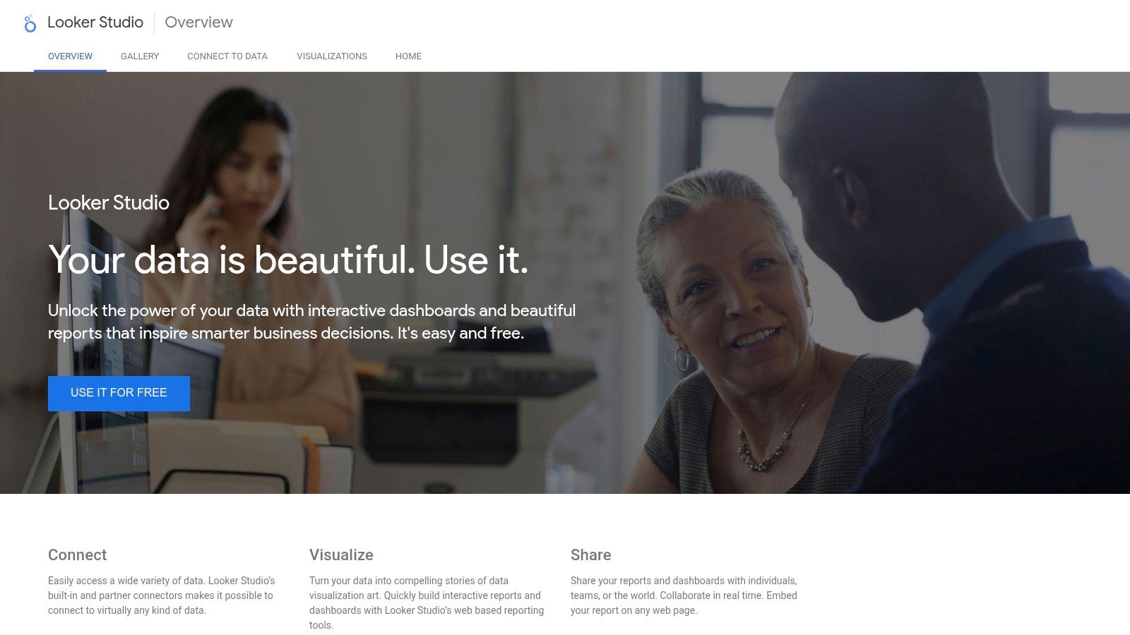
4. Google Looker Studio (Report Gallery and templates)
For organizations seeking a powerful, no-cost entry point into business intelligence, Google Looker Studio (formerly Data Studio) offers an exceptional solution. Its Report Gallery serves as a community-driven showcase of executive dashboard examples, providing a rich library of templates that can be copied and connected to your data with just a few clicks. This makes it a go-to tool for startups, SMBs, and marketing teams needing to build C-level performance snapshots without the immediate financial commitment of enterprise BI platforms.
The primary appeal of Looker Studio is its accessibility and speed. For a founder or marketing lead, the ability to take a pre-built "Marketing Performance" template, connect it to Google Analytics and Google Ads, and have a live, shareable report within an hour is a game-changer. This approach removes the barriers to entry often associated with BI, allowing for rapid prototyping and immediate value demonstration to stakeholders.
Strategic Analysis & Key Features
Looker Studio’s strength lies in its frictionless, browser-based workflow and seamless integration with the Google ecosystem. The "Make a copy" feature democratizes dashboard creation, allowing even non-technical users to produce professional-looking executive summaries.
- Key Executive Dashboards: The gallery features a wide array of templates, including SEO overviews, e-commerce performance summaries, financial KPI dashboards, and website analytics reports.
- Native Google Connectors: Effortlessly pull data from Google Analytics, Google Ads, BigQuery, and Google Sheets, making it ideal for monitoring digital marketing and operational metrics.
- Community and Partner Templates: The gallery highlights work from partners and the community, offering diverse design perspectives and niche use cases.
Key Strategic Takeaway: Use Looker Studio to quickly build and share high-level executive dashboards, especially for marketing and web analytics KPIs. Its zero-cost model is perfect for proving the value of BI initiatives before investing in more complex, enterprise-grade tools.
Actionable Takeaways for Your Business
Leveraging Looker Studio is about achieving quick wins and building a data-driven culture without initial overhead.
- Identify a High-Impact Template: Browse the Report Gallery and find a dashboard that addresses a key business question, like "How are our online campaigns performing?"
- Copy and Connect: Use the one-click copy function and follow the prompts to connect the template to your own data sources (e.g., your Google Analytics account).
- Customize Key Metrics: Adjust the default charts and scorecards to reflect your specific KPIs. You might want to focus on conversion rates over raw traffic, for instance.
- Share and Gather Feedback: Use Looker Studio’s simple sharing features to distribute the live dashboard to key stakeholders. Gather feedback on what is most useful to guide further iterations. While it's a great starting point, you can explore other options in our guide to the best free data visualization tools.
Access Requirements: Looker Studio is completely free to use with a Google account. Connecting to non-Google data sources like a SQL database or CRM may require paid, third-party partner connectors.
Website: Google Looker Studio
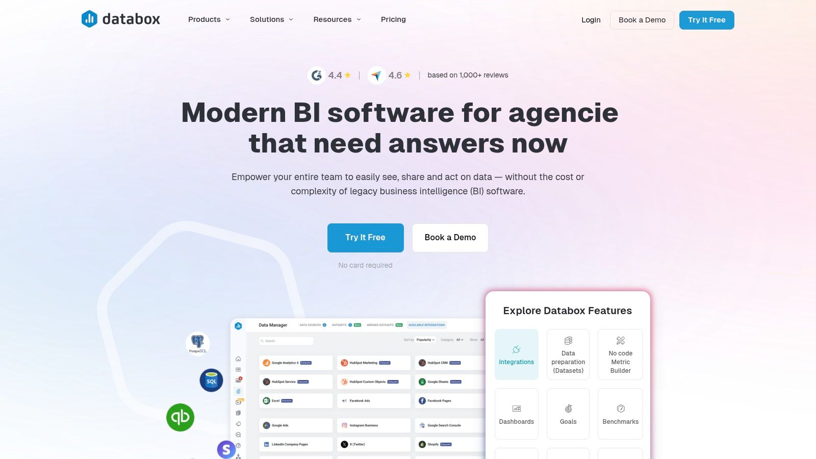
5. Databox (Executive dashboard template library)
For businesses seeking to launch executive reporting with maximum speed and minimal technical overhead, Databox offers a compelling, plug-and-play solution. Its core strength lies in an extensive gallery of pre-built dashboard templates that connect directly to popular business applications. This makes it an ideal platform for marketing, sales, and operations leaders who need to aggregate KPIs from various tools without a lengthy development cycle.
The primary value of Databox is its focus on rapid time-to-value. Instead of complex data modeling, the platform uses one-click integrations to pull metrics from over 130 sources like HubSpot, Google Analytics, and QuickBooks Online directly into a pre-designed executive dashboard. For a busy founder, this means you can have a live, consolidated view of your most critical metrics within minutes, providing immediate visibility and simplifying performance tracking.
Strategic Analysis & Key Features
Databox’s advantage is its frictionless setup and focus on KPI monitoring rather than deep, exploratory analysis. It excels at answering the "What is happening?" question by consolidating metrics from siloed platforms into a single, cohesive view. The platform is designed for accessibility, enabling non-technical users to build and share dashboards effortlessly.
- Key Executive Dashboards: The library contains over 50 executive-specific templates, including "CEO Dashboards," "Marketing Performance Overviews," and "Sales Team Scorecards."
- One-Click Integrations: Its main draw is the ability to instantly connect to sources like Salesforce, Stripe, and social media platforms, automatically populating templates with your live data.
- Goal Tracking and Alerts: Leaders can set specific targets for any KPI and receive automated alerts when goals are met or performance deviates, enabling proactive management.
- Sharing and Display Options: Features like scheduled snapshots via email or Slack and a "TV Mode" make it easy to keep leadership informed.
Key Strategic Takeaway: Use Databox to quickly establish a "single pane of glass" for your operational KPIs. It's perfect for consolidating high-level metrics from cloud-based tools, especially in marketing and sales, to provide leadership with a real-time pulse on business performance.
Actionable Takeaways for Your Business
To leverage Databox effectively, focus on a specific department or function that relies on multiple cloud services and needs a unified performance view.
- Identify High-Priority Integrations: Start by listing the key SaaS tools your team uses (e.g., HubSpot for marketing, Xero for finance). Browse the Databox template library for a dashboard that covers these sources.
- Connect and Populate: Sign up for a plan and use the one-click connectors to link your accounts. Select a pre-built executive template and watch it populate with your data.
- Customize Your KPIs: Review the default metrics. Drag and drop to rearrange visuals, remove irrelevant KPIs, and add new metrics that are most critical to your executive team.
- Set Up Automated Reporting: Use the scheduling features to send daily, weekly, or monthly performance snapshots to key stakeholders via email or Slack, eliminating the need for manual report creation.
Access Requirements: Databox offers a free-forever plan with limited features. Paid plans scale based on the number of data sources and dashboards.
Website: Databox
6. Klipfolio (Live executive dashboard examples + templates)
Klipfolio stands out by offering a gallery of fully interactive, live executive dashboard examples. This "try before you build" approach is invaluable for business leaders who want to understand the user experience and analytical flow of a dashboard before committing to a design. It allows executives to click, filter, and drill down into sample data, providing a tangible feel for how different KPIs and visualizations work in a real-world context.
The platform's core strength is its educational value combined with practical application. You can explore pre-built dashboards for specific functions like an "Executive KPI Dashboard," then use the associated templates to start building your own. This significantly lowers the barrier to entry, moving teams from inspiration to a functional proof-of-concept with their own data much faster than starting from a blank canvas.
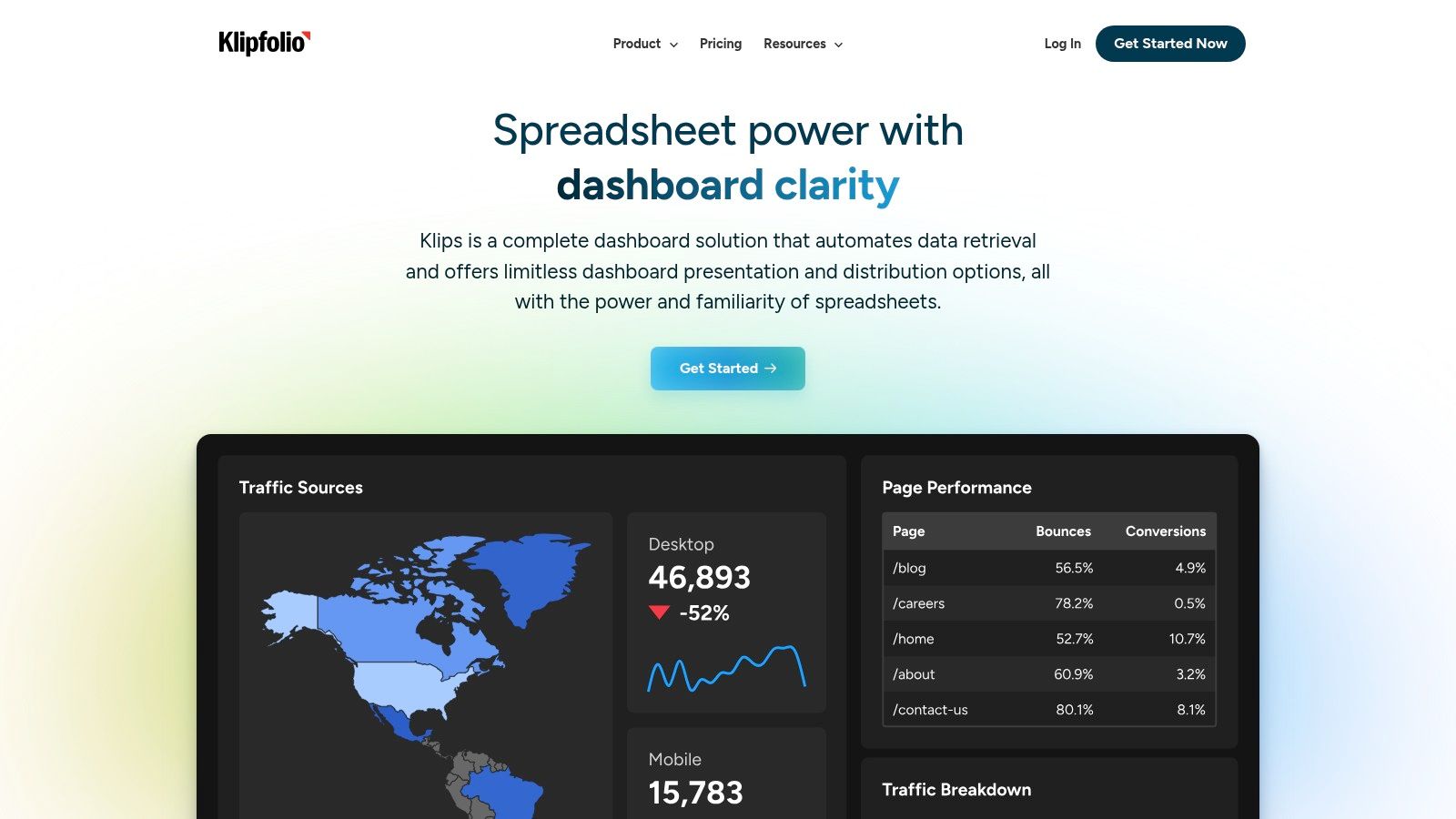
Strategic Analysis & Key Features
Klipfolio’s primary advantage is its focus on reverse-engineering. By providing live examples alongside cloneable templates, it empowers non-technical users to deconstruct and understand what makes a successful dashboard. This is particularly useful for SMB owners and operators who may not have a dedicated BI team.
- Live Interactive Examples: The gallery includes working dashboards like the "Executive KPI" example that users can interact with directly, offering a hands-on learning experience.
- Template Library: Klipfolio provides over 20 pre-built dashboard templates that connect to common services, allowing you to quickly visualize your data.
- Detailed How-To Content: The platform is supported by extensive help articles that walk you through connecting data sources and customizing "Klips" (individual visualizations).
Key Strategic Takeaway: Use Klipfolio’s live dashboards as an interactive blueprint for your own executive reporting. Allow your leadership team to engage with these examples to gather direct feedback on which KPIs and chart types are most intuitive and valuable before you invest heavily in development.
Actionable Takeaways for Your Business
To get the most out of Klipfolio, use its gallery to define your requirements and then transition to building a live prototype.
- Explore Live Dashboards: Navigate to the Klipfolio gallery and have your key stakeholders interact with the "Executive KPI" or other relevant live examples. Note which visualizations they find most insightful.
- Select a Core Template: Choose a pre-built template that most closely matches your strategic objectives. The "Financial KPIs" template is an excellent starting point.
- Connect a Single Data Source: Sign up for an account and connect one key data source, such as your accounting software or CRM, to quickly populate the template with familiar data. For a deeper look at dashboard examples, explore our comprehensive guide to business intelligence dashboard examples.
- Customize and Validate: Modify the template based on the feedback gathered in step one. Share this initial version with your team to validate that it answers their most critical business questions.
Access Requirements: Exploring the live dashboard examples is free. To use the templates and connect your own data, you will need a Klipfolio account (plans range from free tiers with limitations to paid business plans).
Website: https://www.klipfolio.com/
7. Geckoboard (Dashboard examples and ready-made executive KPI setups)
Geckoboard carves out a niche in the BI world by focusing on simplicity, real-time data, and shareability, making it an excellent choice for creating "at-a-glance" executive dashboards. Its primary strength lies in creating always-on, highly visible status boards designed for team spaces, TV displays, or easily shareable links. For leaders who need a constant pulse on key operational metrics without the complexity of a deep-dive analytics platform, Geckoboard delivers clarity and speed.
The platform is designed for rapid deployment, allowing a founder or manager to connect to over 90 common data sources and build a live dashboard in minutes. This is particularly valuable for tracking high-frequency metrics like website traffic, customer support tickets, or daily sales. Instead of waiting for a weekly report, a CEO can have a live, self-refreshing view of performance, fostering a culture of real-time awareness and accountability.

Strategic Analysis & Key Features
Geckoboard's core advantage is its frictionless user experience, which prioritizes getting live data onto a screen with minimal technical overhead. This approach is ideal for operational teams and leaders who need immediate visibility rather than complex data modeling capabilities.
- Effortless Integration: With 90+ pre-built integrations for tools like Google Analytics, Salesforce, Zendesk, and Xero, you can pull key metrics into your executive dashboard with just a few clicks.
- TV & Sharing Focus: The platform is optimized for large-screen displays (wallboards) and provides simple, secure sharing links, making it perfect for keeping teams aligned on KPIs.
- Metric-First Builder: The interface is straightforward and widget-based, allowing non-technical users to build clear, uncluttered visualizations without needing to understand complex chart-building logic.
Key Strategic Takeaway: Use Geckoboard to establish a "single source of truth" for high-level, real-time operational metrics. Its strength is in broadcasting live performance data to a wide audience, promoting transparency and quick tactical responses.
Actionable Takeaways for Your Business
To get the most out of Geckoboard, focus on its intended use case: creating a live, shared status center for your most critical, frequently updated KPIs.
- Identify Core Real-Time Metrics: Start by selecting 3-5 KPIs that are crucial for your company's immediate health (e.g., new sign-ups, active users, open support tickets).
- Connect Your Key Services: Use Geckoboard's native integrations to link to the platforms where this data lives. Prioritize direct connections to avoid manual data entry.
- Build Your "Wallboard" Dashboard: Design a simple, high-contrast dashboard with clear number widgets and gauges. The goal is readability from a distance.
- Deploy and Socialize: Display the dashboard on a TV in a common area or share the link in your company's main Slack channel. Encourage the team to use it as the go-to source for real-time performance tracking.
Access Requirements: Geckoboard is a SaaS product with tiered pricing based on the number of users and dashboards. Plans range from a free option to team and company plans with more integrations.
Website: Geckoboard
Comparison of 7 Executive Dashboard Examples
| Solution | Implementation complexity (🔄) | Resource requirements (💡) | Expected outcomes (📊) | Ideal use cases | Key advantages (⭐⚡) |
|---|---|---|---|---|---|
| Vizule (Custom Power BI) | 🔄 Medium–High: consultancy-led, diagnostic workshops and iterative deployments | 💡 Consultancy budget, executive sponsorship, data cleanup/integration effort | 📊 Single source of truth, automated pipelines, causal analysis & ML insights within ~30 days | SMBs needing automated, adoption-focused finance/analytics transformation | ⭐ End-to-end BI + data science; ⚡ Fast 30-day delivery; strong adoption focus |
| Tableau Exchange (Accelerators – Executive dashboards) | 🔄 Low–Medium: connect-and-go but customization needs Tableau skills | 💡 Paid Tableau license; authoring skills for edits | 📊 Fast executive-level dashboards with best-practice visuals | Teams already on Tableau wanting curated executive templates | ⭐ Curated, enterprise-grade accelerators; ⚡ Very quick to deploy |
| Microsoft AppSource (Power BI apps/templates) | 🔄 Low–Medium: one-click installs; some publisher variance | 💡 Power BI licensing and Microsoft data stack integration | 📊 Prebuilt executive apps with drill patterns and benchmarking | Power BI + Microsoft ecosystem users benchmarking KPI layouts | ⭐ Native MS integration; ⚡ Wide catalog of industry templates |
| Google Looker Studio (Report Gallery and templates) | 🔄 Low: copyable templates for rapid prototyping | 💡 Minimal licensing (free); some paid connectors for enterprise sources | 📊 Quick executive-style reports and marketing/finance snapshots | Rapid prototyping, budget-constrained teams, digital/marketing reporting | ⭐ Free and easy sharing; ⚡ Fast to prototype |
| Databox (Executive dashboard template library) | 🔄 Low: plug-and-play templates with prewired integrations | 💡 Subscription cost scales with sources/features; many connectors included | 📊 Fast time-to-value for leadership KPIs, goal tracking and alerts | Agencies, marketing/sales teams, multi-brand rollouts | ⭐ Large template library; ⚡ Quick setup and goal tracking features |
| Klipfolio (Live executive dashboard examples + templates) | 🔄 Medium: interactive Klips require learning and setup | 💡 Account subscription and time to build/learn Klips | 📊 Live, interactive executive dashboards suitable for reverse-engineering patterns | Finance/SaaS teams wanting hands-on dashboard construction | ⭐ Strong documentation and sample content; 💡 Good for learning dashboard patterns |
| Geckoboard (Dashboard examples and ready-made executive KPI setups) | 🔄 Low: simple builder focused on airtime/TV dashboards | 💡 Subscription; many prebuilt integrations; minimal setup overhead | 📊 Always-on executive scorecards and TV wallboards with scheduled loops | Leadership scorecards, operations teams, TV displays | ⭐ Very quick rollout for wallboards; ⚡ Excellent for always-on displays |
Ready to Build Your Single Source of Truth?
Throughout this guide, we've explored a diverse collection of powerful executive dashboard examples. From the ready-made accelerators in Tableau to the customizable templates in Databox, the potential to transform raw data into strategic insight has never been more accessible. We've seen how top-tier dashboards move beyond mere data visualisation; they become the central nervous system for an organisation, providing a real-time, trusted view of business health.
The most effective examples share common DNA. They don’t just present numbers; they tell a story. They connect high-level financial outcomes like Net Profit Margin directly to the operational levers that drive them, such as Customer Acquisition Cost (CAC). This linkage is the key to empowering leadership with the clarity needed to make faster, smarter decisions. By unifying data from disparate systems like your CRM, ERP, and accounting software, these dashboards dismantle information silos and establish a single, undisputed source of truth.
From Inspiration to Implementation: Your Strategic Roadmap
Seeing these polished executive dashboard examples is inspiring, but bridging the gap to a fully functional, automated system is where the real work begins. The journey involves more than just picking a template; it requires a strategic approach to data architecture and business intelligence.
Key takeaways to guide your implementation include:
- Define Your "Why" First: Before you consider tools, clearly define the critical questions your executive team needs answered. Are you focused on cash flow, sales velocity, or operational efficiency? Your primary business objectives must dictate your KPIs.
- Prioritise a Solid Data Foundation: A beautiful dashboard is useless if the underlying data is unreliable. The most crucial step is building a robust data model. This means cleaning and structuring data from all your sources into a coherent system, often within a tool like Power BI. This foundation enables accurate, automated reporting.
- Balance Simplicity with Depth: The best executive dashboards provide an at-a-glance overview but also allow for drill-down exploration. A leader should be able to see the top-line metric and, with a single click, investigate the underlying trends and root causes.
Choosing the Right Path Forward for Your Business
Selecting the right tool depends heavily on your existing tech stack, technical resources, and scalability needs. If your organisation already operates within the Microsoft ecosystem, leveraging Power BI is a natural and powerful choice. For teams seeking rapid deployment with pre-built integrations, platforms like Geckoboard or Databox can offer significant value.
However, the tool is only one part of the equation. The bigger challenge for many SMBs and founders is the process: connecting data sources, cleaning messy spreadsheets, and building a financial model that accurately reflects business drivers. This is where many well-intentioned BI projects stall. Instead of liberating your team, the project becomes another time-consuming burden.
This is precisely where a specialist partner can accelerate your progress. If you're tired of grappling with manual Excel reports and disconnected data, and you're ready to build a truly automated reporting engine that scales with your business, we can help. Our expertise is in turning the chaos of siloed data into the clarity of a single source of truth, all within a powerful Power BI framework designed for leaders like you.
Ready to transform your 'Excel chaos' into an automated, insightful executive dashboard? The team at Vizule specialises in building the BI and financial reporting stacks that empower SMBs to make data-driven decisions with confidence. Book your free BI consultation today and let's map out your path to actionable insights.


